0

When I saw it, I couldn't understand it. Neither my a few friends.

Now I won't ask for the meaning of it, or if I should understand it or not, as it will turn out to be subjective.

First, is it done by mistake or a bad design? If yes, how can a world's top agency can make a mistake/bad design (that is hard to understand), when the design goes through several approvals?

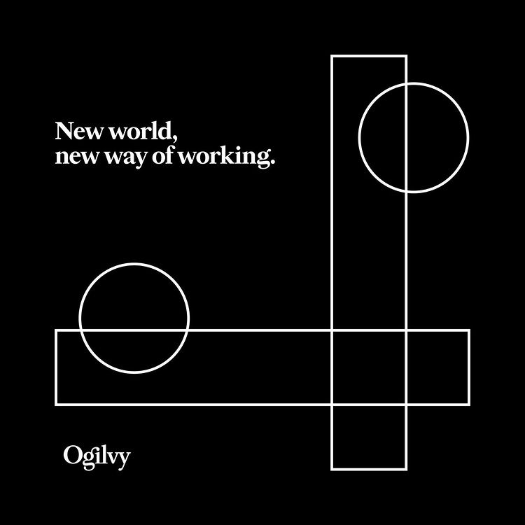
And if it is not a mistake and not a bad design, then definitely there has some kind of significance (if not meaning) of this design, which I can't understand. I mean I can't even judge it before knowing what is it. Yes I think this the right way to ask. What is it?

Why I'm curious? Because if I don't ask it here, I will never be able to talk about it with others or share my views about it. Or maybe someone else would ask me similar doubt, I would be answerless. I don't even know if it's an ad or some other stuff. I don't know if it is supposed to work or not. I don't know what the creative team had in mind while designing it.

Given all that, what's the significance/use of such type of design? Is it a special category of a design without any significance/use and done for some other purpose?

EDIT: I think there's a big confusion in comments. Some users might think I'm judging/calling/declaring it a bad/complex/mistake design. It may seem from my question above, maybe because I couldn't put my original thoughts here.

But just to make you understand, I was curious to find out if it was a bad/complex/mistake design or how correct/incorrect I am, rather than declaring it. And then I was curious about knowing the purpose of it, and how to understand and enjoy this kind of design so it serves the purpose of designer and design itself.

Yes, it might seem from my question that I suspected it bad/complex/mistake design, but that doesn't mean I was in favor of proving it bad. I was more interested in knowing the truth and correcting myself. I've always liked their typography and geometry shape based designs because they follow principles which I learned here from some top users. I always relate them with this site. No question I would prove them wrong. Not in my dream.

In a simple sentence, I was almost sure it isn't a bad design, it was just I didn't know this kind of design and I needed a confirmation and explanation about it, so I understand it. That's it.

enter image description here

5
  • 4
    Any answer to this is going to be as subjective as the question. When you say you don't understand it, what about it don't you understand? You question if it could be a mistake or bad design… Let's assume it's extremely unlikely to be a mistake; what quantifiable criterion would you use to categorise it as bad design? You might be better starting at "What's this design style called? What is it influenced by?" which would give you some things to further research - minimalist, deco, nouveau, bauhaus all spring to mind.
    – Tetsujin
    Commented Jan 16, 2021 at 11:30
  • 2
    It has a message, so it's not a logo. The message being 'New World, new way of working.' and it's being offered by Ogilvy (I take it that it's a company name). The shapes seem to be two similar shape groups aligned together in a different orientations, (i.e., vertical and horizontal). I guess that it's to show how the same thing can be processed differently. I don't think that it's a mistake.
    – nocturns2
    Commented Jan 16, 2021 at 12:02
  • Times change. They have put parts of a drawing board ruler set to a new order to be able to response the challenge.
    – user82991
    Commented Jan 16, 2021 at 18:06
  • @Scott you're right.
    – Vikas
    Commented Jan 16, 2021 at 19:34
  • 1
    Added as an answer.. :)
    – Scott
    Commented Jan 16, 2021 at 19:35

3 Answers 3

4

Does it make you think? Remember it a bit longer than something else?

Will you remember the Ogilvy name?

There's the purpose/significance entirely.

It's merely a self promotion piece designed to "stick" in your brain as much as possible. It doesn't have to make any immediate sense or have a clear, concise, message. In fact, it works better if you struggle a little understanding it.

2

What is the significance/importance/use/purpose/need of this design?

What is it?

I see this as simply an advertisement. It is this company, Ogilvy, putting their name out there- for familiarity, for name recognition. In your view, this is a bad design or a mistake. This is merely your "opinion"- which you are fully entitled to. I happen to like this design (and I don't think anyone really cares what I like or don't like- better yet, I don't even care about that- haha).

You can site your reasons for judging it as "bad". There certainly exist some design "rules" or "guidelines" which could be generally categorized. And yet, these "rules" are often broken to create an effect or to get the attention of their audience. Your dis-like and/or not understanding this simple design/ statement has caused you to ask this question here on GDSE. As a result, you have brought this Ogilvy advertisement to all of our attention- around the world. This leads me to judge this as a highly effective advertisement- I, for one, was not thinking about Ogilvy today and now I am.

As far as the "design"- One can look into the basic shapes used and speculate as to some inferred "meaning" to them. You can also just see them as simply balancing the layout. That is purely subjective- subject to each viewers interpretation. Any further discussion is speculation and unanswerable without seeking a statement from the original artist about their intention in creating this piece.

11
  • No. Actually I'm not calling it bad. It's more of want to know if I'm wrong when I suspect it as bad design? That's why I wrote in question "I can't even judge it".
    – Vikas
    Commented Jan 16, 2021 at 18:05
  • "As a result, you have brought this Ogilvy advertisement to all of our attention- around the world." lol
    – Vikas
    Commented Jan 16, 2021 at 18:07
  • @Vikas- This is my whole point- you "suspecting it as a bad design" is subjective and purely your opinion- great ! You can surely find people who agree with you- I happen to disagree with you, as I said, I like it. Art is like this- a creative expression. Whether I like any particular Art or not has nothing to do with whether it is good or bad- that is merely my opinion- and what right do I have to judge another person's creativity ?
    – Kyle
    Commented Jan 16, 2021 at 18:21
  • okay I'll correct myself more. Maybe I didn't use right words. Actually I didn't want to criticize it or call it bad/useless design. I like their designs espeically typography and geometry shape based designs (you can find on their instagram) because they are kind of unique, away from crowd. When I said suspect, I mean I was curious to know if I am wrong to think it can be a bad/mistake design".
    – Vikas
    Commented Jan 16, 2021 at 18:39
  • My intention was to find out if I'm am wrong, which I was. When I suspected it a bad/mistake design, I didn't judge it. I came straight here, because I believed Ogilvy can't make mistakes, and there's some reasons behind it. I just wanted to find out that and understand this design :) My way of describing problem might interpret that I am suspecting it bad design only. But I was curious about knowing truth. And now that I've known the purpose of this design and how to deal with such designs/art, I have found out that I was wrong and design is simple, good and meaningful (at least to me).
    – Vikas
    Commented Jan 16, 2021 at 18:39
2

This can be interpreted in different ways, but it is by no means a “mistake”. If you dig deeper, you'll find this is part of their 'visual language', which they use to decorate their communication.

Given the context of this particular visual, this is probably their take on adapting a traditional business model to the new realities of the 2020 Coronavirus situation, where full time employed teams are no longer the rule, and businesses, Ogilvy included, have had to adapt their workflow to different ways of getting it done.

Design translated to English: “We're still doing the same thing, but upside down.”

Purpose: self-promotion.

5
  • While I'm going through the answer, could you please make the paragraph in bottom a bit more easy to understand for me? It seems a long sentence with commas, I kind of didn't get it fully since I'm not that good at English communication.
    – Vikas
    Commented Jan 16, 2021 at 12:16
  • 4
    I downvoted because I absolutely disagree with your assumption in your first paragraph. The fact that Ogilvy is a well-known brand does not mean they cannot produce bad designs or make mistakes. Yes, their designs are vetted through entire committees before being published, but that's hardly a guarantee for good design, is it?
    – Vincent
    Commented Jan 16, 2021 at 13:17
  • I know what you mean, I was just generalizing to build up to my point. Yes ofcourse not everything made by a global consultancy will be top notch, and sometimes they'll need to prioritize efficiency over quality. What I meant, with probably the wrong wording, is that them being so global, everything is filtered by internal teams, and if a compromise is being made, they're probably aware of that at some level. However, in many cases, they'll need to move on with whatever is getting approved, as larger clients can prove more difficult than smaller clients.
    – lmlmlm
    Commented Jan 16, 2021 at 16:06
  • I will be removing that part from my answer, as it seems to throw this offtopic and the OP already has trouble understanding some of this.
    – lmlmlm
    Commented Jan 16, 2021 at 16:07
  • @Lucian yeah I just find this paragraph hard to understand grammatically because it's a long sentence: "Given the context................of getting it done". Would probably understand if could be broken in small sentences.
    – Vikas
    Commented Jan 16, 2021 at 18:03

Your Answer

By clicking “Post Your Answer”, you agree to our terms of service and acknowledge you have read our privacy policy.

Not the answer you're looking for? Browse other questions tagged or ask your own question.