3

I will be printing invitations with body text set in 14pt Snell Roundhand Bold which has "pen strokes" that end with very thin ornaments.

The text needs to be light gray and, if I understand correctly, this basically gives me only two options:

  1. Use a low tint percentage of K100 or just a low K value, like K25. (Both options produce equivalent results.)
  2. Use a light gray spot ink at 100%.

I am concerned that the first option will result in gaps in the thin strokes as the printer will space out the black dots to create the illusion of gray. Worst case scenario, the thin ornaments will not be reproduced at all. (I'm not sure what the correct technical term for this kind of dot spacing is. I saw in another post someone refer to it as "open raster.")

The second option will probably give me the best results, but I am not sure if the printing will be offset or digital. Do I understand correctly that digital printers do not use spot colors?

What would be my safest option?

Thanks!

2
  • 2
    "Open raster" probably would be called "halftone screen," "screened," or just "halftone."
    – Yorik
    Commented Feb 9, 2021 at 15:05
  • 2
    Call your printer and ask them this question :)
    – Vincent
    Commented Feb 9, 2021 at 15:44

2 Answers 2

4

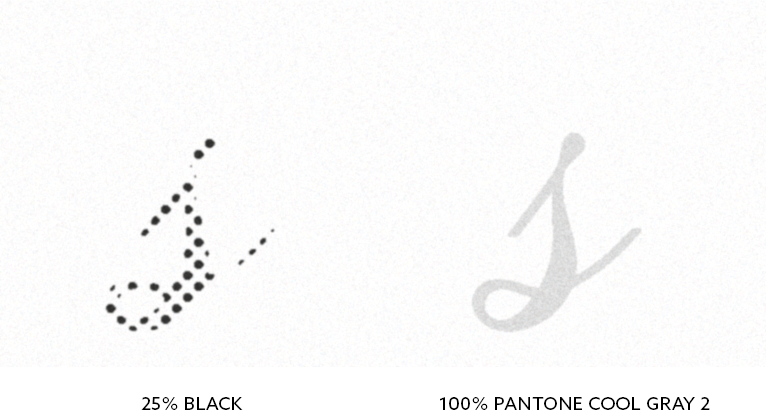
Having thin lines in a percentage of black can lead to the lines looking fragmented. Very thin lines might even disappear as they can end up between halftone dots.

I generally would advise against having small text in anything other than 100% of an ink. Printing with a gray spot color (often Pantone) at 100% would not have this problem.

Here is a preview of how small text could look like when offset printed in 25% black and 100% Pantone Cool Gray 2:

Since you are making invitations, which are often made in relatively modest amounts, it doesn't sound like offset printing is an economic possibility. My guess is that you will end up doing the prints digitally.

In digital print the screening is often different and you will often see some kind of stochastic screen which has smaller dots in a random pattern. This might look better. Since digital print doesn't require making printing plates etc. you can ask your print provider for a test print to check out how it looks.

My personal opinion

I actually often see the use of gray script fonts on wedding invitations and similar. People seem to feel that it gives an authentic look. The thing is though, that back in the time were these kind of fonts come from, I doubt that you would see gray text very often. Most (if not all) handwritten documents I have seen from "the old days" have black text.

If you are going for an authentic/noble/vintage feeling, I think you should make the text 100% black. One of the ideas with having fonts with different weights is to enable you to change the perceived tone of the text by choosing between Light, Regular, Bold etc.

2
  • Thank you for your answer. It confirms my suspicions about using tints for rendering fine detail. Sent the job in with 100% spot color for the text.
    – mxfe
    Commented Feb 9, 2021 at 22:18
  • 1
    Good. Just be in mind, as I mentioned, spot color print is normally only possible in offset print. Just defining the color as Pantone does nothing if the print house doesn't actually print it with Pantone ink.
    – Wolff
    Commented Feb 9, 2021 at 23:46
3

For quality you will want to use a spot color.

I've run 5 color jobs just so colored type appears properly ... and I wasn't using anything as delicate and Snell for a typeface. I've also had print providers, on their own, split jobs to 5 color for this reason, at no additional cost, just so they could deliver a quality product.

If you are concerned with quality which (to me) demands the use of spot color, then trusting any online printer may not be wise. Many online print providers will use digital printing for smaller run jobs, or gang smaller jobs running them together - meaning spot colors throw off their workflow which is normally all RGB or CMYK. So they wont' run spot even if it's specified.

That is not to say online print providers are, as a whole, less useful. It all comes down to the customer desires and job specifications. The more specialized you get the less ideal they can be. When things get specific, one starts to see a need to possibly start factoring in mistakes and possible reprints along with the associated delays and communication hurdles with some vendors.

Online print providers really tend to shine for full color projects. When dealing with a limited color, or specific (spot) color, run it can often best to try some local print providers.

Speaking as someone in the United Stated, if your project is merely one or two color (you don't specify), there are often several small print providers locally. Small "mom & pop" providers who have a 1 or 2 color press. This type of work is their "bread and butter". They thrive on this type of work and will customarily provide much more attention to detail than any online print provider resulting in overall great quality for small run, limited color, jobs. Just bust out the phonebook, or launch the app :), and start calling to get some quotes. I think you'll find they are all happy to help you. Costs are generally not that different than online pricing - especially for limited color.

Your Answer

By clicking “Post Your Answer”, you agree to our terms of service and acknowledge you have read our privacy policy.

Not the answer you're looking for? Browse other questions tagged or ask your own question.