I'm in the process of creating my brand colours and I want to achieve a bright Cyan but any bright colours just appear dull in CMYK.
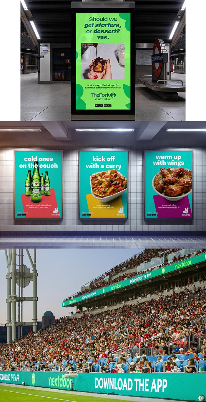
There are 3 big brands I know of that use very bright colours in their branding and I'm wondering how this can be acheived as these colours do not exist in CMYK.
The 3 brands are: TheFork , Nextdoor , and Deliveroo.
Below are some images of their branding so you can see the kind of colour brightness I am looking to reflect in my branding but the bright green and teal just comes out dull and grey when you try to achieve it in CMYK.
Just wondering how these brands are able to apply this colours to printed marketing materials?

