0

Bit of an odd question, so let me know if I need to elaborate further.

I have a logo that consists of two colors: #d6202a and #ffffff. With that said, there is blending between these two colors, so I get intermediate colors like #e08687 etc.

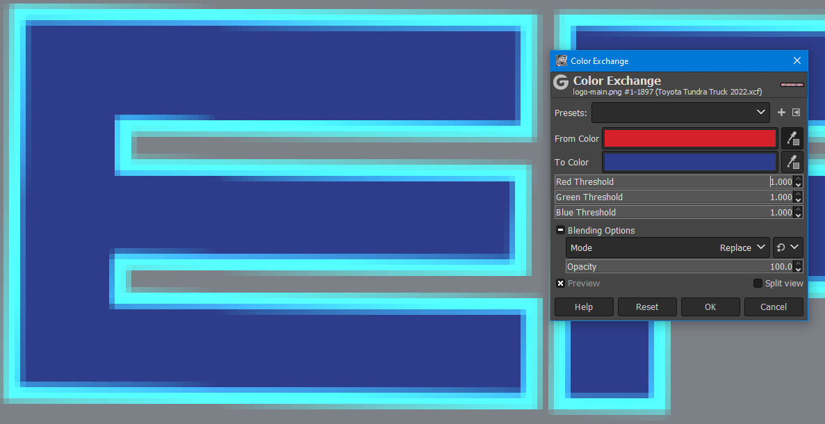
enter image description here

I'd like to do a color exchange from the red to blue. Given I know the primary color, I thought color exchange with increased thresholds would work quite well, but I end up with something completely different along the white borders:

enter image description here

I'm not sure why the pure white would be exchanged for a light blue. It's not a light red in the original image, so why would this happen?

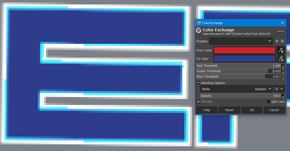
If I reduce the thresholds to try and keep the white, I end up with this ugly off-tone light blue:

enter image description here

I feel like this is a simple operation that I'm misunderstanding. I've been using Gimp for a decade+ and still haven't figured this one out without feathering selections and eyeballing it.


2
  • GIMP isn't really the right kind of software for creating logos TBH. It's a photo editor. The problem you are having is that there is not just two colours. The edges have antialiasing which creates many different colours of pixels, and that will always cause issues. It would be much better to use a vector image editor, even to redraw/recreate the logo in vectors. That way you could draw paths, add fills and strokes, and change them whenever you want, avoiding the antialiasing issue entirely. Inkscape is a free and Open Source vector image editor.
    – Billy Kerr
    Commented Apr 7 at 14:23
  • I don't own the logo, just doing a personal project with it.
    – DonutGaz
    Commented Apr 7 at 14:40

3 Answers 3

1

The general technique:

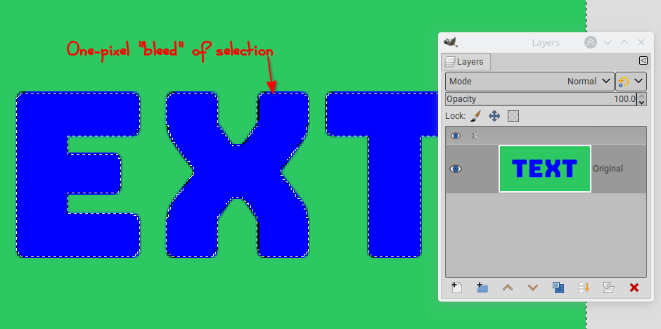
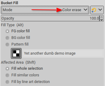
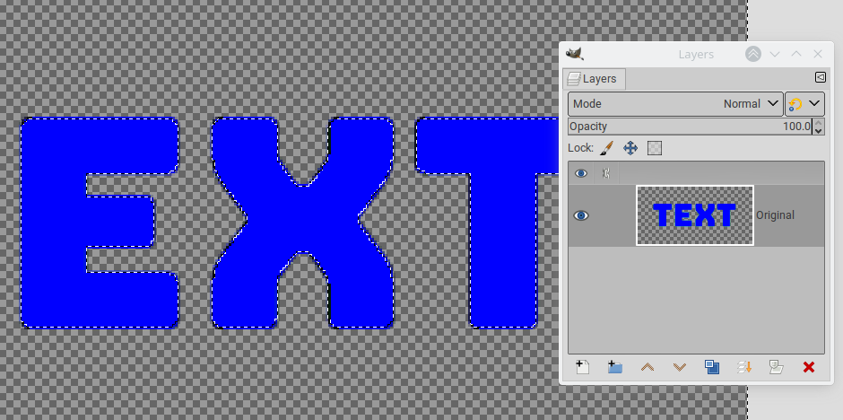
  • Make one color transparent. Where the colors are blended, this will produce partially transparent pixels. This is done by painting the whole picture in Color erase mode, using the color you want to become transparent. If the colors are not distinct enough, this can make the second color slightly transparent as well. In this case, you need a selection: color-select what you want to remove with a tight threshold, then grow the selection by one or two pixels to make it cover the blended pixels.

enter image description here

then:

enter image description here

produces:

enter image description here

  • If you used a selection in the previous step, remove it (Select > None)
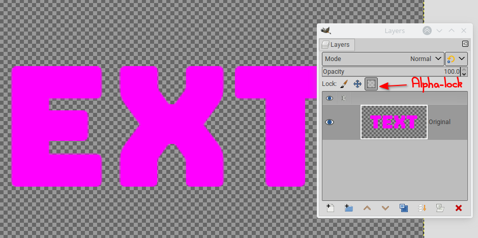
  • Alpha-lock the layer and bucket-fill with the new color (make sure you set the bucket-fill tool back to Normal mode). The partially transparent pixels will remain so due to the alpha-lock.

enter image description here

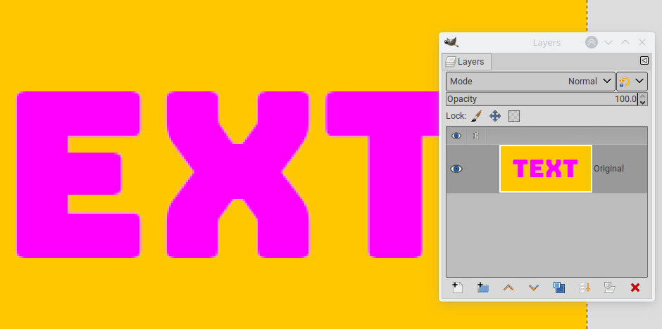
  • Remove the alpha-lock and bucket-fill the whole layer in Behind mode with the new second color

enter image description here

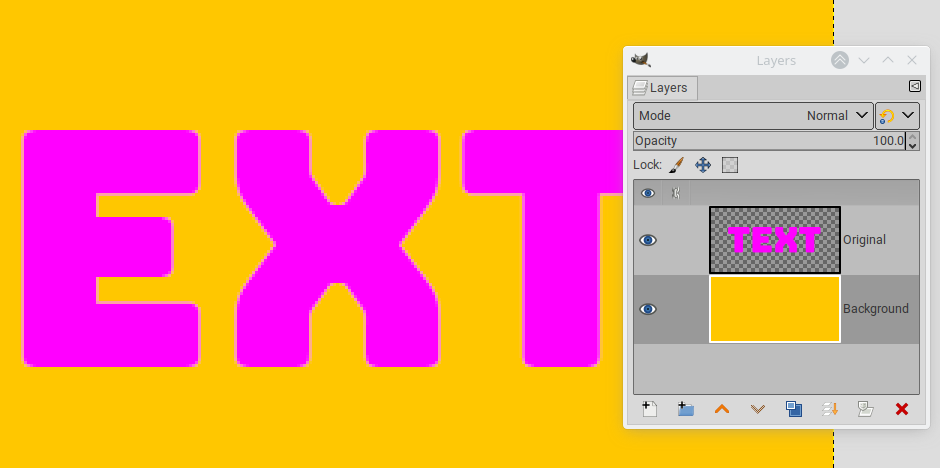
  • Alternatively, add a layer below and bucket-fill it in Normal mode, because keeping the colors on separate layers will make further changes easier:

enter image description here

2
  • Wow, thanks! This was really informative. Never used the color erase mode before, wish I had known this years ago.
    – DonutGaz
    Commented Apr 9 at 12:16
  • IIRC new mode in 2.10. It is the strict equivalent to Gimp 2.8 "Color to alpha", the 2.10 "Color to alpha" being a bit different now, and not always handling the anti-aliasing pixels properly if you don't use the right settings.
    – xenoid
    Commented Apr 9 at 13:01
0

One possibility is to select around the letters, including the white outlines, and use Colors > Hue-Saturation. Choose the "R" option for the primary colours, and move the Hue slider until you get blue.

It would also be possible to select a bit more carefully, perhaps using the polygonal lasso tool, but making sure to included the coloured pixels inside the white border. Or perhaps use select by colour tool, to select the inside colour, and then to Grow the selection by a few pixels, and then run the hue-saturation adjustment.

enter image description here

Note that GIMP isn't really designed for editing or creating logos. Graphic designers tend to use vector software. The benefit of using vectors is that shapes can have strokes and fills which can be easily changed, avoiding the antialiasing problems you can get when using raster software like GIMP or Photoshop.

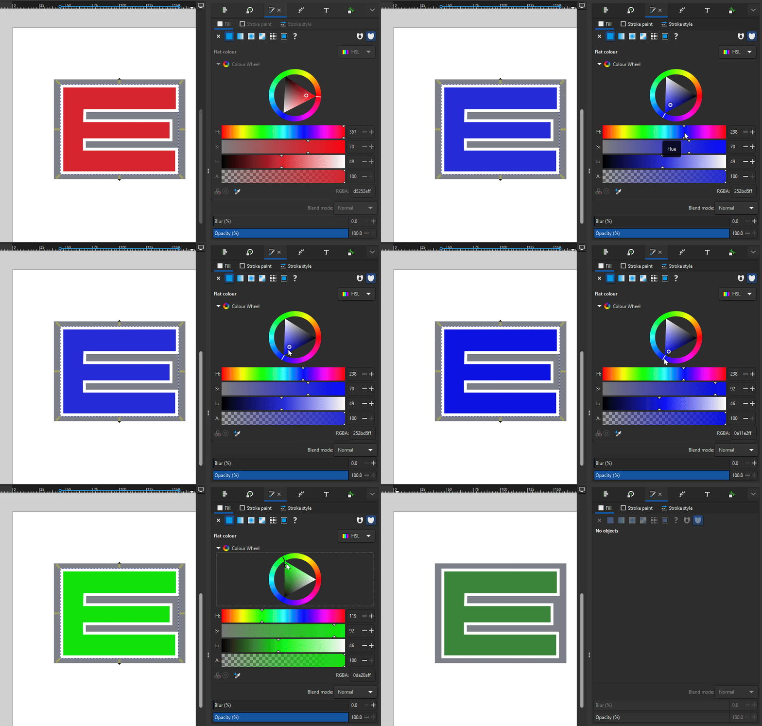
For the sake of comparison, here's an example using Inkscape which is a free and Open Source vector image editor. I re-drew the letter, and here I am changing the fill and stroke colours.

enter image description here

0

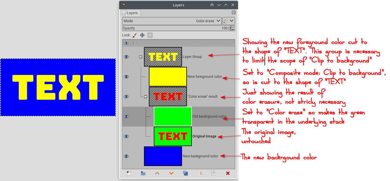
For completeness: if the two initial colors are different enough (no selection necessary), a proper scaffolding of layers can produce the result.

enter image description here

The "Composite mode" can be set by right-clicking the layer/group or using the layer attributes dialog.

The set up is of course a bit more complicated, but if you have to reproduce the change on several images, it becomes just a matter of inserting the other layers, either one by one, or all together and toggling the visibility.

Your Answer

By clicking “Post Your Answer”, you agree to our terms of service and acknowledge you have read our privacy policy.

Not the answer you're looking for? Browse other questions tagged or ask your own question.