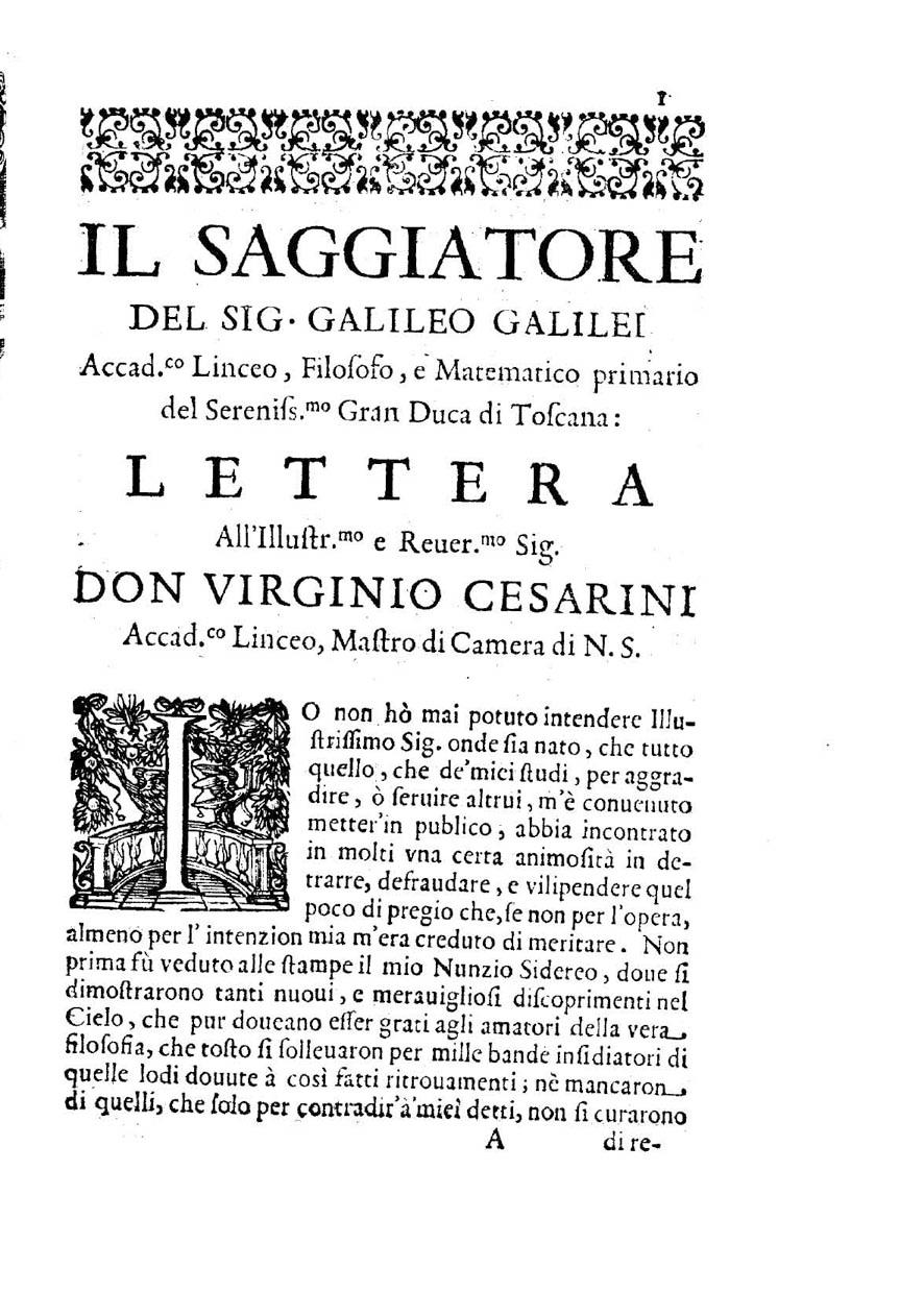
I’m looking for a font that most closely resembles the following page from Galileo Galilei’s Il Saggiatore (published in 1623). I can't think of anything other than Bembo or plain old Times New Roman.
2 Answers
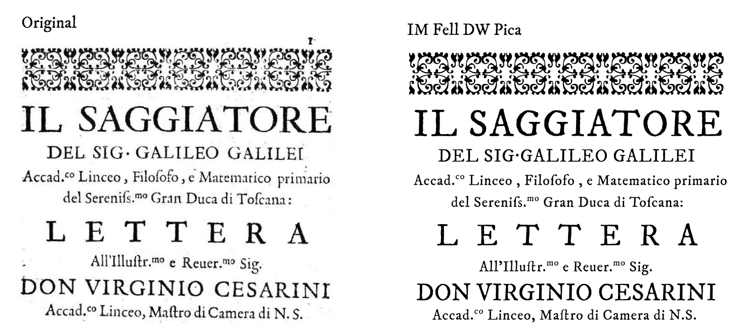
There's a google font called IM Fell DW Pica which comes very close. Not exactly this same, but it has the look. It's even partially degraded like old letterpress type and has ligatures and the long S. I couldn't resist trying to recreate part of it.
By logic, it can not be Times New Roman that was designed in the 1930s.
You need to look for fonts designed in 1465-1600s. That is why Garamond is an option.
But It could be that you need to find an "old-style" version. Some versions include jagged edges simulating imperfections in the manufacturing. You could add those imperfections in post-production.
As a first step focus on the shapes and overall proportions, not on the apparent weight or details.
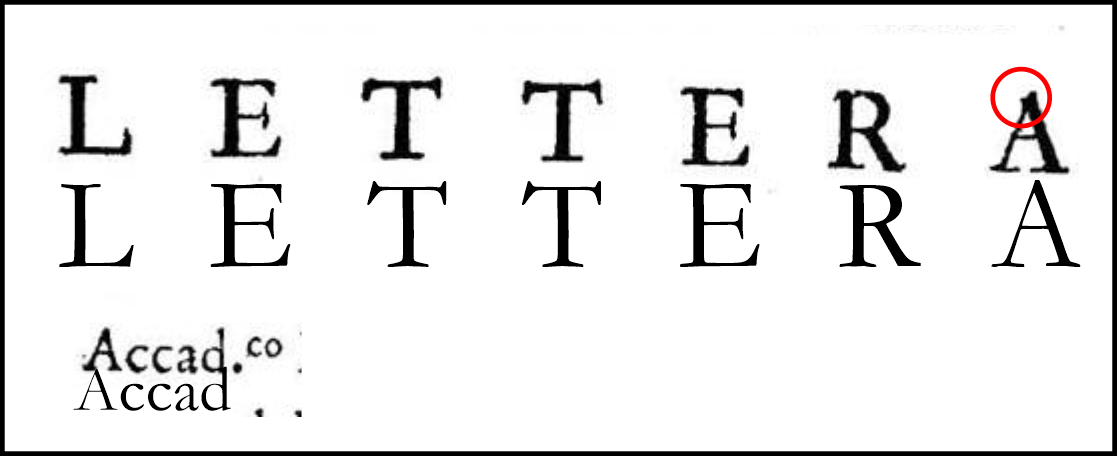
Some additional "weight" and thickness problems when comparing your font are due to the imperfection of the original print, the font size (and then the amount of ink that was absorbed by the paper), the scanning of the image, and the way the image was equalized or adjusted to make it high contrast.
The only feature that, IMHO does not match, and it is not attributable to imperfections in printing and or scanning is the little dent on the A.
But overall I think is Garamond.
-
1


eandaglyphs make me think Garamond or Bembo