1

We are working on a CSS framework for our app, having made the prototype with Twitter Bootstrap and we started by designing the elements of Bootstrap we had used.

One of them was prepended and appended inputs

Which is basically something that helps you recognize what the input is used for, it's not necessarily a label, it's rather some sort of helper. Say it's an input with date, so you throw in there a little calendar icon.

Now I think that it's kind of important for this element to be visibly part of the input, wouldn't you say so?

Our graphic designer thinks otherwise, he's basically done this
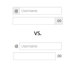
enter image description here

So, do you think it should be visibly part of the input? If so, what would be your arguments for it?

4 Answers 4

2

Bootstrap does the former, which should be a good hint. Just because the Bootstrap guys did it a certain way doesn't make it right, but I bet they considered their options before doing it the way they did.

Personally, I think enclosing it gives the whole thing a better shape. If you're stacking boxes, everything will align better and have a stronger vertical line.

How about a compromise? Maybe get rid of the gray background and/or gray out the non-editable text.

Compromises!

1

First one could be understood as a clickable element. So of that's not the case I wouldn't go with it. Second one indicates being a label. A description of the box. If that's not the case, I wouldn't go with it.

1

The second set... with some possible revision. Is the @ symbol part of usernames? Then the bottom set as you have it.

If the @ symbol is designed to designate an email address, then the symbol is really superfluous. If the username is an email address, then change "username" to "email address" or "email".

If the value field should not include the decimal and two digits then it needs to be outside the input area and not appear clickable, but rather an appendage to the value input. I would also increase the size of the '.00'

Similar.....

inputs

At a minimum, I'd use this. Assuming the @ symbol is not part of the username:

email

While the top set visually appears nicer, as KMSTR points out, the items appear clickable.

And, of course, I have no clue what anything else looks like so it terms of continuity this is either hit or miss. And I'm thinking "design" here not "bootstrap" so integration wasn't really considered.

0

Both your examples are labels. The difference is that the first set of labels are enclosed in a tint box and visually attached to the form field. They are much less likely to be overlooked or dismissed than the second set. On the second set of labels I keep glossing over and mentally dropping the "extra" characters, which I shouldn't because they're important.

I think your designer is right on this one, sorry.

3
  • Designer wants to go with nonenclosing though, so he's not right after all.
    – fxck
    Commented May 9, 2013 at 10:27
  • Your post says "Designer wants to go with THIS" on top of the first, enclosed, graphic. Did I misunderstand what you wrote? Commented May 9, 2013 at 17:17
  • well the first one is the default bootstrap state, but yeah I should have placed them other way around for people who don't know bootstrap
    – fxck
    Commented May 10, 2013 at 7:20

Your Answer

By clicking “Post Your Answer”, you agree to our terms of service and acknowledge you have read our privacy policy.

Not the answer you're looking for? Browse other questions tagged or ask your own question.