6

I am designing the layout for a textbook. The book is organized into themes at three levels:

Modules
    Units
        Lessons

When looking in the table of contents, this organization is easy to understand, e.g.:

Module 1: North America
    Unit 1: The Age of Sail
        Lesson 1: Columbus
        Lesson 2: Magellan
        ...
    Unit 2: The Pioneers
        Lesson 3: Home on the Prairie
        Lesson 4: The Native Americans
        ...
Module 2: Australia
    ...

Once one begins to flip through the book, however, it is not so easy for readers to mentally visualize this structure or to find the pages they want. I examined some other textbooks, but found they had the same problem.

So far, I have designed two types of titles which are easily differentiated. The first is the text printed large, with a photograph behind spanning two whole pages:

 _________________________________
|                |                |
|                |                |
|                |                |
| Unit 1         |                |
| The Age of Sail|                |
|                |                |
|                |                |
|________________|________________|

The second is the text printed slightly smaller, but it is given its own white space at the top of the pages:

 ________________ ________________
|                |                |
| Lesson 1       |                |
| Columbus       |                |
| .............. | .............. |
| .............. | .............. |
| .............. | .............. |
| .............. | .............. |
|________________|________________|

I cannot find any way to make the "Modules" level appear much larger than the "Units" level.

How can I organize the chapter titles in this book so this organization is more clear?

1
  • This is a pure visual design question and, as such, there's going to be a lot of subjectivity involved. But I'd ask yourself some questions--like why does the Modules level have to appear 'larger'? As long as it is BEFORE the first unit, would that suffice? Does it even need it's own title page, or could it be an element on each unit title page?
    – DA01
    Commented Jun 20, 2013 at 6:14

5 Answers 5

7

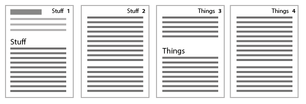
Something no-one has mentioned yet: Running headers.

enter image description here

This is where every page tells you the title of the section that you're in. Most layout applications like InDesign have features for this where you place a running header text variable in a master page set to look at a particular paragraph style and it pulls in the text automatically, with rules about what text to use out of the section number, name, both, or something else.

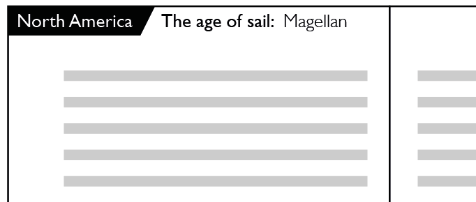
There's no reason why you can't mix multiple types of running header together for something that might look like this, at the top of every spread:

enter image description here

You might prefer to split these out across both pages in a spread, for example:

enter image description here

...you get the idea. There are no hard and fast rules, just consider what works for your particular needs and what is intuitive in your particular case. Which are more important to someone browsing the book out of section/unit/lesson numbers? Will any of these numbers be what they are looking for? How related or separate are these things? etc etc


Running headers can get a bit tricky when ranges are involved (e.g. Lesson 2 - Lesson 4 on the same spread), we've got a question on that.

1
  • 2
    I think running headers are a must-have item for textbooks
    – horatio
    Commented Jun 20, 2013 at 17:07
6

First, all chapter/module/lesson starting pages should always appear on the right page, not the left as in your examples.

I would combine the Module and unit page to a single page with the module number and unit title similar to how you have the unit page (but on the right)

 _________________________________
|                |                |
|                |                |
|                |   Module One   |
|                |                |
|                |     Unit 1     |
|                |The Age of Sail |
|                |                |
|________________|________________|

 _________________________________
|                |                |
|                |                |
|                |   Module One   |
|                |                |
|                |     Unit 2     |
|                |  The Pioneers  |
|                |                |
|________________|________________|

Then have a blank, and then the lesson start:

 ________________ ________________
|                |                |
|                |    Lesson 1    |
|                |    Columbus    |
|                | .............. |
|                | .............. |
|                | .............. |
|                | .............. |
|________________|________________|

If this is a color text book you could differentiate the modules by a color bar bleeding on the right side. Varying the color for each module. When closed the colors would be visible on the page edges. If it's a one color text book you could use grey rather than color, but I'd probably stick to two grey values, a light and a dark, and alternate them.

2
  • 2
    The color bleed is extremely helpful from a useability standpoint. Many books go one step further and have the colored bleed item as a moving tab: a 1 inch color tab that also migrates down the side of the page as the sections change such that when the book is closed, sections sketch out a step-like pattern. I don't know what the proper term is, but it is similar to a cut-index or thumb-index in dictionaries.
    – horatio
    Commented Jun 20, 2013 at 15:50
  • I would do this. Color is an extremely useful shortcut, and easy to understand. Having the stepped tabs is also an excellent idea. Commented Jun 20, 2013 at 16:03
4

You are over developing a process that some will never understand in the book world. The best advise I can give you is keep it simple. Many publishers use the Part/Chapter method and that is a process that usually everyone understands and I will explain.

Now there is two ways, depending on how you want to lay it out to execute this.

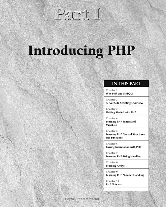
Part I

To distinguish what you consider as "module" you can layout your book as what is considered as a "Part". Some publishers will take a "Part" and if your book is black and white they will use a grey scale for the background. They will title the header in a typical bold font and list out the particular chapters included in the book.

(Example taking from Wiley's PHP Bible. Not the greatest design I like but a good example.) enter image description here

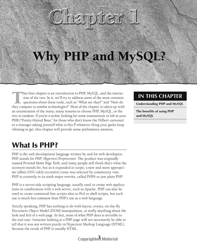
"Chapters" to others you would consider as units and you can simplify the "Lessons" on the Chapter pages.

enter image description here

It would be wise to keep everything on the right page for the part and chapters. If this is for a digital edition I would create navigation links in the parts to each Chapter.

If this is for a colored edition. It is common to distinguish each "Module" as a particular color. What some would do is take the "Module section and use the color across two pages. The left page would be solid and the right page will have the info. Each chapter would have a strip of the chapter.

PART II

Many publishers are leading to establish each part at the beginning of the book like so:

enter image description here

If you choose this method and are planning a digital edition make each part a link to the "Modules". The down fall to this is each "Unit" will be harder to distinguish from.

Some advise. If this is for a printed edition its best to design with the common two page method but if this is for digital it is best to not have any white pages and it really doesn't matter how the book is designed because it is not typically common to view a digital book in a landscape. However, for quality I would take this into consideration. Many e-stores will charge based on how many pages are in the book so in a single page view removal of white pages would make it cheaper.

0
2

I would propose that maybe we take an abstract look:

Could it be that your trying to communicate a structured message in a very small and unobstructing, easily accessible space? i.e. the edge of the page, for quick and easy physical navigation through the contents.

This is very similar to designing websites and apps for mobiles; navigation must be extremely obvious, but take up as little space as possible.

So what do they do?

One of the most effective methods is using iconography, symbols that are easily recognisable - even at tiny sizes, and either familiar from previous experience or quickly memorable.

How about using icons at one of the levels, at the top right of every right page.

So which level should we symbolise?

Well, in the case of a book, we have another dimension available for navigation, as others suggested, a natural place to look on a good textbook is the sides of the paper when it's closed, so the staggered approach is a good indicator to use, and of course it's only likely to be easy to physically use when applied on the top level of the navigation, because the steps need to be wide enough for the reader to target.

So first level:

___________________________
|===================[mod1]|
|=============[mod2]======|
|=======[mod3]============|
|_________etc..___________|

Simple, obvious, familiar and easy. The next navigation level of Units, is likely to be the best level to use symbols on, with the third level indicator nearby.

So you could introduce in the contents like so:

Module 1: North America
 [¬]Unit 1: The Age of Sail
        Lesson 1: Columbus
        Lesson 2: Magellan
        ...

Then again at the start of each chapter:

 _________________________________
|                |                |
|                |                |
|                |   Module One   |
|                |     Unit 1     |
|                |      [¬]       |
|                |The Age of Sail |
|                |                |
|________________|________________|

Then at the edge of each lesson in the unit, something like this:

 _________________________________
|                |              |¬|
|                |              **|
|                |                |
|                |    Lesson 1    |
|                |    Columbus    |
|                | .............. |
|                | .............. |
|                | .............. |
|                | .............. |
|________________|________________|

Finally, you could place the third level right underneath the symbol like so:

____________ _________________________________
            |                        |        |
            |                        |  ====  |
            |                        |     || |
            |                        |________|
            |                         Columbus|
            |                                 |
            |                                 |
            |                                 |
            |                                 |
            |                                 |
            |                                 |
            |                                 |
            |                                 |
            |                                 |
            |                                 |
____________|_________________________________|

As long as you keep it away from the absolute edge of the page it won't obstruct the first navigation level steps.

So this way the process of finding something particular, once the reader is familiar with the book goes:

1. Find and open directly to target Module while book is closed.
2. Flick through at the top right corner fairly rapidly to find the unit icon.
3. Flick through a little bit slower to find the lesson.

If they're reading it for the first time, but looking for something specific, they'll naturally go to the contents page. You can introduce the indicator to them there, so steps 2 and 3 still apply.

0
1

Let's add to iconography the obvious integral typographic and color modulations. With the caution that integration adds further complexity! http://generatedcontent.org/post/21279324555/viewportunits. No doubt Matt West and Treehouse have something to this effect on the press as we write.

Three layers of content signaling is not a quick fix, when properly assembled. ICON ~ TYPOGRAPHY ~ COLOR

Icon is artistically implemented, with pleasing variations assured.

Typography evidences linguistic and cultural revisionism. It is best to access professional publishing discretion here. Though simple adjustments, like Contents extension throughout main body organization (however stylishly stressed) should reflect subtle Contents implementation.

Color of Content text is somewhat problematic, due to very common individual color perception variance. That variance was topical (for me) in two concurrent Behavioral Science classes at University: suffice to say, greyscale conversion is an essential minimum. And probably the only safe endpoint refuge. Though reds and dark greens tend to be your 'safer' options.

Typography and color applied as "layout offset" are publishing tricks hundreds of years in the making. This technique in Contents introduces "drop subtitles", enabling an additional page-specific content layer. Typically the sub layer is applied at just one level, like say conserved iconography. For example:

(icon) TITLE - chapter -- section (drop title) sub-section

This allows readers to filter iconographic titles and easily isolate subsection inclusions.

Your Answer

By clicking “Post Your Answer”, you agree to our terms of service and acknowledge you have read our privacy policy.

Not the answer you're looking for? Browse other questions tagged or ask your own question.