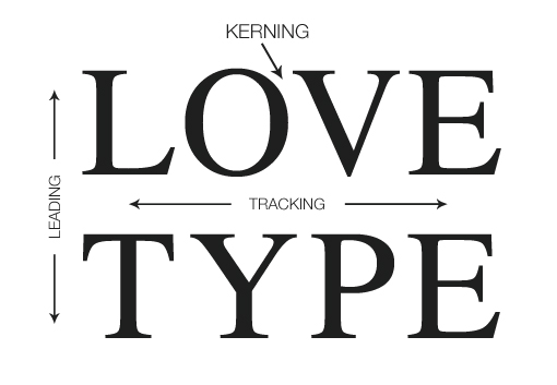
I was playing a kerning game where the goal is to see if you can kern a word by eye and then compare your kerning with that of the designer.
I was doing... ok. Until I got to:

I kerned is as such:

Not perfect, but not horrible.
The 'correct' kerning was:

A comparison; blue being the 'correct' kerning:

I can see that I could have made the 'Xyl' tighter, but why is there so much space in the 'one'? It seems that there's a gap there.
Even when typing "Xylophone" I see the gap from the kerning.
What's the reason for this spacing? Why did the designer choose to create these kerning pairs?


