0

I recently discovered this font in the July/August edition of Little White Lies Magazine.

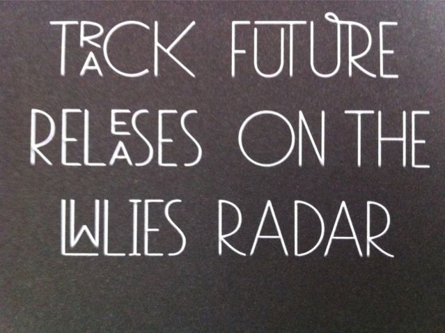
Here's an example of the font:

Sample image

Is anyone familiar with this font? I have used WhatTheFont to try and find it. The closest Mostra Nuova Thin and Nobel Cond Light but there not quite right.

2 Answers 2

4

If that graphic isn't handmade, then it is a typeface that was heavily modified to stylize it the way you see there. I would be surprised if there was a typeface that existed that had those ligatures—the "UR" and "LW" atypical. The ones you have found so far are close enough that modifications shouldn't be too hard in your favorite vector-illustration application.

4

As Philip says, this is likely hand drawn or created in a font editor from scratch or from some existing fonts as a starting point.

There are actually two different fonts here, which makes me suspect this was put together from actual fonts with some hand-customizing (the swash UR and the UT ligature, in particular). The stacked letters are not simply two half-sized letters kerned and baseline-shifted; their structure is different (compare the E, A and R with the larger characters).

There are three slightly-different uppercase R glyphs in your sample, but most of the other glyphs don't vary, so if it's not hand drawn, it's a combination of two actual fonts, at least one of which is OpenType with alternate glyphs, then modified from there. The UT and UR ligatures are done by hand, at the very least.
Your Answer

By clicking “Post Your Answer”, you agree to our terms of service and acknowledge you have read our privacy policy.

Not the answer you're looking for? Browse other questions tagged or ask your own question.