3

I want to make game graphics that are smooth not pixelated, kinda like vector graphics and I will need to use them in iOS games. I am not that experienced in creating graphics so I looked here and no question are the same with mine so I decided to ask here.

What tools or techniques can you suggest for making vector: buttons, backgrounds, moving animations etc. Also, how do you make it retina? I know a little Illustrator but I can learn if there are tutorials. Thanks.

4
  • search here for the tag [retina]
    – horatio
    Commented Apr 16, 2014 at 17:45
  • 1
    Learn Illustrator and SVG more.
    – Scott
    Commented Apr 16, 2014 at 17:56
  • how about for moving animations? its hard to make them
    – hansy2010
    Commented Apr 16, 2014 at 18:16
  • How you make the animation is going to be somewhat dependent on how you're building the app.
    – DA01
    Commented Apr 17, 2014 at 18:16

3 Answers 3

7

I use Illustrator for that. If the platform you are going to use supports SVG, go for it. Otherwise, here are some thoughts about how to create crisp raster UI elements using AI (JPG, PNG, etc). Mind you, I am a pixel picker and a bit obsessive at it.

  • Make sure you create a document that is RGB to start with (as opposed to CMYK) so you can see the colours the same way they will look when you export the web friendly files.

  • Make sure you are familiar with the way "Align to Pixel Grid" works. If this option is active for a shape all its handlers will snap to the pixel grid (i.e. to an exact pixel, not a fractional one). This might create puzzling (or desired) artifacts. If it is inactive, you have the freedom to place the shape at fractional pixels and make its dimensions fractional as well. I prefer this option off by default having the freedom to turn it on when I need it.

    • To activate/deactivate the option when creating a document, make sure it is ticked on/off at the bottom of the Advance section on the New Document window. Please be aware that the default Web profiles, which are recommended for RGB images, have this ticked on by default.

    • To activate it/deactivate it for a specific shape, select the shape, open the Transform window (expand the options if necessary) and tick it off or no at the bottom.

    • To change the default for a document that has been already created, click on the corner of the Transform window to expand the options menu and tick/untick Align new objects to pixel grid. The new default option will apply to future objects. They objects that exist already in the document will keep their settings.

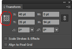
  • Be aware that the coordinates are can be relative to any of the the corners or the centre of the shapes (origin). Use this in your advantage but remember (or double check) what you select if the width or height of your shape is odd. In this case, if you select one of the 4 centres, you can end up placing the shapes at fractional pixels (0.5 translations). To change the origin of the coordinates of a shape, use the left top corner of the Transform window

    enter image description here

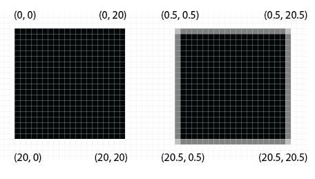
  • Be aware of how fractional pixels will affect your result. Fractional pixels will be anti-aliased (rendered as lighter colours) when saving for the web creating the illusion of being fractional. For example, a black line of 1px width will be rendered as a series of black pixels. But if you make its width 0.5px then it will be rendered as a series of lighter gray pixels creating the ilussion of a thiner line. The same will happen with shapes that are not aligned to an exact pixel. Take a look at these two squares, one aligned to the pixel greed and one moved 0.5 to the left and to the bottom. This image is zoomed in.

    enter image description here

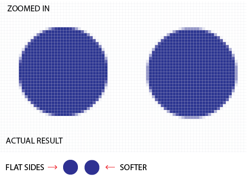
  • Do not be afraid of fractional pixels. Angular shapes, like rectangles, look their sharpest best when aligned to the pixel grid. On the other hand, I find that circles look better when shifted 0.5 both on the X and Y. enter image description here

  • Now that you know the trick use it in your advantage. Making a 1px line a lighter colour will make it look thinner in the final result even if does not use fractional pixels.

  • Activate the Pixel preview (all the time or often) (View->Pixel Preview or Alt+Ctr+Y) so you can see how the graphics will look when you save them avoiding late surprises. Graphics are still vectorial, so you will be able to stretch them and shrink them without loosing resolution, but they look they way they will be rendered to the specific pixel dimensions. This is particularly useful for shapes not aligned to the pixel grid or with fractional pixel dimensions. Take a look at this image, zoomed in.

enter image description here

  • Make sure the artboards are aligned to the pixel grid to avoid extra artifacts during the pixel preview and surprises when saving. Open the Artboard window, double click on the icon at the right of the artboard name and make sure one of the corners and the dimensions of the artboard are exact pixels.

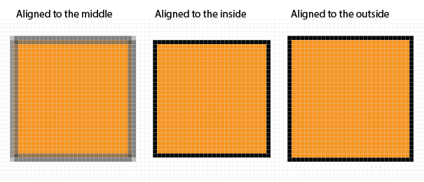
  • Make sure you are familiar with the 3 ways you can align the stroke of a closed shape. It can be aligned either to the outside of the shape, the inside of the shape or the middle of the stroke. By default they are aligned to the middle of the stroke. For example, if you have a square that is aligned to the pixel grid perfectly and add a stroke to it with width = 1px, the stroe will be aligned by default to the middle of the stroke. Since the stroke is only 1px wide, it will end up looking shifted 0.5 pixels both on the X and Y adding a blurred stroke all around the shape when it is finally rendered. This might not be what you want in some cases.

  • Be aware that vertical lines width odd widths (1px for example), to be aligned with the pixel grid (rendered without anti-aliasing) have to be shifted 0.5 either to the left or right. Similar thing happens with horizontal lines: they have to be shifted 0.5 either up or down. To see this in action, select a line and select "Align to pixel grid" in the Transform window. Then take a look at what happens with its coordenates.

    • To change the alignment of the stroke, open the Stroke window, show the options if they are hidden and select your desired option besides "Align Stroke".

enter image description here

  • When saving the final art, be aware of the options "Art Optimized" and "Type Optimized" on the "Save for Web" dialog. They will tweak the final render a bit more giving preference to the option you have selected. In some cases I have had to save two options of the image (one optimized for art and another one optimized for type) and then compose a final one using Photoshop to achieve the optimum image.

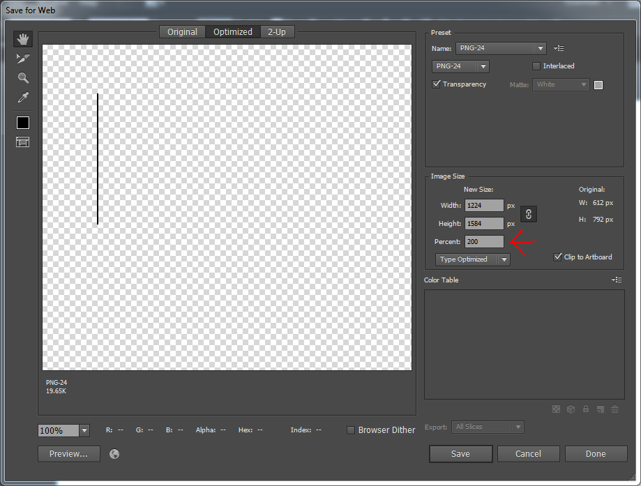
  • I have only with Retina when creating websites, not actual apps. At least for web, since retina has a higher pixel density than most displays, I always make sure I save the images twice the size I will need them. When I specify the size on the webpage though, I specify the actual size, not the doubled one. So, if I need a 30px x 30px icon, I make sure you save it 60px x 60px but when I place it in my webpage I indicate it is 30px x 30px. Neat trick, you can change the dimensions of the final image just before saving it, on the Save for Web window. Since they are vector images, they will adapt perfectly well to the new dimension. You can enter a percentage as well so in my workflow I enter 200% before saving.

enter image description here

5
  • Does that work for iOS games? Thanks.
    – hansy2010
    Commented Apr 16, 2014 at 21:30
  • these are just general guidelines about how to use illustrator to create digital
    – cockypup
    Commented Apr 16, 2014 at 21:46
  • Out of curiosity, why not SVG? The primary advantage of using AI in the first place is that you could retain the vector format as SVG files.
    – DA01
    Commented Apr 17, 2014 at 18:17
  • SVGs are great but they are not 100% supported by all platforms. Not-so-old Internet browsers, for example, don't support SVG. I am not sure if they are supported by the platform that the OP will use to create the game, so I thought I would share my guidelines about how to create crisp raster UI elements with AI. I will add a comment at the beginning of my answer.
    – cockypup
    Commented Apr 17, 2014 at 19:10
  • I hate illustrator with a passion. It's antiquated, legacy ridden, poorly coded, unoptimised, cranky un-design. But this is a GREAT answer!
    – Confused
    Commented Nov 15, 2016 at 6:56
0

If you want static images, then Illustrator or Photoshop will do the job. If you want interactive/animations then Flash or Edge Animate have that ability.

As mentioned in my answer to the other related question you should get an Adobe Creative Cloud subscription so you can experiment with all of the mentioned Adobe software.

0

One of the easier ways to handle multi-density screens (ie, Retina) is to use resolution-agnostic file formats.

For iOS development, SVG ideal. An SVG file is a vector file, so no matter what size you scale it too, or what the pixel density of the screen is, you will always have the 'crispest' image possible.

This also saves you the hassle of having to create multiple sets of images for Retina vs. non Retina screens.

As for animation, you really need to figure out what the needs of the development platform you are using. Some will want you to import individual images as frames for the animation. Sometimes they'll want sprite sheets. Sometimes the app will do the tweening for you. It all depends.

Your Answer

By clicking “Post Your Answer”, you agree to our terms of service and acknowledge you have read our privacy policy.

Not the answer you're looking for? Browse other questions tagged or ask your own question.