5

I am currently producing a new edition of an old book of mine; this new book will incorporate code samples from several different computing environments.

What I want to know is: what is the best way to differentiate the different environments in your document? I can of course say so in the text:

This is how it's done in foogle:
<foogle code example>
and this is how it's done in scronk:
<scronk code example>

The idea is that glancing over the page it should be immediate to see what code sample relates to which language.

Is there a "best practice" for this sort of thing? Most texts concentrate on just one programming language, so this is rarely an issue.

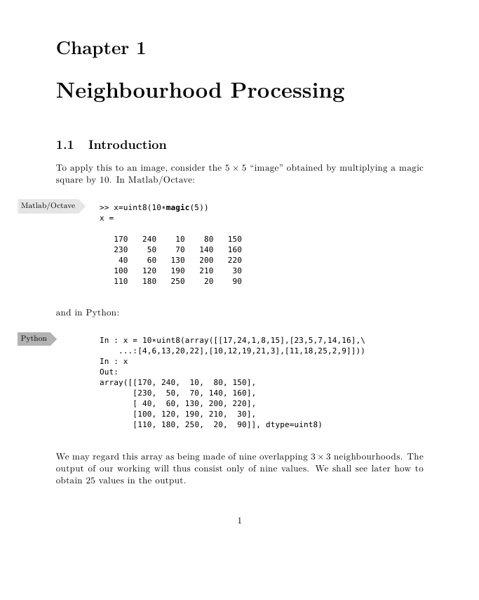
Here is one possible layout, where I've put the two different environments in boxes with labels attached (this for space efficiency). I'm using TeX/LaTeX as my typesetting engine, so I have very fine control over all aspects of layout.

(Note that this is just a cut-and-paste example, hence what appears to be "Chapter 1" beginning in the middle of an example.)

page layout example

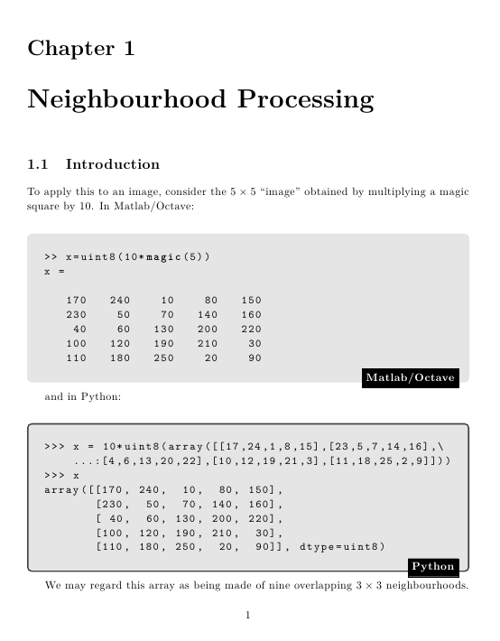
Here's another version of the same thing, trying to take allcaps' comments into account:

enter image description here

7
  • 2
    Interesting question. Could you edit the question to include a little bit more detail for us: Do you only want to show text or the programming environment as well? Do you plan on printing this book, and if so in color? If you have any initial ideas about the book's design and layout a screenshot of that would be helpful too.
    – Ryan
    Commented Apr 29, 2014 at 13:47
  • 2
    Is colour an option? Even if your book is printed in only two ink colours, eg black and blue, you could have foogle code be in a grey frame and scronk in a light blue one.
    – Vincent
    Commented Apr 29, 2014 at 14:49
  • How many would different languages be? Commented Apr 29, 2014 at 14:53
  • I just want to say that I love the terms foogle and scronk.
    – DA01
    Commented Apr 29, 2014 at 15:31
  • One problem is how to deal with in-line examples. @allcaps answer handles the general case well, but for brief snippets, you wind up with a lot of white space which extends the page length.
    – horatio
    Commented Apr 29, 2014 at 16:15

1 Answer 1

6

Headings (proportinal font) and code blocks (background, mono spaced font) are typographical the simplest and cleanest solution. It will work with small snippets and big (page overflowing) examples:

Python

print "Hello world!"

JavaScript

alert('Hello world!');

SQL

SET SERVEROUTPUT ON;
BEGIN
    DBMS_OUTPUT.PUT_LINE('Hello, world!');
END;

Headings can be space consuming. Especially when you have a lot short snippets. Commenting the language name as label is a good alternative:

# Python
print "Hello world!"

// JavaScript
alert('Hello world!');

-- SQL
SET SERVEROUTPUT ON;
BEGIN
    DBMS_OUTPUT.PUT_LINE('Hello, world!');
END;

Separate these snippets with a small white gap. So your reader sees it as three blocks.

UPDATE

An example of inline code:

Now type print 'Hello World!'. Well done!

Again monospace and gray background. A monospaced font for code is an obvious choice. But there are other methods to create 'contrast' between body copy and code. Obvious typographic methods for making distinctions are typeface, size, color, position, shape, etc.

To make a distinction between the two programming languages, you can choose from the same pallet.

FEEDBACK

This is some feedback on your mockup:

  • Make the font-size of the code smaller. At the moment the code looks bigger than the body copy. It should be the other way around.
  • No black frames. Did somebody die? No.
  • Put the language label on top. It's the obvious place. In situations where a code example flows to the next page the label will be invisible.
  • Add a left indent to the code blocks. The code should align with the text or jump inwards. At the moment it's the other way around.
  • If you need a distinction between the languages, make it MUCH more subtle. These graphical elements will repeat a lot.
  • Maybe icons? .m Matlab, .py Python. Explain them in a chapter font conventions. http://books.google.nl/books?id=nEJ-jcYF2fMC&lpg=PP1&hl=nl&pg=PR41#v=onepage&q&f=false
  • I don't think the gray background is absolutely necessary. They downside of frames is that the add a extra margin. From body copy to the frame and from frame to the code.

Example without background and with indentation:
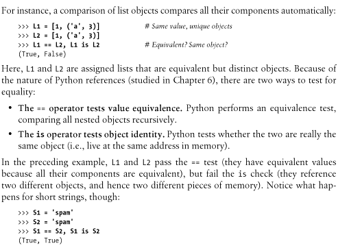
Learning Python

I think a small icon before the code examples (in the margin aka 'off canvas'). Will be nice.

Keep copies of your design cycles to be able to compare and see what works best. I normally make very small steps, saving the whole process.

My feedback are just tips, you have to see for yourself what works best.
3
  • This answer itself is a good example of how to do it with a limited set of tools. I would suggest at least prototyping something with a specific typeface per language in addition to the good examples here, but with more than two languages, it may not be possible and then it just gets confusing if several languages are lumped into a generic "Other" category.
    – horatio
    Commented Apr 29, 2014 at 16:13
  • Thanks, allcaps - you have provided me with excellent feedback and advice. My first book contained gray backgrounds, but in fact I think the simple indentation with a smaller font will be better. Thanks again! Commented Apr 30, 2014 at 12:37
  • Perhaps if you converted >>> to py>/mt>. Might get too busy though.
    – horatio
    Commented Apr 30, 2014 at 15:42

Your Answer

By clicking “Post Your Answer”, you agree to our terms of service and acknowledge you have read our privacy policy.

Not the answer you're looking for? Browse other questions tagged or ask your own question.