72

No matter how nice the composition, flow, and lines of my design are, if I am not copying directly from nature, I have a very difficult time picking a decent color scheme. It either looks too drab, or too garish.

Is there a good resource that will help me to choose a color scheme that has 2 or 3 colors, and the colors do not clash?

I'm not looking for specific colors or color schemes. What I need is a resource that will help me choose a color (or colors) that go nicely with, or provide a good accent to, whatever main color I am working with on the design.

1
  • 2
    Have you tried Agave, available in the Debian/Ubuntu repositories? I use it for this all the time.
    – ixtmixilix
    Commented Jan 18, 2011 at 1:06

15 Answers 15

54

One useful tool is Paletton (previously known as Color Scheme Designer):

You specify a starting color and a type of color scheme and it will generate a palette for you and allow you to modify that palette.

The nice thing about this tool is that you can see how it chooses the other colors based on the color you select. There is also a tool to simulate how those colors would look with different kinds of color blindness.

1
26

There are a lot of color pickers/generators out there. Most I list here allow you to enter in your own color like you specified:

There are also some sites that give you pre-made palettes, including those of popular brands

There are also some sites that offer gradient combinations which you can get the color codes from:

Or you could let AI choose some colors for you using AI Color Wheel.


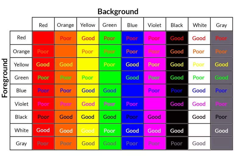
I also like to look at the chart below (pulled from here when considering which colors to mix (usually on top of the gradients above) for best contrast:

colors contrasted with each other chart


P.S. Similar but different, some tools to interpolate between two colors:

24

You need to read about a good book of color theory to understand at least the general principle, for example on what is Primary and Secondary color, Complementary colors etc... otherwise you will not get the importance of some palette choices that you will make.

On the web my favourite at the moment one is: Kuler of Adobe , as well I used to use http://colorschemedesigner.com/ already mentioned.

I suggest to have a quick read about SIMULTANEOUS AND SUCCESSIVE CONTRAST where the association of color make feel that a color on a different background look different.

Even if you didn't ask me I suggest to have at hand for checking that colors of website have a good contrast for readability I use this: http://graybit.com/main.php

2
  • 1
    for more information on colour theory check this previous stackexchange question: graphicdesign.stackexchange.com/questions/2/…
    – Hemi
    Commented Jan 17, 2011 at 10:35
  • Adobe Kuler (color.adobe.com/create/color-wheel) is also my favorite for the moment mainly because the interface is nice to use. I don’t usually judge tools based on looks, but when it has all the features that the others do and integrates with Adobe products (my design software of choice), you may as well go with the pretty one.
    – user72517
    Commented Jul 4, 2017 at 9:54
8

Photoshop CS5 has an extension called Kuler that does this.

You can reach it through the menu; Window/Extensions/Kuler or through the website, http://kuler.adobe.com/

alt text

7

First and foremost: familiarise yourself with the HSB colour model. HSB defines a colour by:

  • Hue: kind of colour, as in: pick one from a rainbow—in degrees;
  • Saturation: inverse of the amount of added white—in percent;
  • Brightness: inverse of the amount of added black—in percent.

A good rule of thumb would be to sample the existing brand colours and determine their Hue value. At first, stick to those H values and start varying the S and B values. This creates colours that harmonise well with the existing colours almost by definition.

If you really, really need a contrasting colour and the only way is to use a different H value, try and determine first how the existing colours' H values are related. You can then build upon that relation to create new hues.

Are the two colours 180° apart? Then you might want to add 90° to either of them to create a third hue to work with. Are they 40° apart? Add 40° to one of the colour values or subtract 40° from the other to get an analogue colour setting. Or, take the average of the two H values and then invert the result (add or subtract 180°, whichever gives you a positive number less than 360) to create a split complementary colour setting.

Then start fiddling with the new hue's S and B values.

Don't forget to take a step back, and adjust the H value you calculated when the result isn't up to your expectations. Exactly calculated H values are great, but they're only a tool—don't hesitate to edit things a litte to make it look better aesthetically.

6

I've found colourlovers.com a very useful resource for constructing color schemes. But if you want to have a better idea of using contrast and harmony as a tool to improve your design you should read color theory. I personally liked Wucious Wung's Principles of Color Design and Josef Albers' Interaction of Color

1
  • Interaction of Color is a fantastic primer! I try to read through it every now and then to brush up on my color theory. Commented Jul 2, 2012 at 22:34
5

You can always go to your local Home Depot or Lowe's, head for the paint department, and pick up some of their sample room flyers. :)

Or more seriously, here's a description of how color schemes work.

4

Usually, I use the color picker to pick colors directly from pictures i'm working with. That way, I'm sure the colors are gonna match. It's easy and fast when you dont have much time to put on your project.

2

Check out this can help out you more.

http://galacticmilk.com/sphere/

1
  • Suppose the given link is broken your answer is useless. Please add what the link shows in own words, too.
    – Mensch
    Commented Nov 21, 2015 at 16:58
2

One amazing tool for creating color palettes, that I believe to be a hidden gem is Adobe Capture CC. I discovered it while watching an Adobe Live stream event.

It is a free app, available for both ios and android that automatically generates the color palette of a photo you take with your camera.

If you go on a walk in the park, visit a museum or just stumble upon a chromatically impressive sight, you can get that color palette within minutes.

The app also gives you the ability to turn a paper sketch directly into a vector. You draw it on paper, you photograph it and voila. No more importing pictures and tracing with the pen tool.

I encourage everybody to check it out!

2

Part 3 of a three-part series on colour theory applies directly to this question:

Creating Your Own Color Palettes

Great explanation on choosing your own colour scheme based on the colour wheel, taken from this stackexchange question.

1

Some resource that I have found useful listed below when picking colors.

  • AI with Colormind: Tool using AI and large sample of "good" designs/artwork/prints to generate color combinations. Also possible to supply your own colors and generating complementing colors. http://colormind.io/

  • Structured rules: Many other good answers on HSB and other approaches/theories. This page takes a stab at it with clear rules on how to do it and with ok results. https://tallys.github.io/color-theory/

1

I would definitely suggest ColorPK

It loads more fast and clean to me,

and It also could extract color from image enter image description here

0

I'd suggest checking http://colorsupplyyy.com It is a good tool for color generating and uses color palettes from the best designers around the world!

1
  • Hello Mason, thanks for your input and welcome to GD.SE. I'm sorry to tell you that your answer attracted some flags for spam. We have been under a veritable flood of spam and the community is carcking down hard on anything that remotely looks like it. If you could explain a bit more why you like this tool and make very clear that you are not affiliated with it, your post would improve a lot. Thanks for the effort! If you have an y questions about the site, have a look at the help center. Keep contributing and enjoy the site!
    – Vincent
    Commented Jan 17, 2017 at 9:18
0

Coolors is my go to color palette generator.

Coolors

Not the answer you're looking for? Browse other questions tagged or ask your own question.