17

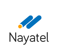
Nayatel's logo Concept

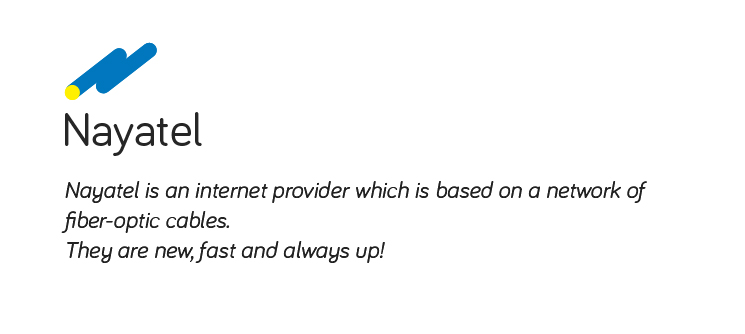
Nayatel description

Above is the concept behind the logo. And below is the description of what company does.

Plus in the description I am keeping the icon left align to enforce movement towards the right a bit more.

How can I improve it or is it OK to go with? This is a large scale company, so do point out anything that can create a problem in future.

9
  • 4
    Not that I'm anywhere near a colour expert, but on my screen, the yellow and blue you've chosen look very similar to the commonly accepted primary shades of blue and yellow. As such, it gives a fun and playful feel, but does not look serious or particularly professional.
    – Dom
    Commented Jul 14, 2014 at 12:17
  • 2
    I've only just realised that the symbol creates an italic N, even after I read the formula before. The clue there is that it's not obvious enough.
    – Dom
    Commented Jul 14, 2014 at 16:41
  • 2
    I'd think you can stick with having the cables be an N but perhaps it should just be more obvious. What about taking an actual N and just manipulating the ends and thickness of it to make it look more like cable?
    – Hanna
    Commented Jul 14, 2014 at 22:36
  • 2
    @Matt You are incorrect. The subject of both clauses is the same (Nayatel is an internet provider, Nayatel is based on a network) and therefore does correctly take which is. "Based on a network of fiber-optic cables" is a dependent clause, so that also requires the use of "which." However, you are correct to say you can drop "which is" altogether, and it's implied. Commented Jul 14, 2014 at 23:53
  • 3
    For future topics like this, you may want to avoid using the actual client's name; they may not like to see their designer getting tips from Stackexchange. You could get just as good a critique if you change the company name (and obviously name in the logo) to something like Acme Co. Commented Jul 15, 2014 at 14:45

6 Answers 6

40

Well, I would hate to go against the crowd here, but I totally disagree that you need to rethink your design. In fact, I think the reasoning behind your idea is very solid. The idea of using the fiber optics as a symbol for connectivity is clever without being contrived and most importantly, it gives you a gut feeling of "this is a technology company" while remaining clean and minimalistic.

However, while your thought process was good, the execution is lacking. All it needs is some attention to detail.

logo construction

The most important change is the spacing. That little bit of whitespace better defines the shapes and lets you see the circle at the bottom left even if it were the same color. Also, the length of the cables is based on the size of the circle, which makes them feel more balanced. I made the secondary color orange because it is hard to see yellow on a white background.

enter image description here

It's still a bit boring, but even changes of a few pixels can make a huge difference. You did a great job of having a good reason for each part of your design, you just need to do the same for each shape in the logo.

Sorry if that was a bit too in-depth, but I hope this was a better critique than "you need to start over". Let the man have some creativity!

9
  • 1
    By the way, I like your choice of font. What is it?
    – nonphoto
    Commented Jul 15, 2014 at 4:17
  • 4
    Ace answer. Welcome to GDSE!
    – Vincent
    Commented Jul 15, 2014 at 9:06
  • 3
    +1 Your edit of the logo although subtle makes it look a lot more professional. It's amazing how a little space and balance can affect the whole feel of a logo.
    – SaturnsEye
    Commented Jul 15, 2014 at 9:33
  • 1
    @SimaarCharms, no problem! I could tell you had put in more effort than you were getting credit for. Feel free to use any of my changes as long as you don't use these particular images, and I would definitely like to see the final product. Thanks for the kind words, all!
    – nonphoto
    Commented Jul 16, 2014 at 0:07
  • 2
    @MrE.Upvoter There's no need for anyone to "know" what ideas went into designing the logo. What's important is that everything works toward an end goal, and that will be sufficient to create a design that works. Not every logo needs an obvious gimmick for you to understand it's meaning.
    – nonphoto
    Commented Jul 16, 2014 at 14:48
9

Personally, I'd shy away from the pure yellow, pure(ish) blue colour combination. Nothing screams 'cheap' and 'pedestrian' to me like the use of two or three pure and saturated primary colours. Try and come up with examples of logos that do, and ask yourself whether you want to be in that kind of company.

4
  • Given the things i have to represent and give a clue towards, i am having very few choices. I chose the blue accent because the over all company structure,values demands it plus i seem to think that this shade of blue is a bit in the middle of playfulness and seriousness. You,however, got me into thinking if there is any other shade of yellow that contrasts this blue like the pure yellow does.
    – Simaar
    Commented Jul 14, 2014 at 12:49
  • 10
    IKEA comes to my mind from the colors.
    – joojaa
    Commented Jul 14, 2014 at 13:33
  • 1
    I disagree on the 'few choices' part. Reliability and technology do not necessarily have to be blue. Be original, Try and find your colours elsewhere.
    – Vincent
    Commented Jul 14, 2014 at 18:13
  • IKEA has those colors because it's the colors of the Swedish flag, I'd consider them an exception to the rule.
    – erb
    Commented Jul 16, 2014 at 8:25
5

Personally, I think you are way off track.

There is nothing that tells me that the blue and yellow thingy is either fiber cable or "N", without your little explanatory rebus at the top. To me it is a company name with some blue thingy floating absentmindedly above. If you need to explain an image to a bunch of designers by making another much more complicated image, you might want to rethink.

Trying to make an N of two bits of "cable" is constructed, contrived and misleading. Some people, maybe in the fiber-cable business might get it, most will not. An for those who only wants better internet: do not care.

Who is it for? Is if for cable-geeks; nerds that spend their lives discussing fiber optics? doubt it. For most people, fiber optics is pretty abstract, and I am not sure if putting a "cable" in the logo is meaningful or helpful. You want a logo that makes your company look serious, solid and trustworthy (fun, games and silly-creatures-logos are for software-geeks only).

Drop the cabel-y bit, drop the yellow (if you can), keep the blue (if you must) and go for a pure text-based logo. Experiment with some other fonts. Find one that is solid, clear. Then you can consider tweaking a tiny bit.

Consider what kind of company this is for: you do not need a logo with an "app-recognition". This will not be a programme on your computer or phone. You want people to recognise it on packaging, ads etc.

3

I think it needs alot more work. To me it just looks like two tubes with little to no significance. You may be better off making a logo out of the company name and then adding embellishments. Sometimes simple is better.

2

I like it. It has a minimalistic, flat feel that is the trend for web design right now. For some reason the yellow opening looks a little misaligned to me, and perhaps you could add another yellow opening to the other line as well. Also, have you thought about beefing up the lines a little bit?

2
  • 2
    I completely agree with this answer, I actually really like the logo (especially because it does look like an N), and I have the same issue with the yellow opening. It looks like it's on top of the cable, instead of 'inside'. I'd perhaps try to add a stroke to it, in blue.
    – Yisela
    Commented Jul 15, 2014 at 1:52
  • 1
    I think the misaligned yellow opening could be improved by giving the blue outer of the cable a definite thickness, say 5-10% of the diameter
    – rossmcm
    Commented Jul 15, 2014 at 5:20
2

I would either be going very literal, or very abstract, but not a mish mash in between the two like you currently have.

Two more well associated concepts for fibre optics, one literal, one abstract:

  1. Create an image of the wiring itself, with the company name on it.

  2. Use the infinite sign, like a well known fibre optic ISP here in the UK. The infinite sign is extremely relevant to fibre optics, and if I were you, I'd be relishing the opportunity to make a concept with it.

Your current concept has quite weak foundations, and it isn't entirely clear what it's getting at. Even if you don't like either of these ideas, they may help to spark a concept with a deeper meaning.

4
  • 1
    Thankyou for the precious suggestions, I will try to think upon it again.
    – Simaar
    Commented Jul 14, 2014 at 13:25
  • 3
    It might just be my dirty mind, but your first example makes me think of this imgur.com/a/lphHd Commented Jul 14, 2014 at 17:10
  • That's weird, link works fine for me... try http://i.imgur.com/FBOGrps.jpg ... it's not a particularly serious point, just a suggestion of a possible case of "phallic logo syndrome" :) Commented Jul 14, 2014 at 17:42
  • 2
    Sorry to pile on, Mr E, but your first logo is a condom and your second one is a pair of boobs. I will freely admit to having a filthy mind. :) Commented Jul 14, 2014 at 23:55

Your Answer

By clicking “Post Your Answer”, you agree to our terms of service and acknowledge you have read our privacy policy.

Not the answer you're looking for? Browse other questions tagged or ask your own question.