1

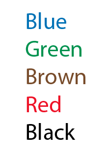
I have a document that uses 5 different colors for text, on a white background.

  • blue
  • green
  • brown
  • red
  • black (or any shade of gray)

I need to adjust the colors so the text has the best visibility against the white background and each color is easily distinguishable from the others.

I found some problems:

  • If the colors are too light, they become difficult to see against the white background. If too dark, blue becomes too difficult to distinguish from black.
  • Red and brown are similar, so difficult to distinguish.

Is there some way to use the color wheel to identify the best balance of these two properties within these five colors?

5
  • What is the purpose of the different colored text? What is it communicating?
    – DA01
    Commented Sep 6, 2014 at 22:43
  • The four colors plus black represent the 4 tones in Mandarin Chinese, plus the neutral tone, which could use a color, but does not need one. Each color is assigned carefully to a different tone. blue = flat, high tone, like the sky; green = rising, as a tree grows; brown = falling, then rising, like the shape of hills; and red = falling, because the tone has an energetic sound to it.
    – Village
    Commented Sep 6, 2014 at 23:39
  • I found these suggested colors at sinosplice.com/life/archives/2009/08/11/… and found these colors make it easy for readers to remember which color means which tone, could not find a readable palette. That is why any shade of those colors will be fine.
    – Village
    Commented Sep 6, 2014 at 23:39
  • So it's a form of pronunciation guide? Will individual words consist of multiple colors? I'm just wondering if there's another way to communicate this info without sacrificing legibility of the text. Maybe via colored 'highlighter' type backgrounds? Or underlines? Also, do note potential issues for those that are colorblind.
    – DA01
    Commented Sep 7, 2014 at 0:26
  • Yes, the letters help people to know how to pronounce the word, but the color tells them which tone to use. There is a fall back is the marks above the letters. The colors are used as additional reinforcement. The goal is to help readers to remember the correct tones more easily, as some people find it difficult to remember the marks above the letters.
    – Village
    Commented Sep 7, 2014 at 0:32

3 Answers 3

6

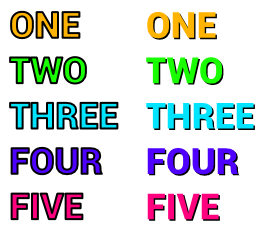
I wouldn't say there is a full-proof method for this. I think you may just need to adjust the Saturation and Brightness of each color so that colors that are close, like black and brown, don't appear the same. See my example below for your 5 colors.

Text colors

4

At least for a first approximation, go for hues at 0°, 72°, 144°, 216° and 288° (hint: 72° = 360°/5), like this:

Tweak the colors to satisfaction. For example, if red and violet feel too strong for you, you could try shifting all hues by a few degrees (this seems pretty okay) or otherwise playing with luminosity and (to a lesser extent) saturation.

As Eddie A. helpfully points out, you might need a border or some shadow and a large font for this to work with text. If you are working with small type, his answer is plainly better.

4
  • 1
    If you're looking for inspiration, just look at transit maps :)
    – badp
    Commented Sep 6, 2014 at 17:02
  • 1
    Some of these straight RGB values may not be ideal for text legibility on a white background. Commented Sep 6, 2014 at 18:13
  • If the typeface is sufficiently large I believe you can get away with anything so long as you have a black border on it.
    – badp
    Commented Sep 6, 2014 at 18:21
  • 1
    The black border causes legibility issues too.
    – DA01
    Commented Sep 6, 2014 at 22:42
3

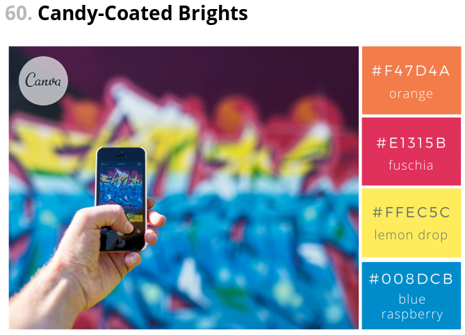
If the colors are in a context, i.e. they should somehow harmonize, I would search the internet for "set of colors". This led me to this site: this site. They provide color combinations (including values for RGB) based on photographs like this enter image description here

or this enter image description here

3
  • 1
    A "set of colors" is commonly called a palette and there are a plethora of sites that help people find them, as this answer shows in part Commented Jan 25, 2017 at 12:52
  • I especially liked the idea of picking the main colors from a beautiful picture, capturing the mood.
    – Metalbeard
    Commented Jan 25, 2017 at 13:17
  • 1
    There are a couple tools linked in the answer I linked above that do that to any image you upload :) Commented Jan 25, 2017 at 13:55

Your Answer

By clicking “Post Your Answer”, you agree to our terms of service and acknowledge you have read our privacy policy.

Not the answer you're looking for? Browse other questions tagged or ask your own question.