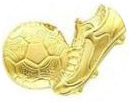
I'm trying to reproduce this customer's logo which they made years ago. I supposed to reproduce it in Photoshop but I can't get the effect right. Any help/advice would be greatly appreciated.

I'm trying to reproduce this customer's logo which they made years ago. I supposed to reproduce it in Photoshop but I can't get the effect right. Any help/advice would be greatly appreciated.

You've prompted quite a discussion! An answer would be a lot easier if you put up the original photo, but let's take things at face value.
The client says they "pushed a few buttons." That immediately suggests that they went to the Styles panel and picked something from there (since a style is simply a collection of layers effects you can apply with a single click), or applied a single layer style such as "gradient overlay" with its blend mode changed.
From the appearance of the finished image, this looks like brass, from the metal gradients, applied in Overlay or Color Burn mode, or with slightly reduced Opacity, using the "Reflected" gradient setting. Those are the exact colors of the default brass gradient. From there, either the angle of the gradient was changed slightly, or the image has been rotated. Fairly primitive. (On close inspection, it actually looks like two images with the same effect applied at different angles.)
A while back, I had a very similar request from a client. They have their logo foil stamped on their stationery, and wanted something on their website that would better imitate the embossed gold metallic look than what was there already, plus a drop shadow (everybody needs drop shadows, don't y'know). I had the original vector art from the amazing Mike Manoogian, who designed so many iconic band, magazine and company logos "back in the day," as he puts it, so I did at least have something clean to work with.
We went from this:

to this:

There are two layers involved, one for the logo itself and a plain circle shape layer for the center, both with the same color (#e2ce5e) overlay applied in Color mode over different black-and-white gradients -- simple for the center circle, complex for the rest -- then appropriate Bevel and Emboss above that on each layer. Stacking color on top of a gradient tends to produce a much more metallic-looking effect than the "metallic" gradients that ship with Photoshop. Adding a Curves layer above that can dramatically increase apparent gloss, too, although that wasn't the effect we were looking for in this particular case.
I think this tutorial will be usefull as well: http://psd.tutsplus.com/tutorials/text-effects-tutorials/gold-text-effect-photoshop/