There's two questions here.
Let's start with the first:
Why do people use the golden ratio?
Because they are lazy, or just blindly following advice without putting a lot of thought behind it. The reality is that the Golden Ratio is mostly BS. Well, BS may be a bit harsh, maybe a better term is that it's mostly arbitrary. Connections to Roman architecture, renaissance masters, and even nature are extremely weak and often amount to just approximations. ie, something is found to be in the ballpark of the Golden Ratio so a myth forms that it truly is based on the Golden Ratio.
Alas, there is little evidence that there is anything unique about this ratio in terms of aesthetic appeal other than "hey, it's a nice rectangle":
https://cogsci.stackexchange.com/questions/1627/is-golden-ratios-association-with-perceived-beauty-a-myth
Granted, there's nothing wrong with using it as a basis for a layout or mark, but there's nothing particular special about it, either. You could go with any ratio and consider it just as solid if you so desire.
FYI, there are lots of questions about the Golden Ratio on this Graphic Design SE site as well as several of the other SE sites.
Keith Devlin from Stanford has an interesting video on this topic: http://vimeo.com/88132964
The other question:
Why do people use circles to create logos
The literal answer to that question is that people use circles because it's a valid tool. Just as lines, rectangles, stars, color, patterns, textures, etc. are.
As for the specific case of the Twitter logo you reference, it just happens that that particular logo was designed with arcs. Purely a decision by the designer.
(Side note, it should be pointed out that the original Twitter bird was actually a piece of stock art. It was never actually designed as a logo).
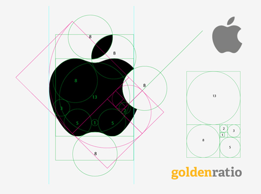
The 'smoking gun' image from the linked article, IMHO, is this one that ties the above two things together nicely:

This, to put it nicely, is complete bullshit. It's a contrived graphic and has no real basis on the realities of the actual logo.
For starters, the original Apple logo was drawn freehand. No actual circle templates were used. The other circles within the Apple are merely arbitrarily put there after the fact. The curves of the apple are not true arcs, but more organic and variable...something in the olden days you'd use a French Curve for. The logo was later tweaked and cleaned up a bit, so the bite and leaf? Sure, I'll give them that one. In the end, though, the only ratio in this logo is the ratio of 'size of typical human mouth to typical apple' ratio.
As for the Golden Ratio, there's absolutely nothing about the Apple logo that fits the golden ratio. As you can hopefully see, they simply plopped the golden rectangle on top without any rhyme or reason. They tried to be clever by picking particular circles and re-assembling them into a rectangle but a) several of those are purely arbitrary and b) If you have to re-arrange it all, then it's not adhering to the Golden Ratio anyways.
This is akin to the films National Treasure or The Da Vinci Code. Fun historical mysteries--but entirely fiction.
In summary
The golden ratio is fine, but nothing special. Use it if whatever you're drawing benefits from it. Ignore it otherwise.
Circles are fine. If your logo will have lots of arcs, you'll want to build it out of circle segments.
(Update, it appears FastCompany agrees. To quote: It's bullshit. The golden ratio's aesthetic bona fides are an urban legend, a myth, a design unicorn.)

