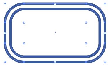
I'm new to Illustrator but have a decent background in Photoshop and After Effects. Anyway, I've spent a good amount of time creating this logo in Illustrator and am unhappy with the results. It's likely that I've used the tools incorrectly.
Here are my list of questions:
The rounded corners don't seem to connect to the straight lines in a smooth fashion. How would I clean that up? Is this caused by the fact that I used a path/stroke? Should I have taken a different approach?
I cut angled corners off the "B" on a rasterized layer in Photoshop. How would I make sharp angled ends on a path in Illustrator?
Is there a way to approach creating a design like this that will auto-magically make the outer wider rounded corners have a wider radius? Or is this something I'd have to do manually? I really dislike how dirty it is a the moment.
Here's the image as reference:

Thanks for reading, I look forward to your answers.

