2

I have hired a design company to help with our logo colors. I picked the Pantones we wanted (3165c and 7408c). When I did a search on Pantones website it gave values for Hex, RBG, and CMYK conversions. Sure enough they match when I use them. This new company gave me a brand identity guideline and their numbers for those values are different.

He keeps telling me his are right and mine are wrong. What am I not understanding? Specifically, for Pantone 3165c it gave me:

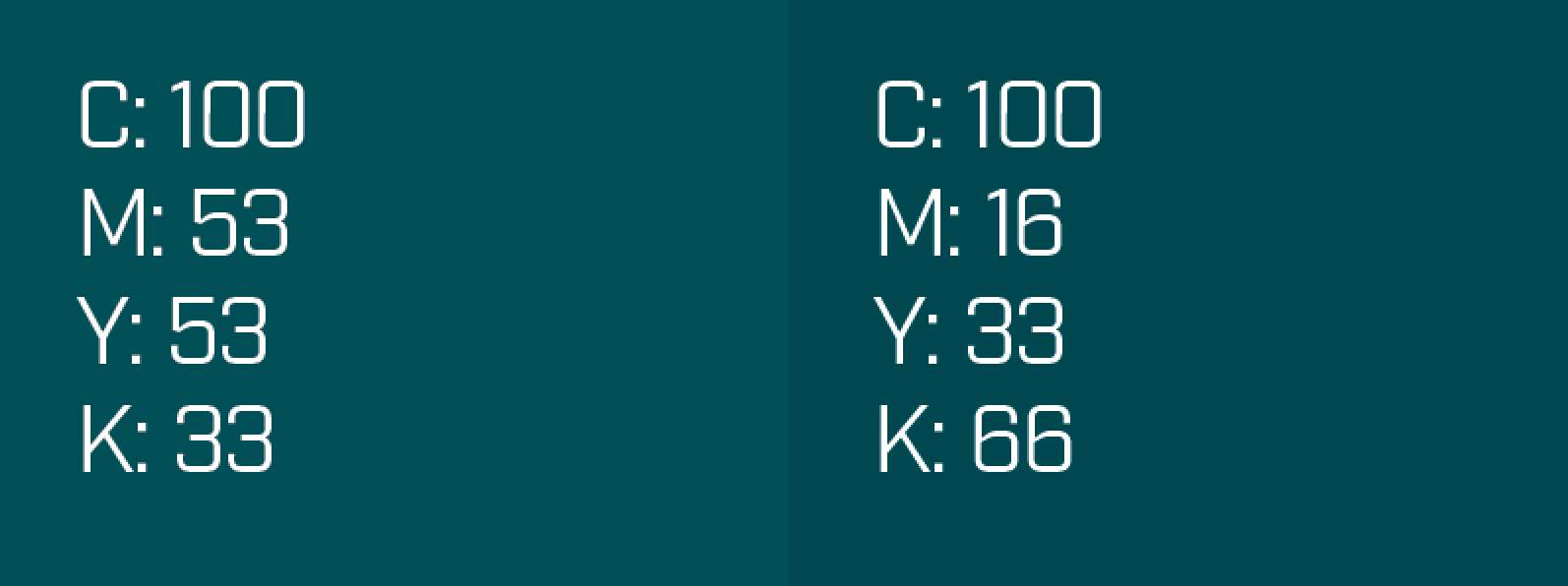
RGB: 0-79-89, HEX: 004f59, and CMYK: 100-16-33-66.

Their brand guidelines give

RGB: 0-79-88, HEX: 004f58, and CMYK: 100-53-53-33.

His last email said that photoshop converts the Pantone to the values he gave me and those are accurate. I don't understand why he is going with those values and not the ones I have. What am I missing or not understanding?

5
  • It does not really work this way. So it does not really matter anyway. read graphicdesign.stackexchange.com/questions/68881/…
    – joojaa
    Commented Apr 21, 2016 at 23:49
  • 1
    Neither value is 'correct' but different approximations. It doesn't really matter which you use, but pick one and be consistent.
    – Cai
    Commented Apr 22, 2016 at 6:05
  • question has been asked before graphicdesign.stackexchange.com/questions/16795/…
    – Luciano
    Commented Apr 22, 2016 at 10:01
  • @Luciano that question is about converting between RGB and CMYK not Pantone to RGB & CMYK. The answer is very relevant but the question is different.
    – Cai
    Commented Apr 22, 2016 at 10:56
  • That's true, I think I paid more attention to the answer itself...
    – Luciano
    Commented Apr 22, 2016 at 11:07

2 Answers 2

6

A few points to make:

  • Any values you have are an approximation, there are RGB colors that cannot be represented in CMYK, likewise there are PANTONE colors that cannot be reproduced exactly in RGB or CMYK. Colors will always look different across different devices, different screens, different printed materials etc. There is no way around that.

  • The way PANTONE derives its RGB and CMYK values is different from the way Photoshop will, depending on how the color is actually brought in to Photoshop. PANTONE's values have and are likely to change anyway. PANTONE obviously think their values are the correct values (and I'm sure they spend a lot more time, effort and money coming up with their values), but who's to say you have to agree with them?

  • It's not uncommon to specify a PANTONE color and have your own approximations in CMYK and RGB. If the designer has made a conscious decision to specify different RGB and CMYK values, that is up to the designer. It may even be that the PANTONE color is derived from the RGB color, not the other way round.

  • The only important thing is, are you happy with how the colors look? Forget about the values. If the difference in values is just a result of a different conversion process than PANTONE does, but you are happy with the color—don't worry about it. As long as you are consistent with the values you use, it doesn't matter if those values came from pantone or not.


In your specific case, the RGB/HEX values are so close theres no point in worrying about that. The CMYK values are noticeably different. The values you have from PANTONE are noticeably darker. Compare them side by side (It's worth noting, this is an RGB simulation of the CMYK values, which may very well look different when printed):

cmyk values comparison

If you want to argue this with your designer, show them the 'official' PANTONE values (send them a link or picture of a color book) and show them both colors side by side, they will see the difference.

If you're happy with the color as it is though, don't worry about the values.

6
  • Great answer. I find greens are especially unpredictable when it comes to PMS > RGB/hex conversion. Not sure why.
    – Alex
    Commented Apr 22, 2016 at 12:10
  • Just to tack onto this, Pantones also have a couple different libraries where based on what it is printed on, can make it appear darker or lighter respectively. And depending what type of printer printed it could also alter it's appearance slightly. Commented Apr 22, 2016 at 13:16
  • It is crucial to point-out, because it is tied intimately to the context of this particular Q&A, that the side-by-side comparison above is an RGB simulation of the CMYK. The best way to really do a comparison for CMYK is to have a CMYK proof pulled (by a well-calibrated professional print provider) of the two swatches.
    – Yorik
    Commented Apr 22, 2016 at 15:35
  • However, if the logo assets are all using one color, you simply must ues the same breakdown if you want them to match seamlessly. I do expect though, in most cases, the logo color will not be placed on a field of the same color. One work-around is to use a one-color TIFF or eps etc and apply the the color swatch in the layout software.
    – Yorik
    Commented Apr 22, 2016 at 15:36
  • 2
    @Alex it's because out eyes are most sensitive to green, because it's a pure color in RGB and in CMYK it's blended from the two lightest inks which means you need to use a lot of ink per shade difference, which means you have little range. Commented Apr 22, 2016 at 15:58
0

I need to make a more comprehensive answer, but the short one is:

Depends on the color profile.

The same Pantone will have different CMYK values depending on the color profile used for converting them.

And also depends on what version of the color profile conversion matrix is used. That sucks actually, but it is how it is.

This changes sometimes are justified, let's say the development of a new ink formula that needed to change because you do not want it to be toxic for example, ok you changed the formula and how this renders the color. Or the specification itself changed a bit because more acurate measurements were taken.

But sometimes these libraries changes with no apparent reason (none that I know)

So, Define your profiles and let the profiles make the adjustment for you. That is more accurate than relying on external sources... Including Pantone Website Itself.

If you have a Pantone product you can download the latest versions, but in my poor inexpert opinion, this just adds one more variable to the chaos. Use the library your current Adobe or Corel application has.

Your Answer

By clicking “Post Your Answer”, you agree to our terms of service and acknowledge you have read our privacy policy.

Not the answer you're looking for? Browse other questions tagged or ask your own question.