2

I am assembling a reference book which has short entries arranged alphabetically. It also has a deep section hierarchy, e.g.:

A
    Am
        Amtrak
    An
        animals
            bears
            penguins
        Anime
        Animation

The book is quite large and readers might often need to flip between pages. I find it too difficult to navigate. Many books of this type have letters cut into the edge of the pages, so if one looks near the margins, they can quickly see which page they are at and how to easily get to other pages, but cutting the pages in this manner is not an option at my printer.

I would like to enable readers to be able to easily see which page they are currently on, where the current page fits within the chapter-section hierarchy, and how they can easily jump to their next desired page. What is a good way to do this?

2
  • I think you will get more help in ux.stackexchange.com
    – Yisela
    Commented Apr 27, 2012 at 0:59
  • 1
    @yisela I doubt it: the UX guys are almost all web/app people. You're more likely to find experienced book/print designers here. Commented Apr 27, 2012 at 8:47

3 Answers 3

3

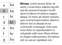
An alternative to cutouts (usually called thumb indexes) is to have outside margins printed with your desired navigational aids. Consider the following two images, taken from subsequent chapters in a book:

enter image description here enter image description here

Update

In reference to another answer posted to this question, if a multi-level solution is required, something like this should suffice:

enter image description here

A and its sub-indexes would start at the top of the page, B and its sub-indexes would start in the middle, and C and its sub-indexes could occupy the bottom third; D would start at the top, and the cycle would continue. When the book's pages are somewhat "fanned", you can easily see where to jump to.

2
  • I like the 'update' idea which I think is well suited to a big, beefy book where you'd want to be able to scan from closed. If there's enough contrast between the dark primary and light secondary level (or if one is black boxed and the other black underlined), it would work without cut thumb indexes by fanning (good terminology!) as you say. Commented Apr 27, 2012 at 13:08
  • The movement ("animation") of the index block is a great way to convey information without the need to actually read it. Whenever possible whilst doing organizational sheets for personal use, I try and make the large-grain information understandable at distances where I cannot even read the content.
    – horatio
    Commented Apr 27, 2012 at 18:01
3

This is a bit like an issue I'm having with a report design I'm working on. The option I'm looking into is to have the page navigation element on the margin of every page with the current section highlighted. In your case it might look a bit like this.

enter image description here

Report design is a small part of what I do so I'm not aware of technical names, theory or practice around techniques like this - hopefully someone more print/book focussed can add to this answer.

Also my implementation of it is pretty crude - the main list in a master page (if I needed a second layer I'd have a bunch of different page types, one for each letter) and then there's are highlight objects with a blend mode (in this case multiply) on each page as appropriate. You'll need larger or multiple highlight objects where there are multiple on a page. There may be a better way I'm not aware of - but it seems to work in my case and might work for yours.

Depending on the printing, you might be able to get the highlighting colour to show through on the edges of the pages, which would help someone see where in the book they should start digging.

3
  • Good suggestion, but do you think the second column is necessary or do you think a dictionary-style header with the first and last entry on the page would be more appropriate? Commented Apr 27, 2012 at 9:08
  • Depends on the book. If there's so much content within one letter that people might get lost within one letter, then it will help. If there is a manageable amount of content within each letter, then it's redundant. Likewise, if it was a really big book and sections like "animal" could span multiple pages, you might consider adding a third column... and if it was a crazy truly enourmass book, like a multi-volume book, you might even need a fourth... It all depends on the nature of the problem and the nature of the book. For something quite slim, I'm sure one is probably enough. Commented Apr 27, 2012 at 9:16
  • While I can understand your argument for up to a second column, I disagree that it would be useful to have third and fourth columns, even in "crazy truly enormous" multi-volume books. In those situations, the spine of the book would be used to indicate the top level (eg b, c, d, and so on) and the thumb cuts would be used for your ba, be, bi subdivisions. Commented Apr 27, 2012 at 10:24
1

In the directories I work on a few have the side tabs for the section heading and then the subheading is at the top corner. In other directories we only do the headings in the top corners. Really we have extensive TOC with every category listed - 9 pages or so for one of the publications we do that has lots of categories. Many of those are listed but refer to something else like "Waste Disposal - See Environmental Services" and in the directory we have the category showing again but saying "See Environmental Services" underneath it.

I know this isn't exactly a solution like the others have been providing but this is how we do it so thought I'd offer it up as another option for you.

Your Answer

By clicking “Post Your Answer”, you agree to our terms of service and acknowledge you have read our privacy policy.

Not the answer you're looking for? Browse other questions tagged or ask your own question.