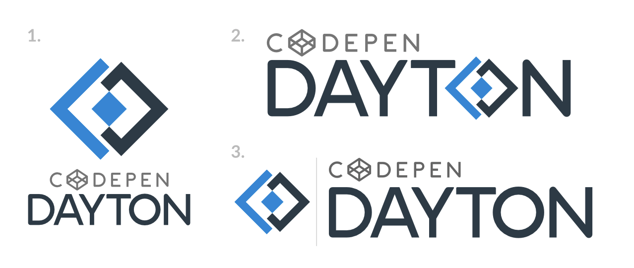
Ok, I'm designing a logo that has another logo in it. The reason I have the "extra" logo is because my product promotes the use of another product, let's call it the "master product" for now.
So for legitimation reasons I'm including the master product's logo into my own logo.
What I've tried to do is to "tone down" the master product's logo by making it small and gray, while trying to allow my logotype and mark stand out by color, size and contrast.
I know this is a very weird case and most designers may see this as an incorrect and/or weird approach, but I urge you to be open minded and try to understand the circumstances of my product.
I've made several variations and I would like your opinion on them:

