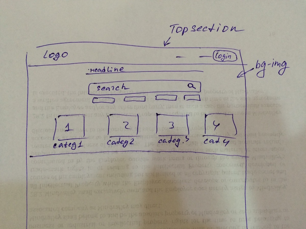
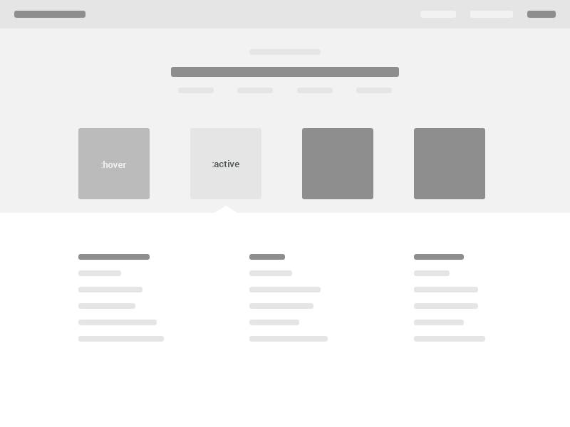
I have been looking all over the web for good examples of how represent 4 major categories on a web page from a design perspective.
I am designing a web site help centre. There are 4 major categories:
- Troubleshooting
- Orders & Payments
- Account & Learning
- Products
If I divide the web front page into sections, the top section has to contain a search box and those 4 categories (needs to be visible above the fold).
Note: When a user clicks on a category, they should see extended and related content down without page reload.
I'm considering 2 actions:
on hover - to show that element is clickable
on click - show under which category customer is now
It would be great to see any exciting examples of web pages where both actions are presented. On most websites, a 'click' (selected state) action redirects users to another page. I haven't had any luck finding an example where 'clicks' reveal more information but don't reload the page.
I did some research already:
support.twitter.com - categories are quite big (with icons and extra explanations) - this won't work for my application, because the user will not be redirected to another page with just breadcrumbs. In our case, the user needs to be able to see all 4 categories and should easily be able to switch between them. There is no need to give a description (maybe in a pop-up way only).
I was thinking about a dot navigation menu (way to present categories) as well, but my client said that it's not that intuitive without icons.
I used a flat, minimalistic design style and really want to find an extraordinary way to convey those categories.
If I decide to apply icons, where can I find stylish icons and what do you feel will best represent “troubleshooting”?
For us “troubleshooting” means everything about issues, bugs, mistakes, etc. from tech perspective.
I would be very grateful if anyone can share your insights and maybe some web examples that could give me some ideas.


