0

I tried using the rule of thirds to place my elements, but it looked wonky ... possibly because the elements are different sizes and heights. I repositioned them so the vertical distance is even between the elements, and also between them and the top & bottom of the "page" (phone screen for an app I'm developing). Is this the right approach?

Note that the top 2 lines are just one example, and that the app may display between 1 and 4 lines at the top.

enter image description here

3
  • 1
    Did you mean to attach an image? Commented Apr 30, 2017 at 6:27
  • The crystal ball here has too low resolution. Insert a photo or sketch of the problematic compilation. Do it before your question is voted out as unclear.
    – user82991
    Commented Apr 30, 2017 at 8:28
  • @user287001 & mayersdesign -- I can't believe I forgot to attach the image!! THANK YOU for pointing it out! Commented May 1, 2017 at 1:30

1 Answer 1

1

It's a tad difficult without seeing the actual aesthetics. However, I'd say . . . don't force it.

Left align the items with equal space (leading) between the lines. As you see to have it in the image. There's no compelling need to center or otherwise distribute objects of varying lengths.

I would place the top items closer to the top of the viewport. Basically, I'd ensure all elements have a minimum amount of padding from the viewport edge. Then I'd place the top elements at that minimum.

Where "rule of thirds' is concerned, place the logo/app name centered, then leave the bottom third empty. This actually helps combat the vertical sense that elements are "sinking".
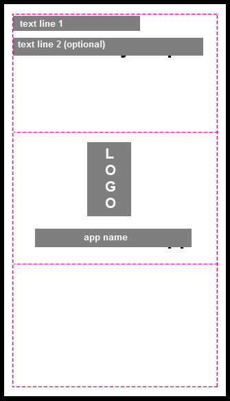
enter image description here

You could center those top two lines, but I'm personally not a huge fan of centering everything. Line-for-line centering is typically boring in terms of visuals. Again, hard to be definitive without the complete aesthetic view.

Alternatively, you could shift to use the Golden Ratio and move the two lines of text, but I don't know the actual context so this may not be appropriate.
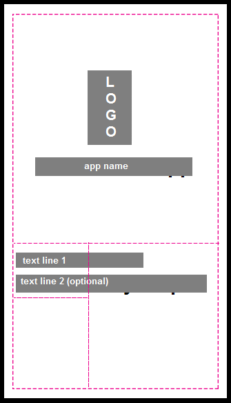
enter image description here

Ultimately, it is important to realize that "rule of thirds" or "the golden ratio" are just general guidelines on what may work. In the end, whatever works works. Nothing has to adhere to any preconceived notion regarding layout.

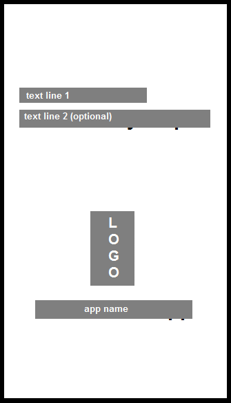
1
  • Excellent guidance! Thank you! (Upvote.) I'm not sure either of these will work for my content. I'll probably have to bite the bullet eventually and post my actual text and images, and explain how the screen will be used. Commented May 1, 2017 at 2:54

Your Answer

By clicking “Post Your Answer”, you agree to our terms of service and acknowledge you have read our privacy policy.

Not the answer you're looking for? Browse other questions tagged or ask your own question.