2

There are similar questions like this and this.

However, this question is different because of different design constraints.

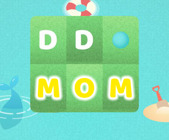
This is the interface for our game. When the user solves a word, we show a yellow star as with the word MOM. (Ignore the distorted share and menu icons, please!)

enter image description here

We are exploring alternatives for highlighting a solved word. The star sticking out from the bottom feels unclean.

Our current choice is to integrate a yellow glow effect under the letters -- similar to this white glow:

enter image description here

Instead of white, our glow will match the yellow color of the star, but our designer is struggling to find a font color that matches the rest of the design.

The linked questions suggest contrast as the key to showing fonts on a light-colored background, but black, brown, and gray clash with the other colors. White fails because the contrast isn't high enough.

So what's the best approach to finding a high-contrasting color that also complements other colors in the design?

3
  • why not just do a slightly lighter green/yellow star with transparency that goes in the middle of the green block? Will that not work for your design? If you go Crayola Spring Green, it's almost yellow :D Commented Jun 7, 2017 at 23:44
  • @AshleePalka agreed
    – joojaa
    Commented Jun 8, 2017 at 12:58
  • @AshleePalka thanks for the suggestion, it's something we're also considering.
    – Crashalot
    Commented Jun 8, 2017 at 18:22

3 Answers 3

4

Does the type have to stay white?

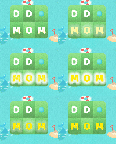
You could merely set the type to yellow.. removing the star.

enter image description here

Or if you wanted that outer glow, yellow type with a white glow...

enter image description here

enter image description here enter image description here enter image description here

7
  • For me, yellow text with a white glow is hard to read (and I allegedly have good eyesight) Commented Jun 8, 2017 at 17:17
  • :) it's all relative. My eyesight is diminishing with age but I have no issue with any of the above. And I'd really call that background green, not yellow.
    – Scott
    Commented Jun 8, 2017 at 17:19
  • thanks for this! so you think changing the background from green to yellow would be too much? we're afraid the yellow letters as @AshleePalka said would be harder on the eyes.
    – Crashalot
    Commented Jun 8, 2017 at 18:25
  • @Crashalot I don't really understand. Are you stating you are changing that green background? If the background is not to be green, it's really difficult to know what may or may not work without seeing the actual background to be used. As my answer indicates... I don't see any issue with any of the images I posted.
    – Scott
    Commented Jun 8, 2017 at 18:56
  • sorry for the confusion! meant to say we're also thinking about changing the background color. that might be cleaner since no other visual elements need to get introduced (and also would address legibility issues around letters with shadow/glow).
    – Crashalot
    Commented Jun 8, 2017 at 21:40
3

If I understand your question, the problem is that colours bright enough to contrast with the background tend to blend in with the white?

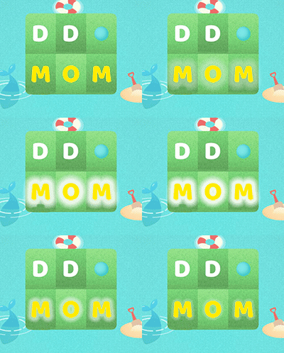
You could potentially solve this by having a slight 'hold-off' around the text before the outer glow starts. This will retain the contrast between the letters and the background, while allowing the glow to show that the letters are highlighted.

Something like this:

enter image description here

I've used a simple glow for illustration purposes, but i think it would look even better with the kind of fancy glow that you are proposing. If you could animate that glowing effect then you could really be on to something!

Hope this helps.

3
  • thanks for the suggestion! definitely looking at glow ideas as well, but afraid it might impair legibility.
    – Crashalot
    Commented Jun 8, 2017 at 18:23
  • I'm confused. Your question specifically mentions adding a yellow glow.
    – Westside
    Commented Jun 8, 2017 at 19:04
  • sorry for the confusion! yes, the glow is our preferred approach, but we're still concerned about legibility even with all the wonderful ideas posted here. meant to say we're considering other ideas as well, but really appreciate you spending time to mock up a concept!
    – Crashalot
    Commented Jun 8, 2017 at 21:39
1

I recently ran into this shot on dribbble and found it really interesting in terms of getting a specific color to fit into a color scheme:

She uses different photoshop blending modes to overlay the main color of your design with the color you are looking for (a.k.a. yellow), and play with the opacity of the main color layer until you get something that looks right.

https://dribbble.com/shots/166246-My-Secret-for-Color-Schemes

As far as the glow goes, I personally would think about just changing the colors of the green blocks themselves to yellow, or one green color vs. alternating greens to show they belong together... just a thought. If you did use a glow I'd put it around the letter blocks as a whole instead of individual letters.

2
  • 2
    Please don't just give a link as an answer. Even if it's just a couple lines, give an excerpt of the solution given in the link. That way, your answer is still of value in case the link breaks at a later time. Moreover, an answer with a prominent link often looks like spam and might attract downvotes and flags for that reason. Thanks for understanding!
    – Vincent
    Commented Jun 8, 2017 at 12:52
  • Thanks @Beneeb10! We considered changing the background color to yellow (or orange, to match the "solved" letter buttons on the bottom) but had two concerns: (1) color-blind users might not see the difference and (2) changing the green background to yellow/orange might look too strong and overwhelming?
    – Crashalot
    Commented Jun 8, 2017 at 16:06

Your Answer

By clicking “Post Your Answer”, you agree to our terms of service and acknowledge you have read our privacy policy.

Not the answer you're looking for? Browse other questions tagged or ask your own question.