I think this question is a bit broad. And I also think "polling" laymen or users for "what do you think of my logo" is always a very bad idea. "Design by committee" often leads to too many varying opinions and no clear direction. A team of a few is great... or a collaboration ... but a poll is generally fraught with those who will never be happy regardless of anything you change/create.
How many designers does it take to create a logo?
--- 100....
1 to create it and then 99 to say, "I could have done that better." :)
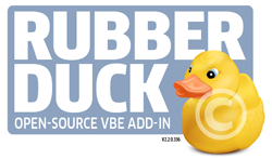
Overall, I think it's a shame that you aren't using such a fantastic graphic as the rubber duck. It's such an immediately recognizable thing and offers an instantaneous open, friendly, inviting impression. I'd really play up the duck more.
I'm not certain what the thought process was to minimize it beyond the point of being inviting, yet retaining a typeface that is.. well... merely not my style. My personal taste is a logo type shouldn't merely be some built in "display style" typeface. It actually ends up looking less professional. Especially if you are in a tech industry where chances are high users are going to see that typeface somewhere else and recognize it.
While I didn't spend a great deal of time on this, I had a previously created rubber duck image, so I couldn't help but to play with it a bit. I think if you focus on the duck more than the type, any splash card or graphic inherently becomes more inviting and enticing.
A more standard typeface will lend to more "professionalism" in my view.
Again, the duck artwork was something I created a while ago, so I had it lying around. Given time, it may work better to customize the duck more and better integrate it with the type .... put glasses on it ... use a different angle ... tie it into VBE code somehow. This was all merely off the top of my head using existing artwork. The type above could use more time and care, but I think it conveys the prominence of the duck itself. (The blue I used is pulled from the duck's eye color for continuity. So, it could be made more vibrant.)
Concepts here are free for the taking.. the actual artwork is not.


