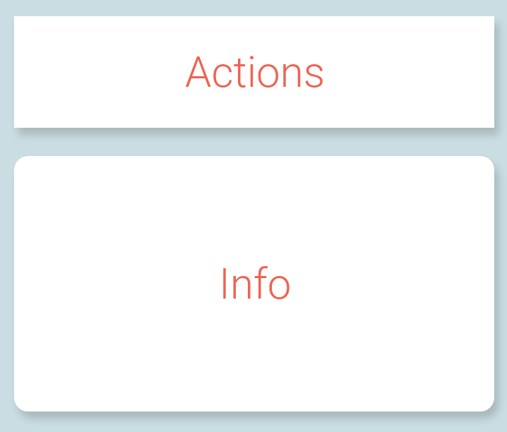
In graphic design (specifically for web and mobile) is it acceptable to combine elements that have rounded corners with elements that have sharp corners on one screen?
Example:
The purpose from of this from a UX perspective is to visualize that the rounded is for displaying information and the sharp is for actionable elements.
But i'm more interested in whether or not this is acceptable from a Graphic Design perspective.

