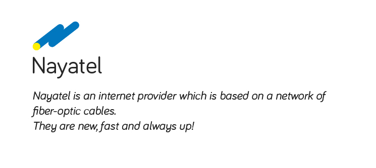

Above is the concept behind the logo. And below is the description of what company does.
Plus in the description I am keeping the icon left align to enforce movement towards the right a bit more.
How can I improve it or is it OK to go with? This is a large scale company, so do point out anything that can create a problem in future.
