Original Problem / Question:
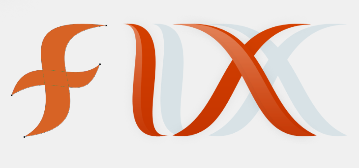
I designed a logo for a little project I just began contributing on, but there's a problem:

The F was unbalanced, meaning there was no way I could use this logo on rectangular button or shape. Ultimately the balance makes it a poorly designed logo.
I've been working for hours to balance this thing, but I simply cannot figure out how to create an "F" that is balanced with the "I" & "X" using the style shown here (this is horrid):

Is there any way that I can achieve symmetric balance with the letter F in this style? I'm open to anything. I dont expect someone to be able to magically make that form of an F work, but perhaps one of you pros can figure out something that will work there.
Result after building upon advice here:

Addendum:
Sometimes it's good to just play it simple. Although the simplest solutions can often be the hardest to reach:

While this isn't related to the question directly, it's indirectly important: I kept working a design that didn't seem to want to be what I needed. In the end the answer was to revisit my objective and ask: Am I trying to create something because I like the style, or because it's the right style for the job at hand?
The answer was obvious in this case.
Thanks to everyone who helped here, and feel free to chime in in the future with advice that might help others with this kind of problem.
