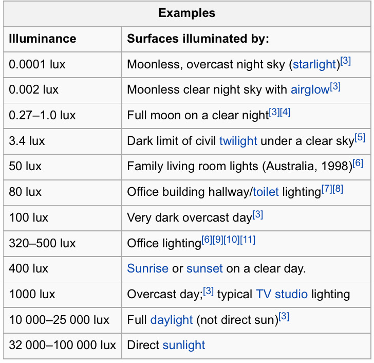
I'd say 1000 is enough, it's very bright actually. It's similar to normal daylight and that's what is usually recommended for graphic design on computers as well.
You can go a bit lower for your own comfort and depending on the style of drawing you do; your eyes are probably the best calibrating tool to evaluate contrasts and colors. Unlike working on computers that produce a light as well, you work directly on your artwork and there's less risks of distortion and less intermediary that could make you misjudge the real colors and contrasts of your illustrations.
Source: Wikipedia
You might also want to take a look at the kelvin for the color of your light as well. Recommended is 5500K. The color of the light will affect how you see your colors, so this is as important as the luminosity in your room.
More details on lux and kelvin for design studio:


