38

Why do some fonts make the I,l,1 characters look identical?
There are fonts where they don't just look similar - they are the same exact pixel locations. Why were they ever created?

I'm guessing this goes back to something historically, for example printing presses where you had to manually possition all the lead blocks for each page.

So if you had many characters that could all use the same block then it was a saving instead of needing 3 sets of blocks for 3 characters, maybe you could get away with 2.
Does anyone know for sure?

6
  • 10
    Arial, one of the most common current culprits, was designed for a computer, so it can't be explained with printing-press explanations. It's incredibly frustrating to deal with logins that contain ambiguous characters. I'm just glad when I have control of the font used to display vital information.
    – Myrddin Emrys
    Commented Apr 27, 2012 at 16:16
  • 4
    I always thought they just hated the abbreviation for Illinois (Ill). Commented Apr 27, 2012 at 20:14
  • 1
    Some of the worst offenders historically were the Monaco bitmap fonts which shipped with the Macintosh. Curiously, the fonts were included in the System file, but the Macintosh would use fonts stored in ROM instead of those in System unless the file also contained a rOvr resource. Monaco was on many machines the only monospaced font, and it used identical glyphs for I and l, as well as for O and 0.
    – supercat
    Commented Aug 17, 2014 at 17:38
  • The real question would be, why is it legal to use homoglyphs on the numbers of important printed documents (such as ID) - which invariably make people input the wrong codes? A good rule would be to generate codes that rule out 1, I and l and 0/O... Commented Dec 3, 2019 at 4:04
  • 1
    @Vikki but how does one know which one is which if the glyphs are identical? Even if there’s just one? You can still confuse l0BJ632 and 1OBJ632… Commented Feb 9, 2022 at 1:15

1 Answer 1

19

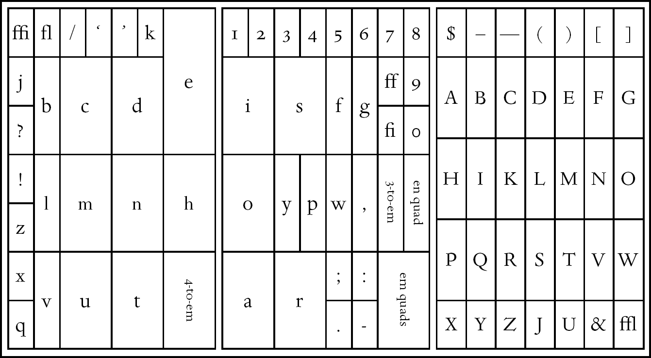
Characters that could be interchanged, indeed, would save money in the days of moveable type.

That said, the '1' and 'l' were given spots in the typical job case:

enter image description here

When typewriters came along, the mechanics dictates that the fewer characters meant the fewer bars needed, which was a huge benefit giving the limited space. As such, early typewriters omitted a '1' key, as the 'l' would suffice.

Today, with digital type, there's no reason whatsoever for characters to look identical other than aesthetic choices or just old habits. It's obviously easier to cut-and-paste rather than design unique characters.

9
  • 5
    Are you implying the creators of Arial were lazy?! Absurd!
    – Zelda
    Commented Apr 27, 2012 at 21:41
  • 3
    Big +1 for the hysterical context... :) @BenBrocka: This issue is not limited to Arial. Its parent, Helvetica, has the same issue. In most true sans-serif typefaces, about the only difference between an uppercase "I" and a lowercase "l" is a slight difference in height and/or weight. It's rarely an issue with a "1". Gill Sans is one that comes to mind with perversely unadorned strokes for all three (although the uppercase "I" is chubbiest, lowercase "l" next, digit "1" skinny). But Gill was a bit of a pervert in other ways, too. Commented Apr 27, 2012 at 22:17
  • 2
    Gill was...umm...an interesting person. That said, the lack of distinction between letters of geometric sans can be blamed on the Bauhaus, arguably one of the biggest proponents of modernism.
    – DA01
    Commented Apr 27, 2012 at 22:19
  • 1
    So, uh...my point...there's various issues here. One is technology limitations (the typewriter). One is efficiency of design/production (cutting and pasting of digital type design). And one is simply style...modernist type families tend to be stripped of all ornamentation and distilled down to the simplest of forms.
    – DA01
    Commented Apr 27, 2012 at 22:20
  • 1
    As a child I did use and old typewriter which my mom bought when she was young, and it indeed lacked a key for the number 1, since it saved an extra bar in the typewriter and key in the keyboard. You were expected to press the "lowercase L" key to get a number 1 (with what we now know as the "Courier" typeface). The numeric keys in this typewriter went only from 2 to 9. I think there wasn't a key for zero, either (had to use an uppercase O letter for zero).
    – OMA
    Commented May 27, 2019 at 14:24

Not the answer you're looking for? Browse other questions tagged or ask your own question.