hope you're all doing great! :)
A little intro: Graphic Design isn't really my thing and the last time I did design was back in 2007...until until today that we need to brand our new wedding videography studio. Because of budget constraints, I had to try my hand again to pencil in a logo (will go through the trouble of relearning Illustrator later on).
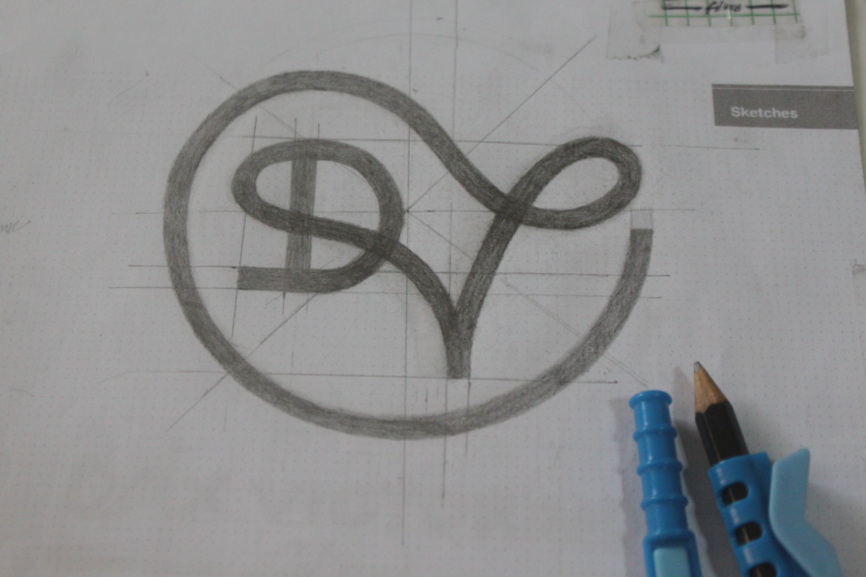
After numerous concepts, this is the sketch that my partner liked the most.
I have been gathering feedback from friends and I'll be definitely looklooking forward for any unbiased feedback from experts like you, for. For example, I'd like to know:
1. What are the top keywords/message that pop in your mind when you saw the logo (albeit still a sketch)? 2. What letters, in your opinion, are visible? (I'm going for the easy readability of the logo) 3. Are there any logos you have seen that is too similar to this one? (If so, I will take it into consideration and modify the logo) 4. Where do you think I should improve on/any advice to improve
- What are the top keywords/message that pop in your mind when you saw the logo (albeit still a sketch)?
- What letters, in your opinion, are visible? (I'm going for the easy readability of the logo)
- Are there any logos you have seen that is too similar to this one? (If so, I will take it into consideration and modify the logo)
- Where do you think I should improve on/any advice to improve
This is the sketch I am talking about (Sorry for the hastily shot and unprocessed image):

Thank you for your time - take care! :)
