Commonmark migration
Source Link

I would like to have a visual separation between a normal text (above the line) and its explanation (under the line) so that the readers can easily notice the difference when skimming the article. So far I have used a simple line to separate like this:

![enter image description here][1]enter image description here
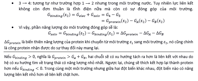
I feel something uncomfortable to my eyes, but I can't name it. I would like to know what's wrong and how to improve it.

Because this is a scientific article, I don't want to overdecorate it, just be clean and neat. I don't think it is a good idea to use ornaments. The program in use is MS Word. [1]: https://i.sstatic.net/iwGdk.png

I would like to have a visual separation between a normal text (above the line) and its explanation (under the line) so that the readers can easily notice the difference when skimming the article. So far I have used a simple line to separate like this:

![enter image description here][1]

I feel something uncomfortable to my eyes, but I can't name it. I would like to know what's wrong and how to improve it.

Because this is a scientific article, I don't want to overdecorate it, just be clean and neat. I don't think it is a good idea to use ornaments. The program in use is MS Word. [1]: https://i.sstatic.net/iwGdk.png

I would like to have a visual separation between a normal text (above the line) and its explanation (under the line) so that the readers can easily notice the difference when skimming the article. So far I have used a simple line to separate like this:

enter image description here

I feel something uncomfortable to my eyes, but I can't name it. I would like to know what's wrong and how to improve it.

Because this is a scientific article, I don't want to overdecorate it, just be clean and neat. I don't think it is a good idea to use ornaments. The program in use is MS Word.

deleted 21 characters in body; edited title
Source Link
Ooker
  • 1.9k
  • 2
  • 23
  • 39

Critique: Nice and How to make elegant separation between technical proof/equations and explanationits meaning?

I would like to have a visual separation between thea normal text (above the line) and its explanation (under the line) so that the readers can easily notice the difference when skimming the article. So far I have used a simple line to separate like this:

![enter image description here][1]

I feel something uncomfortable to my eyes, but I can't name it. I would like to know what's wrong and how to improve it. Thank you so much.

Because this is a scientific article, I don't want to overdecorate it, just be clean and neat. I don't think it is a good idea to use ornaments. The program in use is MS Word. [1]: https://i.sstatic.net/iwGdk.png

Critique: Nice and elegant separation between proof/equations and explanation

I would like to have a visual separation between the normal text (above the line) and its explanation (under the line) so that the readers can easily notice the difference when skimming the article. So far I have used a simple line to separate like this:

![enter image description here][1]

I feel something uncomfortable to my eyes, but I can't name it. I would like to know what's wrong and how to improve it. Thank you so much.

Because this is a scientific article, I don't want to overdecorate it, just be clean and neat. I don't think it is a good idea to use ornaments. The program in use is MS Word. [1]: https://i.sstatic.net/iwGdk.png

How to make elegant separation between technical proof and its meaning?

I would like to have a visual separation between a normal text (above the line) and its explanation (under the line) so that the readers can easily notice the difference when skimming the article. So far I have used a simple line to separate like this:

![enter image description here][1]

I feel something uncomfortable to my eyes, but I can't name it. I would like to know what's wrong and how to improve it.

Because this is a scientific article, I don't want to overdecorate it, just be clean and neat. I don't think it is a good idea to use ornaments. The program in use is MS Word. [1]: https://i.sstatic.net/iwGdk.png

added 41 characters in body
Source Link
Ooker
  • 1.9k
  • 2
  • 23
  • 39

I would like to have a visual separation between proof/equationsthe normal text (above the line) and its explanation (under the line) so that the readers can easily notice the difference when skimming the article. So far I have used a simple line to separate like this:

![enter image description here][1]

I feel something uncomfortable to my eyes, but I can't name it. I would like to know what's wrong and how to improve it. Thank you so much.

Because this is a scientific article, I don't want to overdecorate it, just be clean and neat. I don't think it is a good idea to use ornaments. The program in use is MS Word. [1]: https://i.sstatic.net/iwGdk.png

I would like to have a visual separation between proof/equations (above the line) and its explanation (under the line) so that the readers can easily notice. So far I have used a simple line to separate like this:

![enter image description here][1]

I feel something uncomfortable to my eyes, but I can't name it. I would like to know what's wrong and how to improve it. Thank you so much.

Because this is a scientific article, I don't want to overdecorate it, just be clean and neat. I don't think it is a good idea to use ornaments. The program in use is MS Word. [1]: https://i.sstatic.net/iwGdk.png

I would like to have a visual separation between the normal text (above the line) and its explanation (under the line) so that the readers can easily notice the difference when skimming the article. So far I have used a simple line to separate like this:

![enter image description here][1]

I feel something uncomfortable to my eyes, but I can't name it. I would like to know what's wrong and how to improve it. Thank you so much.

Because this is a scientific article, I don't want to overdecorate it, just be clean and neat. I don't think it is a good idea to use ornaments. The program in use is MS Word. [1]: https://i.sstatic.net/iwGdk.png

added 84 characters in body
Source Link
Ooker
  • 1.9k
  • 2
  • 23
  • 39
Loading
No need to mention tags in the title.
Link
Wrzlprmft
  • 15k
  • 5
  • 61
  • 95
Loading
added 2 characters in body
Source Link
Ooker
  • 1.9k
  • 2
  • 23
  • 39
Loading
Tweeted twitter.com/#!/StackDesign/status/485155471628967937
changed tags
Link
Ryan
  • 23.1k
  • 16
  • 87
  • 157
Loading
Source Link
Ooker
  • 1.9k
  • 2
  • 23
  • 39
Loading