2

I would like to have a visual separation between a normal text (above the line) and its explanation (under the line) so that the readers can easily notice the difference when skimming the article. So far I have used a simple line to separate like this:
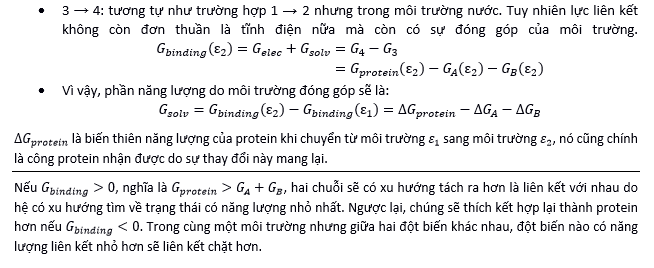
enter image description here

I feel something uncomfortable to my eyes, but I can't name it. I would like to know what's wrong and how to improve it.

Because this is a scientific article, I don't want to overdecorate it, just be clean and neat. I don't think it is a good idea to use ornaments. The program in use is MS Word.

10
  • Is there a particular reason you think the line doesn't work?
    – Ryan
    Commented Jul 4, 2014 at 20:11
  • I don't think it doesn't work. In fact, I still somewhat satisfied with it. I just wonder if the decoration is suitable in the scientific context. I want to attract the readers, in a scientific way.
    – Ooker
    Commented Jul 4, 2014 at 20:26
  • @Ooker "I use word". Use TeX or LaTeX, and it will be done for you
    – user877329
    Commented Jan 2, 2017 at 9:54
  • 1
    Yes some. but I don't know that that is absolutely necessary if the font/weight were changed. Customarily, I like to offset equations specifically in a medium weight sans-serif font and indent (as you have). i'd indent the right edge of the bullets as well though. -- still just my preferences. I don't think what you have is bad by any means.
    – Scott
    Commented Jan 15, 2017 at 17:11
  • 1
    After reading actual answers (which I didn't do before)... @DA01 pretty much sums up how I'd indent. I wouldn't necessarily use the line myself, but the white space is close to what I'd use.
    – Scott
    Commented Jan 15, 2017 at 17:45

3 Answers 3

6

I don't know if I understand the full context but here's my interpretation. I think there are two things that need to be accomplished.

  1. Visually stylize the proof/explanation area differently than the rest of the content.

  2. Separate the content from the proof/explanation.

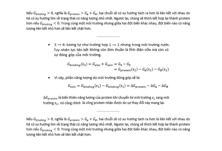
I'd suggest judicious use of white space...both vertically (space between paragraphs/sections) as well as horizontally (indent the proof/explanation area).

A line works well, but it can be subtle. You don't need to make it large and dark. Example:

enter image description here

2
  • Do dissertations have any sort of paper limit either by requirement or by cost? If not this is a very good option.
    – Ryan
    Commented Jul 7, 2014 at 18:09
  • Wow, you have spent your time to cut and rearrange my picture. I appreciate that. I'll accept this. @Ryan: thank you too. Luckily I'm not so much pressure to follow the requirement. This is a very good one indeed.
    – Ooker
    Commented Jul 7, 2014 at 20:01
4

If I were you, I would keep it in essence, but differentiate by either/or:

  • Make the text line italic, bigger font or bold
  • Make the distance from text line to equation bigger

I would remove the left justified on the text lines. It looks bad when the variation in spaces between the words gets so pronounced.


Edit I:

By removing the left justified, I mean that this sentence gets very weird spaces between the words. enter image description here

You see they are placed so that the sentence takes up the whole space. The sentence below the equations are not left justified, so that looks better.


Edit II: As to how big a gap between text and equation;... well. The same as the distance between your paragraphs.

These may be of interest:

Font for section and subsections, titles in scientific thesis

Layout for technical documents

How much space between two paragraphs

Readability as a function of measure and leading

7
  • It is nice. However, instead of bolding the text, I see that fading the line is better. However, which did you mean "left justified"? I don't see any.
    – Ooker
    Commented Jul 7, 2014 at 9:56
  • @Ooker see my updated answer.
    – benteh
    Commented Jul 7, 2014 at 10:27
  • Oh yes. I have actually noticed that. Thank you so much.
    – Ooker
    Commented Jul 7, 2014 at 10:29
  • Not sure what you mean by "fading the line", but whatever you do, make the spaces between sentences and equations bigger.
    – benteh
    Commented Jul 7, 2014 at 10:31
  • 1
    This is kinda a different question, about page layout, but generally: I would reconsider the general structure of the document. There is a good chance you are not using whitespace to good use other places too. I would give good space to headings, tables, quotes; I would increase line-height overall. I would look at page-brakes. And I would look at margins. Be generous with white-space. It makes it easier to read for your advisors. An then at last there is the functionality of assigning to a block of text "do not separate over pages".
    – benteh
    Commented Jul 7, 2014 at 10:52
2

I agree with Random O'Reilly. Especially in regards to the justified text. Only alternative I would also consider for the separator is a double line instead of a single.

Here I used the same size double lines as in your equal sign:

enter image description here

Your Answer

By clicking “Post Your Answer”, you agree to our terms of service and acknowledge you have read our privacy policy.

Not the answer you're looking for? Browse other questions tagged or ask your own question.