0

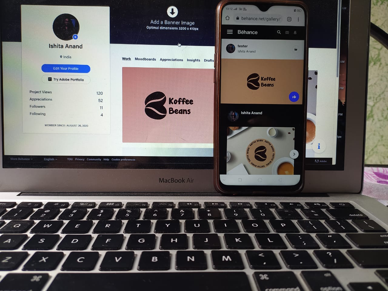
So, I created a project in Illustrator and when I uploaded it on Behance the color appeared way off on my mobile, like the pinks changed to browns. It's appearing fine on my MacBook screen but in all other devices it's appearing brown, how do I fix this issue ? I know colors will change a bit on other screens, but this is just too much.

The project contains some mockups, on my screen everything on the project on Behance looks like the way it is supposed too but the mockups are way off. enter image description hereenter image description here

14
  • Not enough infovto debug. What kind of document mide, what working space for color, what menuitem did you use to save it etc.
    – joojaa
    Commented Sep 16, 2020 at 6:04
  • Is it a CMYK pdf that you're previewing in the browser?
    – Joonas
    Commented Sep 16, 2020 at 7:44
  • Initially i was working in the CMYK mode but since the colors changed alot, I converted it into RGB, but still no difference. Commented Sep 16, 2020 at 8:41
  • What format are you exporting it to? Which colour profile are you using?
    – Billy Kerr
    Commented Sep 16, 2020 at 9:08
  • 2
    Then if the same color (which you didn't create/upload) looks different on your laptop and mobile, on or both of them are wrongly calibrated. I'm afraid it's just how it is. It has nothing to do with your files then. You can't do anything about people's screens displaying color differently.
    – Wolff
    Commented Sep 16, 2020 at 15:02

2 Answers 2

1

I would guess that the color you are using is very close to a hue shift between pink / tan.

Also, laptop screens are VERY sensitive to view angle, dramatically changing colors with variations in screen brightness, ambient light, and the angle that you are looking at the screen.

I would check the preview on a couple different screens though, and if only your phone view is off, I would put the difference being a result of the phone's screen being uncalibrated.

**** Edit with now having the original image and HEX code

The hex #d5ae90 can be broken down here.

But the description of the color flags where your problem is coming in.

#d5ae90 color RGB value is (213,174,144).

#d5ae90 hex color red value is 213, green value is 174 and the blue value of its RGB is 144. Cylindrical-coordinate representations (also known as HSL) of color #d5ae90 hue: 0.07 , saturation: 0.45 and the lightness value of d5ae90 is 0.70.

The process color (four color CMYK) of #d5ae90 color hex is 0.00, 0.18, 0.32, 0.16. Web safe color of #d5ae90 is #cc9999. Color #d5ae90 contains mainly RED color.

With it being a warm beige leaning very heavily to red, it's going to jump to looking "pink" very easily on some screens. If pink was your intent, then I would pick a different color.

Here are a couple colors you could pick that would lean more towards the tan or the pink depending on what screen you are looking at it on.

Original Color
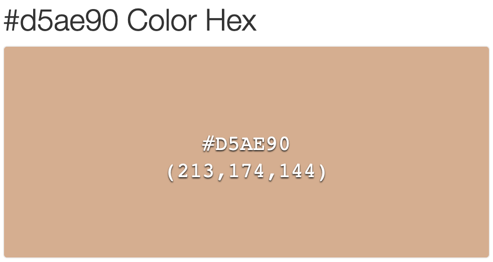
d5ae90

Slightly more "tan"

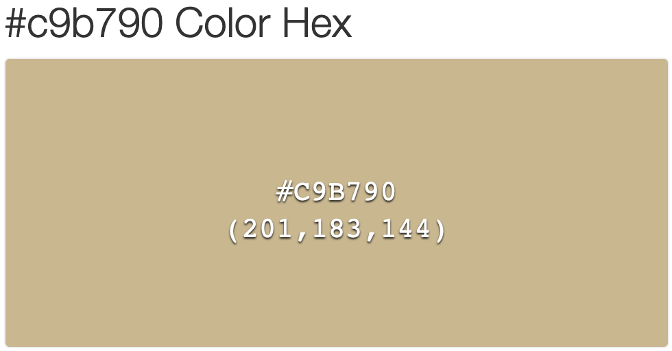
c9b790

Slightly more "pink"

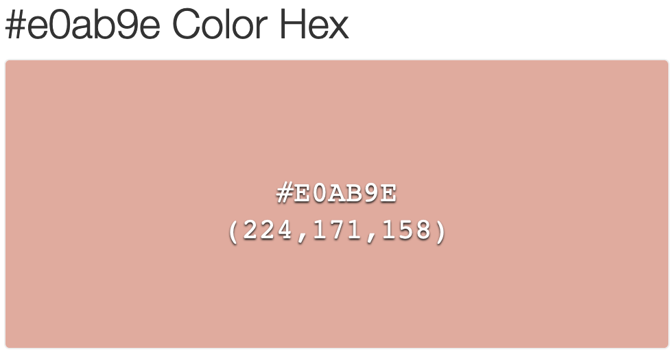
e0ab9e

But unfortunately, the problem of looking different on different screens is a heavily debated topic that really doesn't have a "perfect answer". I would recommend picking a slightly different color that is going to represent the look you want on the majority of the screens.
9
  • It appears same as the original on HP laptops and Apple screens except iPhone. Rest all screens are messing it up. Commented Sep 16, 2020 at 13:16
  • Can you add the original image to the question, not just the photo of what you are seeing?
    – Alith7
    Commented Sep 16, 2020 at 13:20
  • The hex code is d5ae90. I've add the original pic Commented Sep 16, 2020 at 13:46
  • see my updated answer.
    – Alith7
    Commented Sep 16, 2020 at 14:06
  • 1
    @Alith7 it can have a perfect answer if your in a closed loop. That is between you print and your boss. If you all can ensure calibration and good equipment, standard light conditions etc. But it can not be solved on naked internet and random devices.
    – joojaa
    Commented Sep 16, 2020 at 18:25
1
  1. You can not expect every screen on the planet, or even yours render colors the same. That is why manufacturers sell different models and different price ranges, some are cheaper, some are more expensive and some branded as "pro".

  2. What you need to do is make sure the colors are supposed to be reasonably right from start.

Take a look at this gamma test patterns.

And use your graphics card to level them. For windows, the gamma would be around 2.2 and for Mac 1.8 (I am not sure if this value has changed) so some people recommend using gamma 2.0

See if you do not have a color shift on the white point See if this really old tutorial works for you.

  1. Make sure you are working on RGB and using the sRGB color profile.

  2. On your laptop as someone already stated you can have a color shift depending on the viewing angle. You can see a shift even on the photo you took. Look at your monitor perpendicular to you.

  3. If you can, connect your computer to a good quality monitor that does not have this shift and calibrate it.

Take a look at some other posts: How to ensure color fidelity of the same file on two computers?

1
  • I like the gamma test patterns! I always used to use Mac's built in monitor calibrator steps. I sometimes miss the days of balancing out the apple.
    – Alith7
    Commented Sep 16, 2020 at 18:26

Your Answer

By clicking “Post Your Answer”, you agree to our terms of service and acknowledge you have read our privacy policy.

Not the answer you're looking for? Browse other questions tagged or ask your own question.