2

I am looking to print and bind a book. I want it to be reasonably similar to the original. Some places are giving me fits because the original typeface has very short descenders; I cannot fit the Times New Roman text on the page without the descenders being truncated. In the sample, look at those 'g's and 'p's... Times New Roman is generally a decent match, except for this.

Can someone recommend a typeface that may be more appropriate?

enter image description here

6
  • 3
    That font is nothing like Times New Roman. It looks more like a Clarendon-type font, closer to something like Century Schoolbook or Sentinel. Also, if you’re having trouble with descenders being truncated, that sounds like you’re using Word to typeset the book, which is generally not a good idea. There are much better applications for typesetting books, like Adobe InDesign or Affinity Publisher, which give you much better typographic control. Commented Mar 24, 2021 at 17:02
  • Word?? To format a book? Are you mad?? GUILTY AS CHARGED!
    – Tony Ennis
    Commented Mar 24, 2021 at 17:17
  • As always, cost and learning curve are factors here.
    – Tony Ennis
    Commented Mar 24, 2021 at 17:18
  • 2
    There is a learning curve, that is true – but if this is something you plan to do again (or even if you just want to make your regular writings look more professional), it may well be worth it. The learning curve isn’t that steep. InDesign is costly (on a monthly basis) if you only use it occasionally, but you can get Affinity Publisher for a one-time cost of about $30, which is quite manageable. Commented Mar 24, 2021 at 17:22
  • 1
    I purchased Affinity Publisher. Let the learning begin!
    – Tony Ennis
    Commented Mar 25, 2021 at 14:56

1 Answer 1

2

My recommendation would be Bitstream's News 701, which is affordable and gets the density right. This is a typeface in the nineteenth-century "modern-face" style, common for newspapers.

enter image description here

There are a lot of fonts in this style but some are very thin because they're designed to look good after a lot of ink spread from the printing process; if as I imagine you're using book paper and a low-spread printing method like a laser printer they won't look good. News 701, based on Linotype's Legibility Series, is good because it matches the density of your printed sample.

If you wanted something that looked exactly right or has a very wide character set, your best bet would probably be something from the professional font companies that service the newspaper market, Font Bureau, Hoefler & Co, Commercial Type and Frere-Jones Type, as they have lots of fonts optimized for specific production processes.

Benton Modern RE is an example of a pro newspaper typeface that also looks a lot like your sample.

Benton Modern RE sample

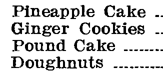
Times New Roman has a "Small Text" version with super-short descenders for exactly this purpose but it doesn't look anything like your sample.

3
  • 1
    This is great information. I am not a designer by any stretch, and I don't know anything about typefaces except it's an interesting rabbit hole of history and philosophy of comprehension. Except for the darkness (weight?) of the first sample, I would not have noticed the two samples you posted are different.
    – Tony Ennis
    Commented Mar 25, 2021 at 14:53
  • 1
    They are quite similar, but there are differences which give each a different character – the weight is one, and the ratio (that is, the width of each letter relative to its x-height) is another: the first is narrower than the second. Commented Mar 25, 2021 at 14:59
  • These fonts are pretty similar-it's Times New Roman Small which is the odd one out.
    – Copilot
    Commented Mar 25, 2021 at 16:28

Your Answer

By clicking “Post Your Answer”, you agree to our terms of service and acknowledge you have read our privacy policy.

Not the answer you're looking for? Browse other questions tagged or ask your own question.