2

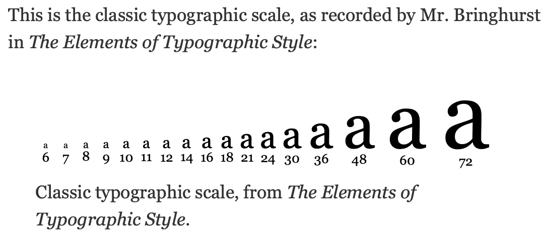
A screenshot from https://spencermortensen.com/articles/typographic-scale:

enter image description here

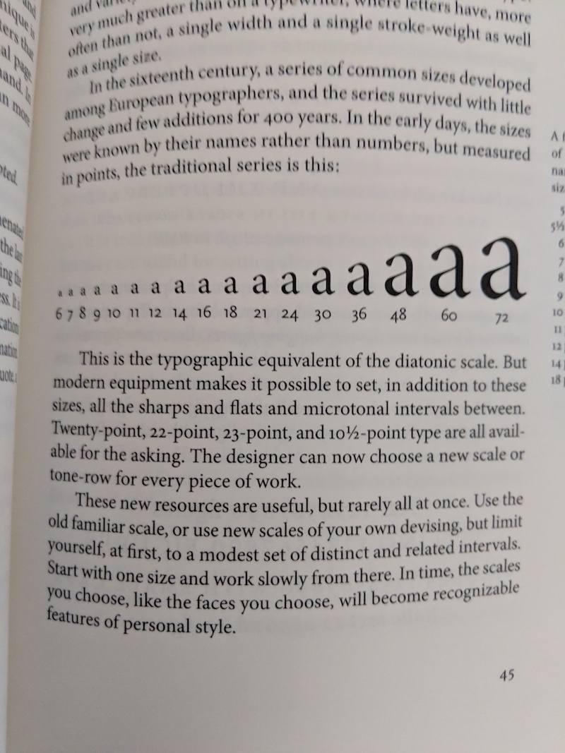
But in the book itself 30-point is missing:

enter image description here

Why is that?

Important note: I have only the 2004 (v3.0) edition of the book. There are newer editions, namely 2005 (v3.1), 2008 (v3.2), and 2012 (v4.0), which I don't have.

1
  • 30pt is not in edition 3.1, which I have. It may have been introduced after that, or removed in or prior to v3.0. In any case, the blog post should have been specific about where it came from. For v3.0 and 3.1 at least, the initial assertion is wrong. Commented Jul 7, 2023 at 18:42

2 Answers 2

2

I have contacted Spencer himself and he confirmed that 30-pt font size missing in 3.0 and previous editions of the book, but is present in 4.0, and sent me a photo of the respective page:

enter image description here

1

I do not think 30pt font is part of the original typographical scale. The author uses a formula to get the exact mathematical values to create a new scale and then compares it to the typographical scale recorded by Mr. Bringhurst.

In the article you linked it says,

The human intuition was very close, but there are discrepancies:

and then makes a note about 30pt specifically.

There is a semitone. The 30 pt font size is midway between two notes, 28 pt and 32 pt, which makes it a semitone. The first two intervals are correct, then the mistake appears, and then it gets doubled up into the next interval as well (60 pt).

Your Answer

By clicking “Post Your Answer”, you agree to our terms of service and acknowledge you have read our privacy policy.

Not the answer you're looking for? Browse other questions tagged or ask your own question.