108

I need large set (20 and more) of contrasted and easily visually-distinguishable colors for coloring different datasets on a scientific plot (the set of colors should not include white or black, and colors should be as bright as possible).

The plot is generated programmatically and intended to be included in a presentation which will be displayed using a projector.

Are there any ready-made sets of colors for such a task (I need colors as a set of RGB values)?

Or maybe there is some algorithm which generates such a set of colors programmatically (I use Wolfram Mathematica for plot generation)?

P.S. The plot itself may look, for example, similar to this one:

screenshot

4

7 Answers 7

87

Thanks to great work

P. Green-Armytage (2010): A Colour Alphabet and the Limits of Colour Coding. // Colour: Design & Creativity (5) (2010): 10, 1-23

(and to user ohadsc who referenced it!) now I know at least 3 ready-made color sets of maximum contrast containing not less than 20 colors (but I still have explicit RBG values only for one of them):

1) The set of 22 colours of maximum contrast proposed by Kenneth Kelly in the work:

K. Kelly (1965): Twenty-two colors of maximum contrast. // Color Eng., 3(6)

Specifics (citing P. Green-Armytage): "The order of colours in Kelly's list was planned so that there would be maximum contrast between colours in a set if the required number of colours were always selected in order from the top. <...> Kelly took care of the needs of people with defective color vision. The first nine colours would be maximally different for such people as well as for people with normal vision. These nine colours are also readily distinguishable by colour name."

Additional information (citing P. Green-Armytage): "The ISCC set up Project Committee 54 with the intention of bringing Kelly's work up to date. However, the committee decided that, for what they were trying to do, they could not improve on Kelly's set of colours."

2) The set of 25 colors suggested by Robert and Ellen Carter in the work:

Robert C. Carter, Ellen C. Carter (1982): High-contrast sets of colors. // Appl. Optics, 21 (1982) 2936-2939.

Specifics (citing P. Green-Armytage): "Carter and Carter make reference to Kelly's work and verify his assumption that the ease with which two colours can be discriminated depends on how far apart the colours are in colour space. From the colour spaces available at the time they chose CIE Luv* as most appropriate for their study. <...> They found that people's ability to identify colours correctly diminished rapidly when the distance between colours was less than 40 CIE Luv* units." In their work they present a set of 25 colors separated by at least 51.6 CIE Luv* units.

3) The set of 26 colors for the Colour Alphabet Project suggested by Paul Green-Armytage in the above-cited work "A Colour Alphabet and the Limits of Colour Coding." This color set is designed for use with white background. RGB triplets of this set are: {240,163,255},{0,117,220},{153,63,0},{76,0,92},{25,25,25},{0,92,49},{43,206,72},{255,204,153},{128,128,128},{148,255,181},{143,124,0},{157,204,0},{194,0,136},{0,51,128},{255,164,5},{255,168,187},{66,102,0},{255,0,16},{94,241,242},{0,153,143},{224,255,102},{116,10,255},{153,0,0},{255,255,128},{255,255,0},{255,80,5}.

UPDATE 1

4) There is another excellent article on the subject:

Zeileis, Hornik and Murrell (2009): Escaping RGBland: Selecting Colors for Statistical Graphics // Computational Statistics & Data Analysis Volume 53, Issue 9, 1 July 2009, Pages 3259-3270

This article contains nice set of 26 distinct colors on the page 11:
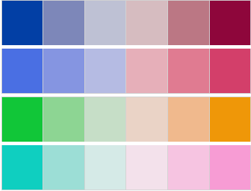
Zeileis, Hornik and Murrell 2009 color set

RGB triplets of this set are: {2,63,165},{125,135,185},{190,193,212},{214,188,192},{187,119,132},{142,6,59},{74,111,227},{133,149,225},{181,187,227},{230,175,185},{224,123,145},{211,63,106},{17,198,56},{141,213,147},{198,222,199},{234,211,198},{240,185,141},{239,151,8},{15,207,192},{156,222,214},{213,234,231},{243,225,235},{246,196,225},{247,156,212}.

UPDATE 2

User Tatarize suggests in his blog:

5) A set of 64 maximally dissimilar colors:
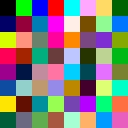
Tatarize's set of 64 maximally dissimilar colors

6) A color dictionary of 269 maximally distinct colors from all previous colors (I used this function for getting RGB triplets from the hex codes):
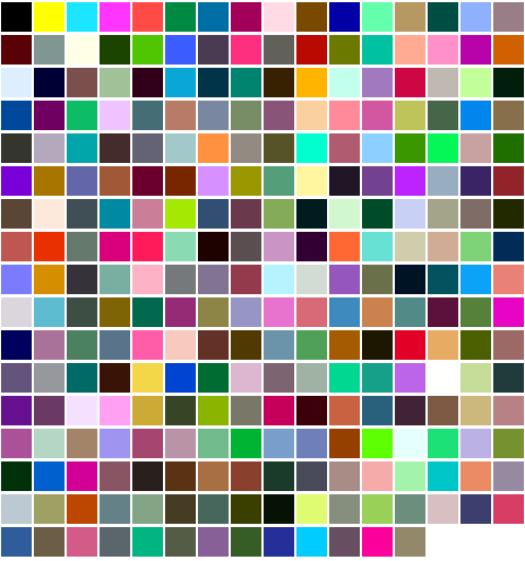
Tatarize's color alphabet

Here are the hex codes from linked blog post (complete listing of 269 hex codes of Tatarize's color alphabet hidden in the history of changes for readability).

7) 256 distinct colors.

UPDATE 3

Potentially useful web-applications:

UPDATE 4

8) List of 20 Simple, Distinct Colors by Sasha Trubetskoy:

image

"I made an easy to use list of colors that is optimized across all media; not without tiny compromises, of course, such as inexact CMYK conversions. The main issue is choosing “pure” (e.g. 100% magenta) or web-safe colors leads to gawdy, distracting and imbalanced color palettes. This is my attempt at a nice palette that works well for network or transit-style diagrams, or for categorical data."
10
  • 1
    This is quite useful, Alexey. Thanks! I'm wondering if you found anything for 1. continuous colour scales (gradients) 2. colour scales or colour sets that retain contrast even after greyscale conversion (a requirement in APS journals, for example). graphicdesign.stackexchange.com/questions/7960/…
    – Szabolcs
    Commented Jun 16, 2012 at 9:33
  • If anyone needs, here are the hex-codes of the colors in the same order as they are on the picture **** private string[,] graphColors = { {"#023FA5","#7D87B9","#BEC1D4","#D6BCC0","#BB7784","#FFFFFF"}, {"#4A6FE3","#8595E1","#B5BBE3","#E6AFB9","#E07B91","#D33F6A"}, {"#11C638","#8DD593","#C6DEC7","#EAD3C6","#F0B98D","#EF9708"}, {"#0FCFC0","#9CDED6","#D5EAE7","#F3E1EB","#F6C4E1","#F79CD4"}, };
    – alex440
    Commented Apr 29, 2014 at 16:22
  • 2
    @redshift They are: "#023fa5", "#7d87b9", "#bec1d4", "#d6bcc0", "#bb7784", "#8e063b", "#4a6fe3", "#8595e1", "#b5bbe3", "#e6afb9", "#e07b91", "#d33f6a", "#11c638", "#8dd593", "#c6dec7", "#ead3c6", "#f0b98d", "#ef9708", "#0fcfc0", "#9cded6", "#d5eae7", "#f3e1eb", "#f6c4e1", "#f79cd4". Commented Feb 23, 2016 at 11:26
  • 1
    @MiguelBartelsman Are you sure? Here are descriptions for sets #6 and #7. In the both cases LABd2000 color distance was used (over a set of RGB colors). Since the intention is to use these colors on a computer or a projector, I think it is nearly the best choice at the moment. Commented Dec 17, 2017 at 8:40
  • 1
    Here is also a brief Wikipedia help article on distinguishable colors: en.wikipedia.org/wiki/Help:Distinguishable_colors Commented Mar 21, 2020 at 18:17
21

The combination of "bright", "easily distinguishable" and "20 and more" is tricky. Reminds me of "Our work is fast, cheap and high-quality. Pick any two." I think you could drop "bright" out of the mix and just say "contrasted". That makes the brief simpler to achieve, and I think will get you where you want to be.

I don't know of such a set off-hand, but here's how I would go about it using Photoshop:

  • Create a blank document in the color mode (RGB or CMYK) you want to use. RGB is correct for all desktop printers and for on-screen or projection viewing. Use CMYK only if you need actual CMYK values.

  • Pick 5 base colors evenly spread around the color wheel. In the Hue setting, that means 0, 60, 120, 180, 240 and 300. These would be your starting points. (Alternatively, replace the default swatches with the Windows or Mac set available in the Swatches panel flyout menu, and use the 7th-last to 2nd-last.)

  • For each Hue, select 5 or 6 brightness and saturation levels that give you easily-distinguished final colors.

  • As you find each one, add it to your swatches.

If you're setting these up to be generated programatically, just take whichever of the values fit the color model you'll be dealing with. If you need to use Illustrator or Flash for the dots, add these steps:

  • Delete all the other swatches (Alt/Opt-click to remove) so all you have left are the ones you want.

  • Save the swatches using "Save Swatches for Exchange..." in the Swatches flyout. This saves a .ASE file which can be loaded into Illustrator, InDesign or any of the other Adobe apps.

I hope that helps.

[Addition after question expanded]

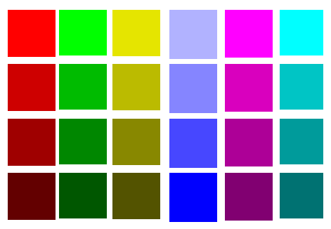
Base colors in hex are: 0xff0000 (pure red), 0xffff00 (yellow), 0x00ff00 (green), 0x00ffff (cyan), 0x0000ff (blue) and 0xff00ff (magenta). Doing some experimenting, I found pure yellow too close too white to be entirely useful for your purposes, and blue required a different starting point because it is visually dark. From each base color, you can get away with 4 shades. Since you can also use greys, that permits a 7x4 matrix of what I would consider quite usable colors, given your constraints (and presumed lack of access to Photoshop or a similar application). Grab a calculator and derive the decimal values if you need them! :-)

  • For all but yellow, blue and gray, your starting points are the pure colors. Reduce the hex values from ff to b0, 87 and 55 for your four shades.

  • For blue, the "bright" is b0b0ff, and the shades are 8484ff, 4949ff and 0000ff.

  • For yellow: e4e400, baba00, 878700 and 545400 will work, and for the gray values make the low order bytes the same as the high and middle in each case.

My quick-and-dirty chart of these (minus the greys) looks like this:

color grid

9
  • I have corrected my question: the colors should be contrasted (and as far as possible bright). The plot is generated programmatically and I need the colors as a set of RGB values. Thank you. Commented Sep 13, 2011 at 3:36
  • See the expanded answer. I think that will get you where you need to be. Commented Sep 13, 2011 at 7:55
  • 2
    Re-read paragraph 2 of my answer. You asked for RGB values, not Munsell; you got RGB. These will work for your purposes, there is no need to use all of them, and I gave you the details to that you have the flexibility to modify them. Site contributors are not here to do your work for you (see the FAQ). Commented Sep 13, 2011 at 17:15
  • 3
    A correction to the values in @neu242's comment (where cyan and blue "merge" and which contains white). I think Alan's colours are: #ff0000 #b00000 #870000 #550000 #e4e400 #baba00 #878700 #545400 #00ff00 #00b000 #008700 #005500 #00ffff #00b0b0 #008787 #005555 #b0b0ff #8484ff #4949ff #0000ff #ff00ff #b000b0 #870087 #550055 #e4e4e4 #bababa #878787 #545454 but I wouldn't necessarily use them in that order... Commented Jan 2, 2014 at 15:06
  • 2
    ... here they are again as RGB triples but "transposed": {255,0,0}, {228,228,0}, {0,255,0}, {0,255,255}, {176,176,255}, {255,0,255}, {228,228,228}, {176,0,0}, {186,186,0}, {0,176,0}, {0,176,176}, {132,132,255}, {176,0,176}, {186,186,186}, {135,0,0}, {135,135,0}, {0,135,0}, {0,135,135}, {73,73,255}, {135,0,135}, {135,135,135}, {85,0,0}, {84,84,0}, {0,85,0}, {0,85,85}, {0,0,255}, {85,0,85}, {84,84,84}. Commented Jan 2, 2014 at 15:09
8

A nice approach is the Solarized color scheme by Ethan Schoonover.

From the descr.:

"Solarized is a sixteen color palette (eight monotones, eight accent colors) designed for use with terminal and gui applications."

I think it's not only a nice color scheme, but also extensible and has a nice theory behind it.

7

There's a fundamental flaw and that's attempting to plot 20 different things in one visual. That's a lot of visual clutter and adding 20 colors is only going to add to that clutter.

I'd consider rethinking the overall visual if you can. Perhaps segment it into 4 visuals of 5 colors each, mix and match overlays, etc.

Tufte is the go-to resource for learning more about plotting data in ways that best communicate the objective:

http://www.edwardtufte.com/tufte/

6

You can try this color picker. It was designed for maps but we use it for charts and graphs as well. Good luck!

http://colorbrewer2.org/

Max 12 colours though. sorry. : )

4

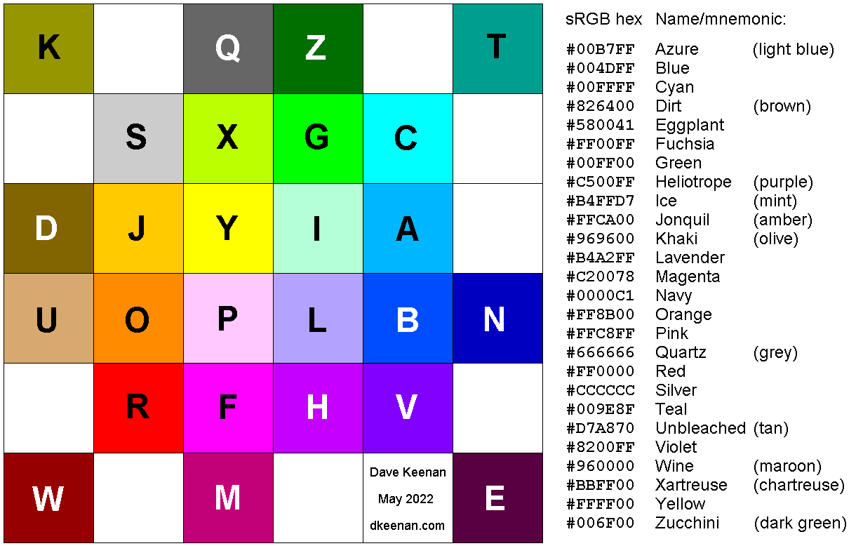
Here's a set I devised, of 26 maximally distinct RGB values (28 if you include black and white). It is also a colour alphabet. It differs from the colour alphabet of Peter Green-Armytage and the 22 colours of Kenneth Kelly, in being optimised for computer displays rather than printed material. And it differs from the 20 colours of Sasha Trubetskoy in not attempting to be tasteful. :-) But these three examples were very helpful.

RGB colour alphabet

 #00B7FF, #004DFF, #00FFFF, #826400, #580041, #FF00FF, #00FF00, #C500FF, #B4FFD7,  
 #FFCA00, #969600, #B4A2FF, #C20078, #0000C1, #FF8B00, #FFC8FF, #666666, #FF0000,  
 #CCCCCC, #009E8F, #D7A870, #8200FF, #960000, #BBFF00, #FFFF00, #006F00
2
  • What made you arrange the squares in this particular pattern?
    – BmyGuest
    Commented Sep 8, 2022 at 11:29
  • 1
    It was the best I could do to place similar colours next to each other, flattening 3D into 2D. It kind of goes from lighter colours in the middle to darker on the outside. And it has approximate lines of constant hue radiating from the centre. It also left spaces for 5 additional greyish colours (and black) that you can see here: dkeenan.com/Colour Commented Sep 9, 2022 at 14:33
3

I ran into the same problem, trying to plot data that mapped to the 24 different human chromosomes (1-22, X, and Y). My solution ended up being to develop my own R package:

https://cran.r-project.org/web/packages/Polychrome/index.html

https://www.jstatsoft.org/article/view/v090c01

This includes tools to build your own palettes and to test the "distinguishability" of colors in a palette. One of the package vignettes includes a heuristic argument suggesting that the maximum possible number of distinguishable colors is probably less than 40. (Oh, and the Kelly, Carter & Carter, and Green-Armytage references were about the best previous attempts I cold find as well.)

1
  • Very nice paper (and color schemes in it). Do you think your tools could be employed to analyze black-to-color gradients instead of individual colors? See my question here. BTW, I tried to contact you via email, but that email bounced as 'no account exists'.
    – BmyGuest
    Commented Sep 8, 2022 at 20:45

Not the answer you're looking for? Browse other questions tagged or ask your own question.