-1

I googled, but didn't seem to be anything out there.

I need to design a set of icons that will be functional at really tiny size (16px x 16px). I realized that a lot of the icons I designed starts out looking nice, but will look unrecognizable when I resize it at 16px x 16px.

I'm just wondering if anyone has any tips in the dos and don'ts for designing tiny things? To make it icons look good and functional at 16 x 16.

12
  • 3
    Design at 16x16.
    – Scott
    Commented May 20, 2015 at 16:59
  • That doesn't sound like a realistic answer. Have you ever tried to work at a 16x16 canvas in illustrator/photoshop? My mouse cursor can easily cover the whole thing at certain positions. Not to mention it's impossible to see where all the anchor points are...
    – CleverNode
    Commented May 20, 2015 at 17:12
  • @Novina your comment makes no sense to me. New document in Illustrator, change unit to pixel, enter 16x16.. I can see everything just fine :\
    – Ryan
    Commented May 20, 2015 at 17:17
  • 4
    Applications do have zoom functions.
    – Scott
    Commented May 20, 2015 at 17:22
  • 1
    "impossible to see where all the anchor points are" = sounds like you are using a vector tool for this. At 16x16, you are essentially making pixel art. You'll likely be better off manipulating each pixel directly in a raster image software like Photoshop.
    – DA01
    Commented May 20, 2015 at 17:45

2 Answers 2

3

Alright I'll try to help you out, in Illustrator.

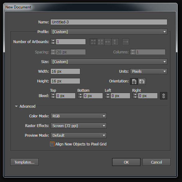
First recommendation is to split screen when you design. Start with settings:

Illustrator New Document Settings

Now do: - Window → New Window. - Window → Arrange → Tile

Set up one of the windows as Actual Size and work in the other:

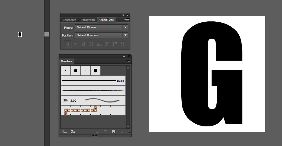
Illustrator Split Screen

2

16x16 is a very small small amount of space for creating anything with detail. This is the size of favicons you see at the top of your browser window. You will notice how simplistic the icons are.

Here are some ideas to think about

  • 1-2 colors max, if using 2 colors, make sure they contrast like B&W (This is only a suggestion, you can certainly use more colors. But the more colors you use, the harder it may be to distinguish the different objects.)
  • Simplified shapes, make sure you use basic shapes to convey your icon and don't use too many.

Take font awesome home icon. The icon uses very basic shapes to convey the image of a home.

fa home icon

  • One style that might work for you is designing line-art icons. This technique uses thin lines for all parts of the icon design. If you place lines to close together, then the details might blend together and hard to distinguish.
2
  • 1
    Thank you. This is basically what I'm looking for. Although I know all these instinctively -- or find out through trial and error, I wish there is a set of rules lay out for me like what you did.
    – CleverNode
    Commented May 20, 2015 at 17:57
  • There is no step-by-step guide or "rules" for creating icons. There are only tips. Designing in grid view may help you design more geometric symmetric shapes. Ryan posted an answer on how to setup a document that may help you quickly glance at how your icon is coming out. I would take a look at icon sets for the web to get some inspiration.
    – AndrewH
    Commented May 20, 2015 at 18:07

Not the answer you're looking for? Browse other questions tagged or ask your own question.