5

My friend and I are working on a new way of writing using the idea of fractions: the part above the fraction line is the consonant and the part below the line is the vowel. This method of writing has several diacritical symbols as well.


Example 1

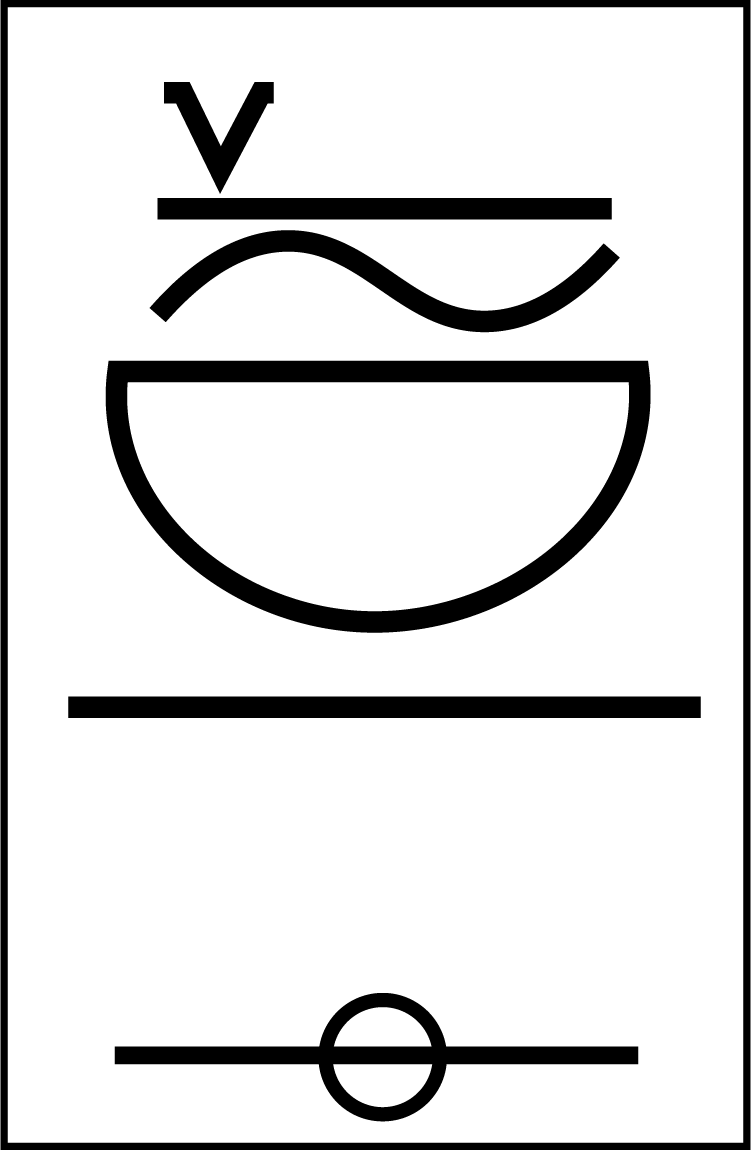
The part above the fraction line is the consonant and the part below the line is the vowel. This method of writing has several diacritical symbols as well.

From top to bottom:

  • Diacritical symbol signifying Specific Consonant (The little V; marks a Consonant to be stronger in a list of Consonant with the vowels (below) applied to them.)
  • Diacritical symbol signifying stretching out the sound of the specific letter (the horizontal line).
  • Diacritical symbol signifying using the vocal cords on the specific group of letters (the "sine wave").
  • The consonant itself (the rotated "D", in this case, Uh).
  • The "fraction line".
  • Vowel (in this case, ee).

Example 2

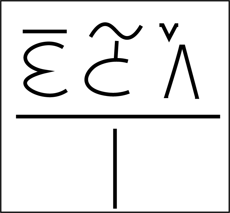
Another example with three consonants "riding" a common vowel, in this case "O".

Here there are three consonants, from right to left: "Ko" (stressed, little V); "V" (sine wave above-head), "M" (horizontal line). As you can understand, the common vowel is "O" as in Overwatch, and is located below the fraction line.

Getting rid of the little V above the A-like letter will make this unreadable.

  • Can TrueType itself even support this sort of writing?
  • Can it deal with multiple symbols above a common line (i.e. grouped to a common vowel)?
  • Is there software that can support this font creation?
4
  • From my understanding, you'd have to develop your layout and font creation systems for something like this Commented Jan 12, 2017 at 19:00
  • Why do you want to create such a language system like this anyway? And why is the line required every time? Commented Jan 12, 2017 at 19:00
  • It's especially usable in Semitic languages, and will be used as a major theme in a novel. The line is used to separate syllables from each other.
    – Phantom
    Commented Jan 12, 2017 at 19:02
  • If I were writing a language I wouldn't want to use lines for that purpose in every single word. I'd use location and certain combinations to signify the syllables and drop the line Commented Jan 12, 2017 at 20:27

2 Answers 2

3

Well, the base idea sounds to me like Hangul https://en.wikipedia.org/wiki/Hangul where you have blocks of consonant / vowel letters and a O where you have an empty sound.

You have some problems

I. Designing a font. You just use a font design program like fontographer or an alternative to it: http://alternativeto.net/software/fontographer/

II. Each glyph should correspond to a call on a keyboard. If you have an english based keyboard, either you type it directly or call for an ascii number or an unicode one.

In other languages it is comon to type two keys to form a variation, for example in spanish you need to type ´ and a to form an á.

In this case you need to configure the keyboard to respond to that combination of calls to from a key, which is more common in asian keyboards than latin based ones.

But this is out of the scope of graphic design.

2
  • Indeed, this was inspired by Hangul. The inspiration is implemented in different structures of the language. The wanted keyboard usage is to type the vowel, which will send it below a line. The order of typing is vowel and all relevant consonants.
    – Phantom
    Commented Jan 13, 2017 at 11:52
  • 1
    Probably ask here how the keystrokes combine to each other: korean.stackexchange.com and here: stackoverflow.com how to implement it.
    – Rafael
    Commented Jan 13, 2017 at 14:25
2

I would suggest the following:

  1. Create the glyphs in your chosen software (remember to use the Private-Use Area if you create a Unicode font)
  2. Use SIL Graphite for the font features (if you only are going to use MacOS X, an other option is to use AAT instead)

Note that the font features only will work in Graphite-aware software, such as LibreOffice, XeTeX and Firefox.

Some useful links:

3
  • Do you have any open-source recommendation besides FontForge? I've spent DAYS trying to fill in the gaps in the manual, as it isn't up to the same version of the software.
    – Phantom
    Commented Jan 13, 2017 at 14:56
  • I mean, the first step in the manual was to make a rectangle and a circle and subtract their paths but it doesn't even work, nor does the interface look remotely look similar.
    – Phantom
    Commented Jan 13, 2017 at 15:20
  • I have not really tried many, and it also depends on what step in the font creation you are on. Glyph design can be made in tools such as Inkscape, Metafont, Birdfont or almost any other tool. But for adding meta information, kerning and the font feature script I really recommend Fontforge. The manual may be somewhat lacking in this respect as you said, but searching the internet (blogs, posts, lists) for specific questions helped me. But as I am not a font designer I hope someone else may give you a better answer. Commented Jan 13, 2017 at 15:33

Your Answer

By clicking “Post Your Answer”, you agree to our terms of service and acknowledge you have read our privacy policy.

Not the answer you're looking for? Browse other questions tagged or ask your own question.