7

I’m currently browsing through a plethora of catchword fonts1, trying to find a good fit for the title on a book cover.

Most of these catchword fonts contain many of the same words—some only in English, some also in other languages—but as far as I can tell so far, there is one thing that they all, with only one exception so far, have in common: no indefinite articles.

All of them contain the definite article the (as well as le/la/les if they include French, der/die/das/dem/den if they include German, etc.), but only a single one contains a or an (or its equivalent in other languages).

Though there’s much overlap, there’s also a fair bit of variation in which words are included, so it seems like more than just pure coincidence that this particular word—the fifth- or sixth-most common word in the language—should be completely absent from pretty much all catchword fonts. In the type of situation where you’d want to use a stylised catchword to write the or of, it seems highly probably that you would want to do the same with a(n).

Is there some specific reason that I just cannot grasp for omitting a(n) in particular from catchword fonts?


1 Fonts which have special, predesigned glyphs that represent common short words like ‘the’, ‘for’, ‘of’, etc., usually with some kind of visual border or similar effects, especially made for use in logos, titles, and such things.

7
  • 1
    Possibly because "a", while an indefinite article, is simply a letter and not enough to warrant the styled treatment of a catchword. Just a thought. Commented Mar 22, 2018 at 14:29
  • 1
    @zee True—but in titles and logos and such things where you want the ‘little words’ to kind of stand out by having borders/frames/angles/whatever, you would very commonly want to give a this treatment too. If the looks clumsy written out as a regular word in your title, then so will a, most likely. And there’s an, which is two letters, but also absent—not to mention un/une/ein/einer/einem, etc., in other languages. Commented Mar 22, 2018 at 14:33
  • Great point, my train of thought on the original comment was to basically apply the styling of the other catchwords to the indefinites as necessary. In other words, replace "the" with "a" or "an". A little inconvenient but achievable. Unfortunately, I can't answer your question of why these aren't included in the original font packages. Commented Mar 22, 2018 at 14:45
  • 1
    And thats why i use a language that has no articles ( defined or undefined ) whatsoever
    – joojaa
    Commented Mar 23, 2018 at 13:15
  • 1
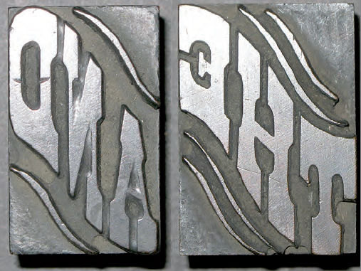
    I love those labels "Dr. XXX's Ointment & Cure for yʳ Ailments". They are hard to replicate using digital software. But can you find a historical example that does include an indefinite article?
    – Jongware
    Commented Apr 22, 2018 at 14:22

2 Answers 2

1

There is no definitive answer to your question, but one line of reasoning on behalf of the type designer is that catchwords usually shorten a string of text. When a “and” is designed to sit within two arbitrary words it allows for making a shorter headline or word mark or catch phrase. A reason short words like “a” or “an” being absent could be the perception that they do not shorten but instead bloat up the text and thus their use and designing for that use does not come intuitively.

To further underline this reasoning look at how many fonts have a Numero or Female and Masculine ordinals, all of which shorten the text and are abbreviations found in handwritten language.

1
  • I don’t see how a stylised a(n) would bloat up the text any more than a stylised of or and or the would, though. True, a stylised a wouldn’t shorten the text as much as a stylised from or with would; but a stylised an would shorten it just as much as a stylised of does—and going further afield, a stylised einem would shorten more than a stylised die, for example. I’m not saying this isn’t how the designers have reasoned, but it doesn’t seem a very well-thought-through line of reasoning to me. Commented Mar 22, 2018 at 20:11
1

The catchwords, in addition to having a decorative function, they have a practical origin as described in this answer.

At the time of the manual typesetting, the characters were placed on a line, one by one and the other way around, following the order of reading. This tedious process forced to create new methods of composition to accelerate the process. This is how the linotype, monotype, and much later photocomposition arose until our days.

But while the system was only to use metallic mobile types and placed manually one by one, some homemade inventions arose.

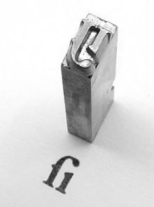
In 1775 a metal type founder named Barletti has the idea of ​​fusing more than one character into the same metal piece, looking the ease of connection between shapes or the greater number of times a group of characters were used.

Such is the case of the double "f", or the syllable "fi", or the union of "st".

enter image description here

To this new metal type that contains more than one character, Barletti gives it the name of logotype (from Greek logos: word) or polytype. These polytypes eventually give way to special types with the initials of the companies or trademarks and short words used very often.

enter image description here

If this whole process was used to achieve something totally functional, such as speeding up the process of manual typesetting, it makes no sense to create a special metal type for a single character that already exist, such as the case of the neutral article a or for short words with infrequent use.

Currently the meaning of a catchword is totally different from a metal type, so neutral articles can be added as a special design. But I think that would not be a catchword but an alternate glyph.

Perhaps the font designers follow the characters pattern of a designed font and it may not have alternate glyphs but just the traditional catchwords.

2
  • 1
    The main purpose of catchwords in fonts is an aesthetic one nowadays, rather than a functional one (‘form is function’ notwithstanding). Speed or practicality were factors in metal type, but hardly in modern computer typesetting. A might be an alternate glyph, but an wouldn’t be, nor would un, una, ein, einem, einer, een, etc. You end up by using the term ‘traditional catchwords’ (implicitly excluding indefinite articles from that category), but my question is precisely why indefinite articles are not part of this category. Commented Aug 15, 2019 at 13:33
  • 1
    It may be, but everything has a historical origin, especially as regards typography and perhaps that historical origin has influenced how the current element is or is not.
    – user120647
    Commented Aug 15, 2019 at 13:45

Your Answer

By clicking “Post Your Answer”, you agree to our terms of service and acknowledge you have read our privacy policy.

Not the answer you're looking for? Browse other questions tagged or ask your own question.