I have a problem with the material-design guideline. Some references about elevation/shadow seem inconsistent to me:
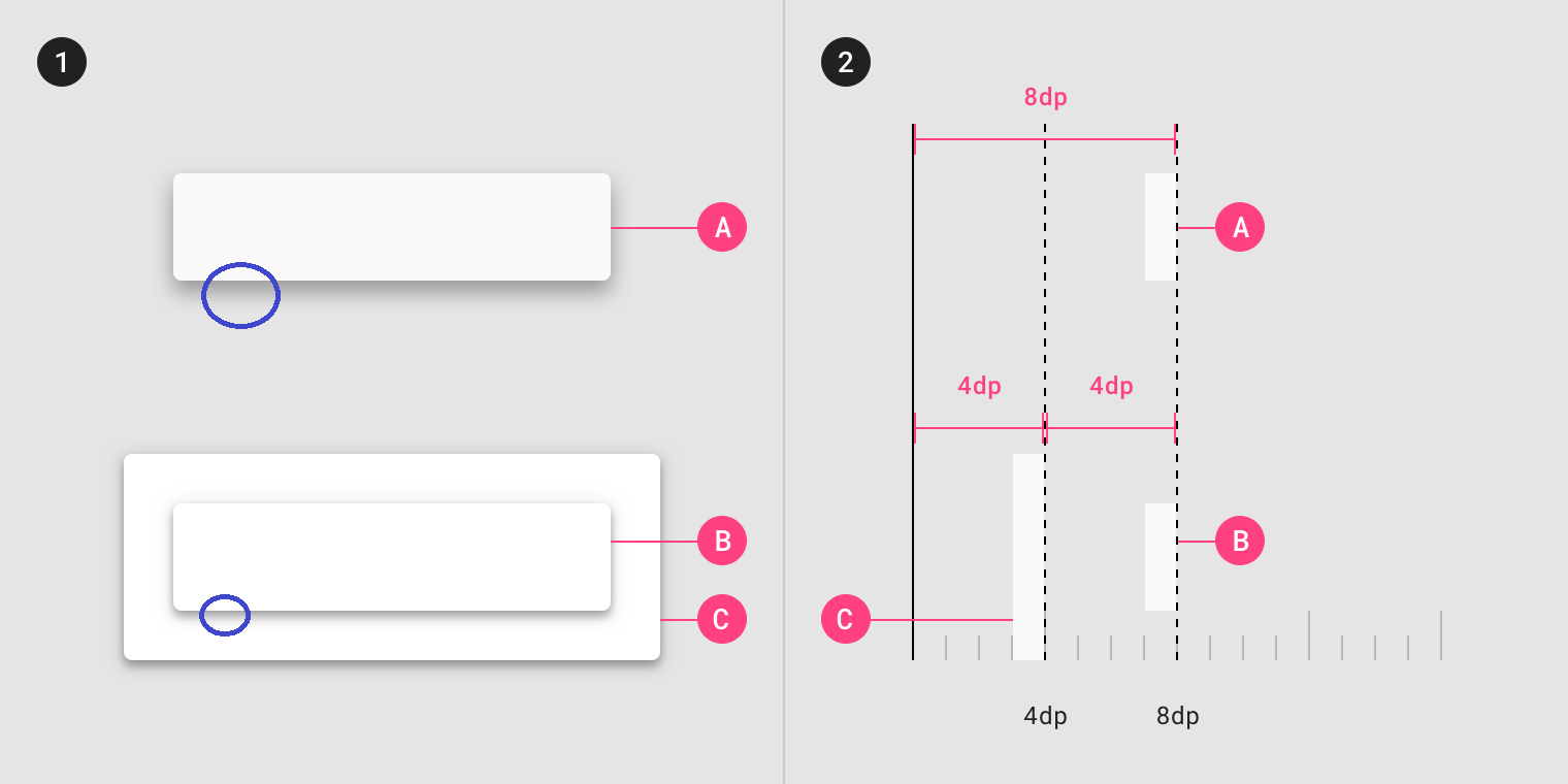
At one point (https://material.io/design/environment/elevation.html#elevation-in-material-design), it says "elevation is the relative distance between two surfaces" and "Surfaces at the same elevation can appear differently when other surfaces are behind them."
Then in this example, the shadow of surface B is smaller than of surface A, since it is cast onto surface C, which is "higher" than the background. This makes sense, that's how light/shadow works in the real world.
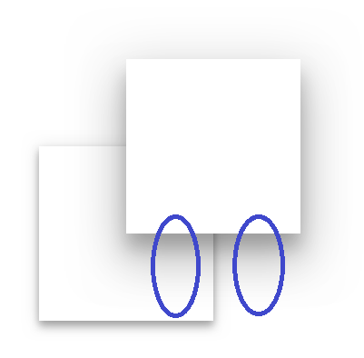
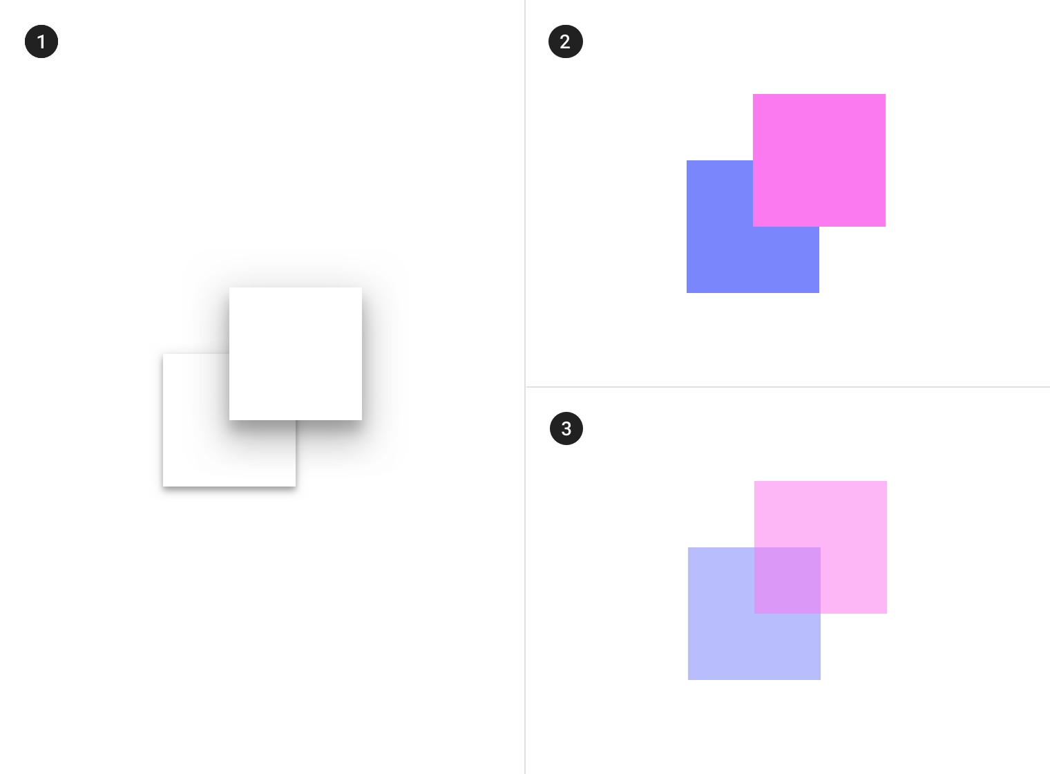
But then a bit later on the same page, a surface is shown, which overlaps another surface and the background. The lower surface is elevated from the background. The upper surface casts a shadow onto the lower surface and the background. From the references above, I would assume that the part of the shadow cast onto the background is larger, since the relative distance is larger. However, the shadow has the same size on both parts.
I dont see how this makes sense, it seems inconsistent.
Is it actually inconsistent, or am I missing some information?
If it is not inconsistent, how would an animation look like, where one surface moves over another, while staying at the same z-level? Would the shadow gradually shrink, but always be the same size at all parts?
If it is inconsistent, why? I could only think of these, rather unlikely explanations:
It is a technical limitation. Calculating shadows that way is more complex, e.g. I don't think this can be easily done with CSS box-shadows. This seems unlikely, because Material Design is not just a concept, it is meant to be implemented.
It's an error in the guideline. Seems unlikely, the guideline is about 4 years old and quite popular, such an error would have been noticed by now.
There exists an explanation, but it is either not or badly documented.
It is a known issue, but there exists no solution, and there won't be any time soon, since nobody cares about such minor details.


