0

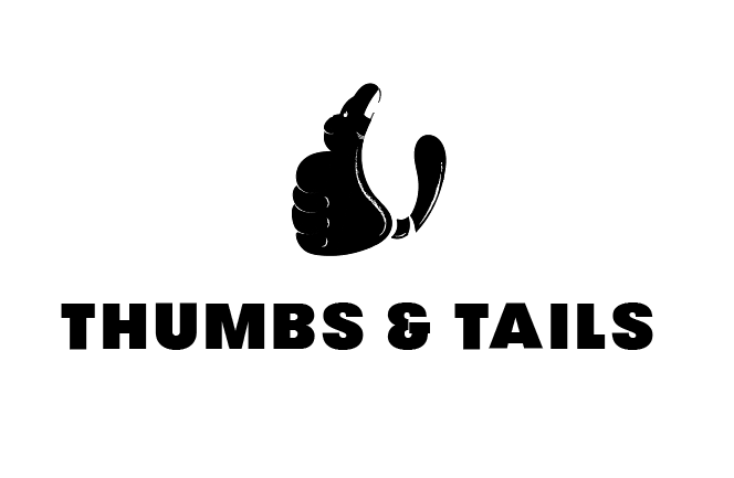
So I am new to logo design (never done identity work before). I am into copywriting and UX Design. I am working with my partner to craft an identity for a two people agency named Thumbs and Tails. This is the logo we have been able to come up with so far (It definitely requires improvement).

enter image description here

The purpose & metaphor behind the name -

Humans have evolved from apes...And we can see UX of the anatomy getting better in this evolution. The two most striking characteristics are losing the tail and gaining a functional thumb, both of which make our daily lives easier than our ancestors in terms of movement, flexibility, stability and capability.

That's why the name, thumbs and tails - hinting improvement of UX.

The logo is a gorilla that lost its tail, and looked at from a higher perspective, is a fist with thumb up.

Right now I am not sure what different technique to use to improve this logo. If I only go by the typography way, I am afraid the concept will not come out as it should.

Any idea of resources/sites where I can go to and learn about some techniques for designing logos?

7
  • 5
    Actually gorillas do have opposable thumbs and no tail. Wikipedia on apes.
    – Wolff
    Commented May 5, 2019 at 18:17
  • 1
    Your question is quite broad. Hard to know where to start. There are quiet a few good questions about logos on this site. Skip the technical ones for now and focus on the ones about composition, aesthetics etc. You logo has some promising curves, but I think it needs to be simplified a little bit. It still more of a drawing rather than a logo. Maybe this answer can inspire.
    – Wolff
    Commented May 5, 2019 at 19:34
  • Thank you for taking the time to write. Yes, I agree it needs more refinement. Sorry if my question is broad. What I am looking for are some techniques like the one used in this case study (not sure if it is more of a technique or a process). behance.net/gallery/20713047/Delps Commented May 5, 2019 at 19:39
  • 1
    And ultimately, such techniques never "create" a great logo. They merely refine, through precision, something which is already a good, solid, idea. Much of the time, case studies like this are merely detailing how the refined the design after it was created, not the initial ideation, because ideation can't often be explained in a simple step-by-step process or technique. They don't sit down with a bunch to lines and circles and make a logo... they draw supporting lines and circles later to show how they implemented precision.
    – Scott
    Commented May 5, 2019 at 20:57
  • 1
    Not saying there is anything wrong with your thinking with regards to the gorilla/tail thing - although my personal opinion is that its a bit muddled - a logo should be instantly recognisable and need no explanation, work at all sizes on all media (print and screen) - the fine lines could be a problem at 72dpi.
    – Mark Read
    Commented May 6, 2019 at 6:37

1 Answer 1

1

No specific website or book will teach you this. This is the result of accumulated experience, which is gained by doing actual work, facing clients and staying informed (aka checking out what other designers are doing). These guys didn't invent circles and lines, you can see similar logo research on other Behance accounts, so these 'techniques' are learned along the way and what you're showing is just one way to present this thinking process.

One advice for your particular situation is to look at the monkey in a more geometric way, think of how you can reduce the shape and build it from lines and circles. Do the logo right first, then think about building this 'process' presentation and identity package, if the client needs this.

Your Answer

By clicking “Post Your Answer”, you agree to our terms of service and acknowledge you have read our privacy policy.

Not the answer you're looking for? Browse other questions tagged or ask your own question.