16

I'm designing a flyer to be targeted to as broad a demographic as possible. I'm making it double-sided to increase the amount of information that it can contain (the font size of the text will be roughly 13-15 pts on A5, so I'm sacrificing a single-page design for ease of readability).

However, I'm worried that consumers will see only one side of the flyer and miss that it has a second. Is it common practice to include some sort of indicator, such as an icon in the bottom corner, to indicate that the flyer is double-sided? Is it a good idea to do so? Is there any data on how people usually deal with double-sided flyers?

I'm in the UK, if that helps with regards to the data.

11
  • 11
    I don't remember getting any flyer with an indication "more stuff on the other side" or one that I haven't flipped at least once to see if there is more stuff on the other side.
    – Luciano
    Commented Jan 7, 2020 at 9:11
  • 2
    You could put page numbers, like "page 1 of 2". and on the other side "page 2 of 2", or "PTO" at the foot of each page. But there's no rule that says you must do this. Perhaps try worrying less. Most people are usually smart enough to work out if a flyer is two sided.
    – Billy Kerr
    Commented Jan 7, 2020 at 10:59
  • 2
    If the flyer is going to be stapled to a telephone pole then no one will ever see the back side but if it physically makes it into a person's hands then people will usually flip it over to check the back. A small percentage won't flip it over and that small percentage is probably not interested in the item that your flyer is marketing. Make sure the important information is on the front.
    – MonkeyZeus
    Commented Jan 7, 2020 at 13:13
  • 4
    @MonkeyZeus If you write "Turn over" on both sides people will get stuck in an eternal loop.
    – Wolff
    Commented Jan 7, 2020 at 16:11
  • 2
    @Wolff The back only morphs into existence upon flipping the flyer. Until then it will be referred to as Schrodinger's back.
    – MonkeyZeus
    Commented Jan 7, 2020 at 16:11

6 Answers 6

16

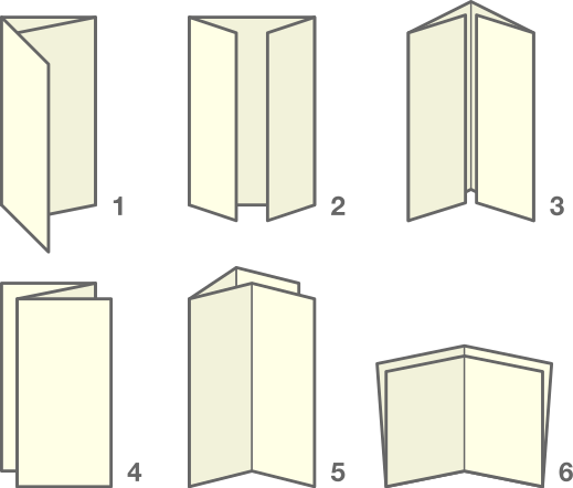
Consider folding your paper to create a brochure.

enter image description here

image source (public domain)

When your single sheet of paper is folded into a brochure, it is clear that there is more information inside it and on the back. People are used to brochures and know to look at all pages and sides.

You get to highlight information based on its location:

  • Front panel: very prominent
  • Inside panels: prominent
  • Back panel: less prominent

The biggest drawback: it isn't common to make brochures out of A5 paper. As such, you may not be able to find a print shop that will print and fold brochures in your preferred paper size. You would either have to use a larger sheet of paper, or fold them all yourself. A4 paper (twice as large) is commonly made into a tri-fold brochure.

9
  • 3
    Great idea, but two downsides are that it requires twice as much paper as the two-sided approach, as well as someone to tri-fold all the flyers. Not much of an issue for small batches, but could become prohibitive if you need a few thousand flyers. Commented Jan 7, 2020 at 15:52
  • 11
    Doesn’t require twice as much paper, because it is two-sided, and the way it is usually folded makes it nearly impossible to open without seeing both sides.
    – WGroleau
    Commented Jan 7, 2020 at 16:10
  • 6
    Twice as much paper??? One sheet is one sheet. How it's folded doesn't increase the "amount of paper"... that was funny. :)
    – Scott
    Commented Jan 7, 2020 at 20:54
  • 6
    It does, though, @Scott, because I have never seen a tri-fold A5. It would be an A4 sheet tri-folded, which is twice the size.
    – TRiG
    Commented Jan 8, 2020 at 10:16
  • 2
    What these guys are saying folds like this are USUALLY A4 (as in over 95%, because this is a VERY VERY standardized format). Ok, we all know that right? Everybody looking at a fold is used to this idea, even if they don't know what the term A4 means. So yes, what these guys are saying that an A4 2-sided is indeed twice as much paper as an A5 2-sided.
    – lmlmlm
    Commented Jan 8, 2020 at 11:47
15

No, you don't.

I believe that once you see a flyer in your hand, in your mailbox, under the door, etc, the general reaction is to at least flip it over and see if there's anything else on the back.

Also, the way you layout the elements on the front can induce the idea that the content extends on the back.

For instance, if its a product being sold, the lack of contacts or product specs from the front will automatically make people think this information must be on the back.

Big picture and logo on the front? Everything else must be on the back.

So I believe the flip over arrow can definitely be a clear indication, but slightly unusual, as most people will probably flip it over anyway.

enter image description here

11

People will naturally try flipping it over if they feel that they are looking at an incomplete part of a larger whole. Ideally, you'd like to take advantage of that -- you want the user to flip the flyer as a natural stage in their discovery process, rather than because they've been explicitly told (i.e. by an icon in the corner) to flip it over. This is the path with the lowest cognitive load and greatest user agency, and it allows the user's discovery process to happen at their own pace.

The layout of your information, then, should trigger this natural process. This may take some experimentation.

Try printing out your flyer and finding a few people to test it out on. Just hand them the flyer and ask them what they think -- but what you're really watching for is whether they turn it over and look at the back of their own volition.

Some factors to consider:

  • It may be counter-productive to divide your flyer into two topics, with one topic on the front and another on the back. With this layout, each side acts as its own self-contained resource for that topic, rather than acting as two incomplete halves of a larger whole. Since each side is self-contained, users might not flip it over because they aren't searching for anything.
  • It may be advantageous to divide the sides of the flyer by level of detail, or by abstract introduction vs. actionable information.
  • If your flyer has a border, rather than letting its design elements extend all the way to the edges of the paper, I am inclined to think this may have a negative impact on the user's likelihood to infer that there is a back side. (I don't have any data to support this, however.)
8

Part of your design should be based on how the brochure/flyer is presented. Will it be hanging on a wall? If so, it's not going to work well if double-sided. If the flyer is in a stack on a surface, one might get away with a less-than-perfectly aligned stack of paper, especially if a few of them are flipped to show the reverse side.

Your idea of an arrow-icon is reasonable. If I'm reading to the end of a block of text and there's an arrow pointing to the right, I'll flip the page over. If it's pointing to the bottom, the flip might be in the wrong direction, but still likely to happen.

Another perhaps-not-so-universal icon is a filled or empty triangle. The filled ones need not to be particular ornate, but the empty ones are more effective in my opinion.

page turn icon

The above image was the result of a search using "page turn icon" and not what I expected to find, but is clearly an indicator of more to come.

Depending on the paper thickness, if the reverse side has a block of colour that is visible from the front side, it's a good indication that something is there, but it is too easily overlooked.

3

My best answer.... possibly. :)

For most sales-oriented pieces, such as a flyer, one would use the content to promote discovery.

There are subtle things within a design that can be done to try and entice the reader into "wanting more". These methods work for practically anything designed to "pull" readers. Sometimes they may require the design to be less-than-ideal in order to serve the purpose of discovery. Often this can be called "ugly sales" in some circles... because design aesthetics give way to discovery.

  • Never end a paragraph or sentence and the bottom of a page. Always stop text mid-sentence/paragraph forcing the reader to look elsewhere to finish the thought. This can be a huge driving factor in discovery. If you stop mid-thought readers will naturally look for completion and thus flip the page. Orphans should be avoided, but Widows are fine if necessary. This goes against many standard text formatting mindsets, but remember, this is for sales.
  • Ensure the content has callouts to look elsewhere. Things like "see other side for time and date" or "turn over to learn how to sign up" those sort of things. You don't necessarily need an arrow or some indicator to flip the page, but the text should have that indicator within the content.

With these in mind, some content is shorter and limited. Depending upon the target demographic, restrictions, and content an arrow or "flip" indicator is not necessarily a bad thing. An "over" indicator will never detract from the response rate and will only ever increase the response. So there's never any real harm in using one. So, it it works sure, use one. All it will do is increase discovery.

Whether or not an "over" indicator is viable for a particular design may be another matter. Higher-end more "luxury" design tends to suffer aesthetically with such items. And that dip in aesthetics can be percieved by the audience and change the brand perception you want. But sales-related, common-consumer, designs tend to do a bit better with "over" indicators, even if they are entirely superfluous. The indicator will often force anyone even remotely interested to immediately check both sides looking for any pertinent information (cost, contact, time, etc.).


enter image description here

Tl;Dr : It depends upon content and target audience. There's no "right" answer as to whether you do or do not need an "over" indicator on items such as flyers, postcards, one-sheets, etc. Only market-testing for your specific product and demographic could answer this definitively for you.

0

Put a starburst graphic with a summary of what's on the other side on each side, along with "SEE OTHER SIDE FOR DETAILS" or similar.

1
  • 2
    I don't think he/she was asking how.. I read the question which seems to be asking if its necessary.
    – Scott
    Commented Jan 7, 2020 at 21:12

Your Answer

By clicking “Post Your Answer”, you agree to our terms of service and acknowledge you have read our privacy policy.

Not the answer you're looking for? Browse other questions tagged or ask your own question.