1

I am working on an e-commerce website. I am creating a Shopify app for the e-commerce website, and I want the shopify app to be within a tabbed menu.

The app has 2 tabs:

  1. Product Mapping: for defining product mapping between Shopify and my e-commerce

  2. Online Store: for defining organisation setting such as Name, address

  3. I might add extra tabs for Payment method and Help

I created 3 similar variations of this tabbed menu and am trying to find out which design is the best...

Note: if user clicks on any of these tabs, a full post back will occur and the entire page is refreshed.

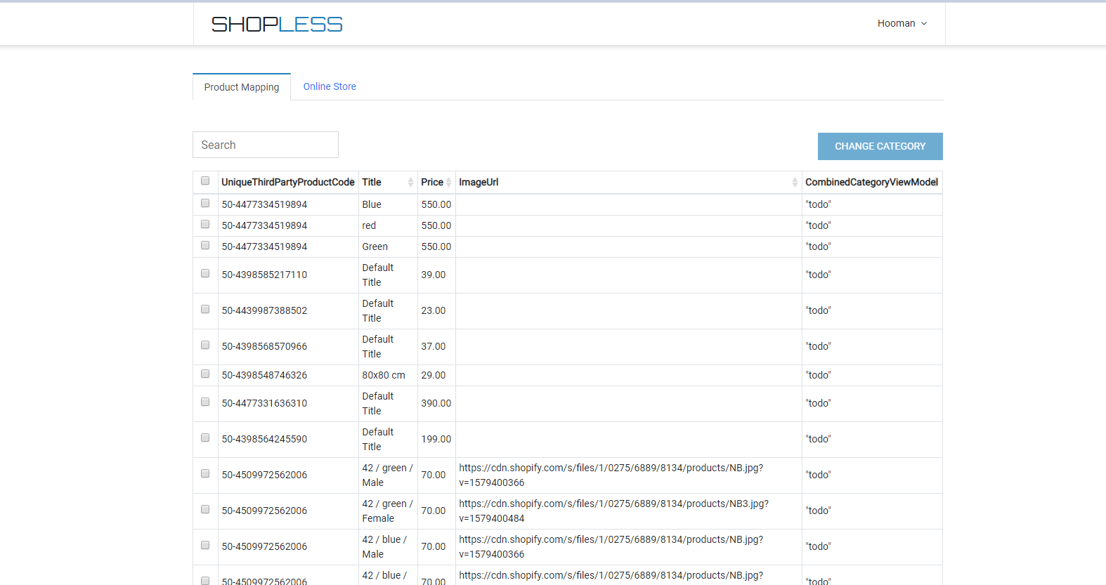
Design 1 (Tabbed menu with no border)

enter image description here

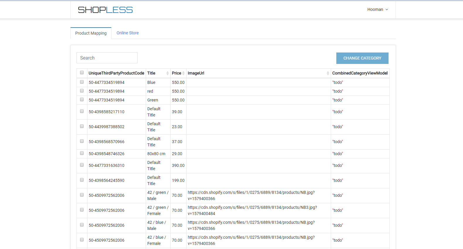
Design 2 (Tabbed menu with no border, but table is inside a card)

enter image description here

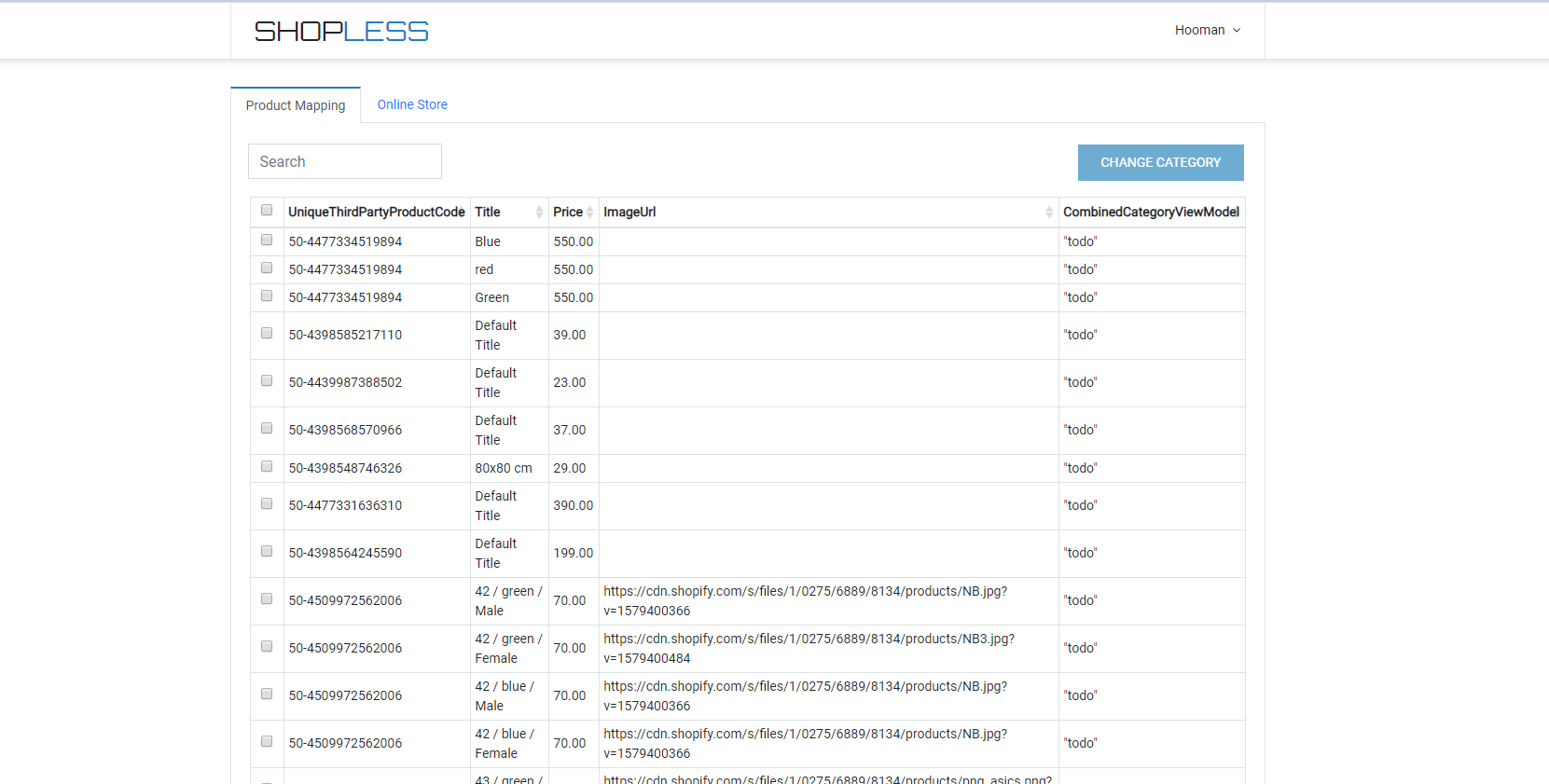
Design 3 (Tabbed menu with border)

enter image description here

I am looking for feedback to decide which one of these designs to use...

In case of tabbed menu, is it more common to have a border around the tabbed menu?

2
  • I don't know if it is just me but I see no difference between 3 designs, have you uploaded the correct images?
    – Trink
    Commented Feb 10, 2020 at 14:56
  • The difference is in the border of tabbed menu. Commented Feb 10, 2020 at 21:10

2 Answers 2

1

Third one is ok, but overall the design is rather poor and could use some improvement. If you haven't done this before, try to get some inspiration.

0
0

You should avoid Nº 2, because the UX fails (don't have clear connection between the tab and the content) and graphic design have too many lines.

1 and 3 are good, but I think that number 3 looks best overall.

Your Answer

By clicking “Post Your Answer”, you agree to our terms of service and acknowledge you have read our privacy policy.

Not the answer you're looking for? Browse other questions tagged or ask your own question.