6

Disclaimer:
I realize there is not a perfect "formula" for this question. I'm looking for your experiential working practices. If you don't have any, I won't hold it against you.


Over the last couple of years, webfonts have finally gone mainstream! Browser support is good enough and the market has broadened to the extent that designers have an excellent range of possibilities.

For my performance-focused clients using webfonts has some nice benefits beyond visual/branding: Getting type out of images makes greater image compression possible and content and style updates much faster.

The question today is:
At what point do you make the break from live html text to graphics? Especially in the context of a site with high performance requirements (loads of traffic, logic, and third party assets loading). I'm walking the line in a few projects now and having a hard time deciding in some cases. I'm wondering what formula others have come up with. If any.

We need to balance several factors (I know there are more):

  • Typographic integrity
  • Asset requests made to the server
  • SEO and accessibility
  • Responsive design (where applicable)

Complicating matters, rendering still varies widely by browser and OS. Compare IE 8 to 9, for instance or, more dramatically, OS X to Windows. Obviously, your market may negate concern for some of those issues (I unfortunately still support back to IE7 in a big way on some projects). And while webfont OpenType feature support is pretty good in Firefox, it's still lagging in virtually all others.

9
  • 1
    Load times are only part of the equation. In modern web design they better factor into your considerations otherwise you're doing your client a disservice. The aesthetic side of the equation is the typographic integrity of webfonts at display sizes and in a responsive scenario and the level of control over the type without complicated javascripting. Commented Dec 13, 2012 at 20:49
  • 1
    HTML5 / CSS3 / JS can achieve just about any type effect. But it's not always going to be an improvement over graphic type. And yes technical considerations are part of graphic design. So I'm wondering how people go about weighting all those factors and if anyone has found a clear way to define where the threshold lies. Commented Dec 13, 2012 at 21:18
  • 4
    @Ryan, design is all about working within constraints. If the question were "how big should my print job be before I took it to an offset printer", would you make the same contention?
    – Brendan
    Commented Dec 13, 2012 at 21:19
  • 2
    Heh. Design overlaps a lot doesn't it :P It could be argued that all of the Adobe questions here should belong on Super User!
    – Brendan
    Commented Dec 13, 2012 at 21:23
  • 1
    The fundamental issue here is maintaining a balance between the visual and the technical. I'm not interested in where a developer or UX person would place the tipping point. Commented Dec 13, 2012 at 21:30

3 Answers 3

9

My solution: SVG sprite sheets with PNG fallback

Personally, I think icon fonts are a poor stop gap technology that won't be around in 5 years. SVG images are a far better way to go if you need vectors. SVG has most of the benefits of icon fonts, plus:

  • SVGs can contain colours, gradients and other effects.
  • Works with img tags.
  • Works as CSS background-images.
  • SVGs are pixel perfect.
  • Like icon fonts, SVG can scale to any size, so you get Retina support for free.
  • SVGs are typically smaller files than icon fonts.
  • If you want everything in one file, you can use SVG sprite sheets.
  • SVGs are easier to create and can be edited in Illustrator.
  • Rendering is far more consistent across browsers (certainly for simple things anyway).

The big caveat for using SVGs? No support for Internet Explorer prior to version 9. That may or may not be a deal breaker for you. WebKit (Safari and Chrome) and Firefox have great SVG support. For older versions of Internet Explorer, you can swap your SVG sprite sheet for a PNG (super easy, typically only a few lines of CSS).

That should cover everything, and give you only a few HTTP requests, small file size, the ability to use colours, gradients and other design effects. Oh, and it means you don't have to resort to horrible HTML hackery. Things can be nice and semantic.

There aren't many situations where I would recommend icon fonts. I think they're a terrible idea. A really hacky stop-gap that will be dead and buried at some point in the near future.

5
  • Thanks for that, Marc. I wasn't thinking of icons but this is a great bit of reference. Totally agree on the icon fonts issue. IE8 is supported on several of my projects (including my biggest on-going project) so I haven't done much SVG outside of mobile. Another icon solution a developer friend has turned me on to is base-64 encoded pngs embedded in the CSS. A very fast solution. Commented Dec 14, 2012 at 16:54
  • You could probably even automate SVG and PNG embedding into your CSS and spit out the IE and non-IE versions using SASS or LESS and some other trickery. Would be fun to try to get it working. I'm all for distribution formats being different to creation formats. Commented Dec 15, 2012 at 1:24
  • The SVG thing was a recent revelation of mine as well. I'm not sure why it's not a more prevalent solution.
    – DA01
    Commented Dec 26, 2012 at 20:29
  • Just to clarify: are you talking about using SVG text using text , tspan etc, getting the fonts with font face and relying on the browser to render, or are you talking about outputting specific text elements like headers as SVG paths with the text in title etc, alt-text style for accessibility? ( stackoverflow.com/questions/4697100/… ) Commented Dec 27, 2012 at 1:29
  • And as a SVG is a text-based XML document you can go in and edit it directly to do small adjustments, or even embed it directly in the web-page without loading it externally.
    – user7179
    Commented Dec 30, 2012 at 7:20
4
+25

You mention it yourself: "The fundamental issue here is maintaining a balance between the visual and the technical". Here's my opinion, and I'm sure not everyone will agree, but this is what I've observed in the last years working in web.

Web fonts vs safe fonts: Technically, you don't need webfonts. You can use safe ones that don't require the user downloading any extra files (requests). You can do marvels combining size, weight, letter spacing and line height, and probably successfully communicate your message with them. Using a different font in this case would probably only be an aesthetic choice.

HTML text vs graphics: I don't think there is a formula for this one. When web fonts became extremely popular, everyone jumped in the font-face train regardless of how awful some fonts looked on certain OS/browsers. Reminds me a little of how people turned their backs on tables, and suddenly anyone using them was blasphemous. Tables are still the best option for tabular data. Pixel perfect graphics are still, in my opinion, the best choice for aesthetic designs.

This will probably change in the near future, though. Mobile rendering is amazing, and some new fonts look great on different devices.

Last time I wanted to 'go custom', I tried most of the sans-serifs in font squirrel in 3 different OSs and all major browsers. I gave each one a 1 to 5 score based on how nicely they rendered. Most of them got a 3, a few got a 4. For a personal website, I went with half graphics half fonts. Like DA01 mentions, "it all depends on the needs of the client, the needs of the client's users, and the particular solution being designed" (DA01 sic).

It's been years since the 'launch' of @font-face, and as much as I would love to use beautiful fonts in my designs, I still don't see the point of using ones that render so differently across various scenarios. But this is just my humble opinion, and I tend to stick with 'what works for me'. The SVG answer sounds great and might change my opinion :)

2
  • Thanks for the realists' perspective ;) There are definitely some atrocious examples out there. Fortunately, solid options are available on Google Fonts and some stellar examples are coming out of commercial foundries through outlets like TypeKit. I think the rendering issue will be gone soon. Commented Dec 26, 2012 at 22:31
  • In regards to @MarkEdwards SVG idea, it's a fantastic solution for icons. Doesn't really apply to the type concern though. Commented Dec 26, 2012 at 22:33
1

Okay, I'll weigh in with where I'm at, since there don't seem to be any fixed approaches popping up.

Rendering

For starters, the days of sketchy webfont rendering will be completely behind us soon, at least with well-made fonts. The main offenders (IE versions prior to 9) are fast becoming a thing of the past. IE 8 is still a player but I'm convinced that audience is not an aesthetically motivated one anyway ;)

Fancy effects

System/HTML text can easily handle changes to
color,
opacity,
scale,
horizontal and vertical positioning,
and text shadows.

When my effects start getting complicated, I consider it an obvious graphic type moment. Beyond simple style controls (anyone care to add to my list?), you'll need to rely on
javascript libraries,
OpenType features with spotty support,
excessively large webfont downloads on the user's end,
and possibly HTML5/CSS3 features with limited support.

If I want to skew my type,
fine-tune the kerning,
apply textures,
precisely position and line break it over an image,
or anything else that requires precise control, I resort to a graphic.
Like I said, there are ways, I just don't think they're worth it at this point.

With that said, I also have to ask myself in those cases if I really need the effects. Could nicely set system type without all the fancy stuff do the job. Maybe. There's always a fuzzy line somewhere.

Big stuff

Where I find myself hesitating to trust webfonts is very large type. Just to throw out a number, let's say 60px and up. Why is that? I'm not entirely sure but I can think of a couple things than concern me.

For one, big type often requires that extra bit of kerning that simple tracking can't solve. The type is dominant on the page and every little flaw becomes painfully evident to me.

Secondly, type that large tends to require very careful fitment within the design. I think it's less critical on content sites where the type can flow and there's some much needed white space but on a commerce site or in a dense content environment a misplaced line break or extending character can wreak havoc.

I think these may just be insecurities left over from the days when browsers did a really bad job with type. Unfortunately, enough of those problems still linger that it makes me cautious. Things like Giantnerd's add to cart button make me want to embrace it :)

The final verdict

Well, maybe not final. Final-ish.

Despite my insecurities, I'm getting past the big type thing. And I find myself using less effects and more clean system text elsewhere. One of the big gains is more responsive layouts: System text is easy to change on the fly!

I am rapidly streamlining my clients sites and moving to less image dependency. Bring on the webfonts! Maybe it'll be another International Style revival period in design ;)

In full disclosure

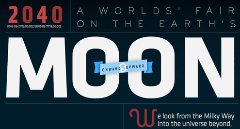
I would be remiss to not mention awesome excercises such as Lost Worlds' Fairs. It's wonderful proof that just about anything is possible given time and the right user base.

Jason Santa Maria's contribution to beautifying the web

Your Answer

By clicking “Post Your Answer”, you agree to our terms of service and acknowledge you have read our privacy policy.

Not the answer you're looking for? Browse other questions tagged or ask your own question.