I wonder if there is any formula for any given text color to calculate the best background color for readability.
-
Don't think in colour, think in light/shade; otherwise you discriminate against colour-blind & other partially-sighted people.– TetsujinCommented Sep 19, 2020 at 17:09
-
@Tetsujin so eventually it's a color, right? Does this formula exist?– Qian ChenCommented Sep 19, 2020 at 21:00
-
Yes there is a guide - the WCAG contrast checker here– Billy KerrCommented Sep 19, 2020 at 22:39
-
What I am really looking for is a formula that I could use to dynamically figure out the best background color considering my text color is a variable.– Qian ChenCommented Sep 20, 2020 at 4:59
-
The contrast checker is based on formulas provided by those published by W3C here– Billy KerrCommented Sep 20, 2020 at 15:52
2 Answers
There's links above to two great help sites for color-blind purposes, but for eye-pleasing color matching, that's personal preference, not really something you can apply a formula to.
Having said that, I do remember back in grade-school art class being taught the "complimentary colors" based on the color wheel and that exact opposite colors are the "best" looking colors. Which is of course why they're called "complimentary".
So:
Red -> Green
Orange -> Blue
Yellow -> Violet
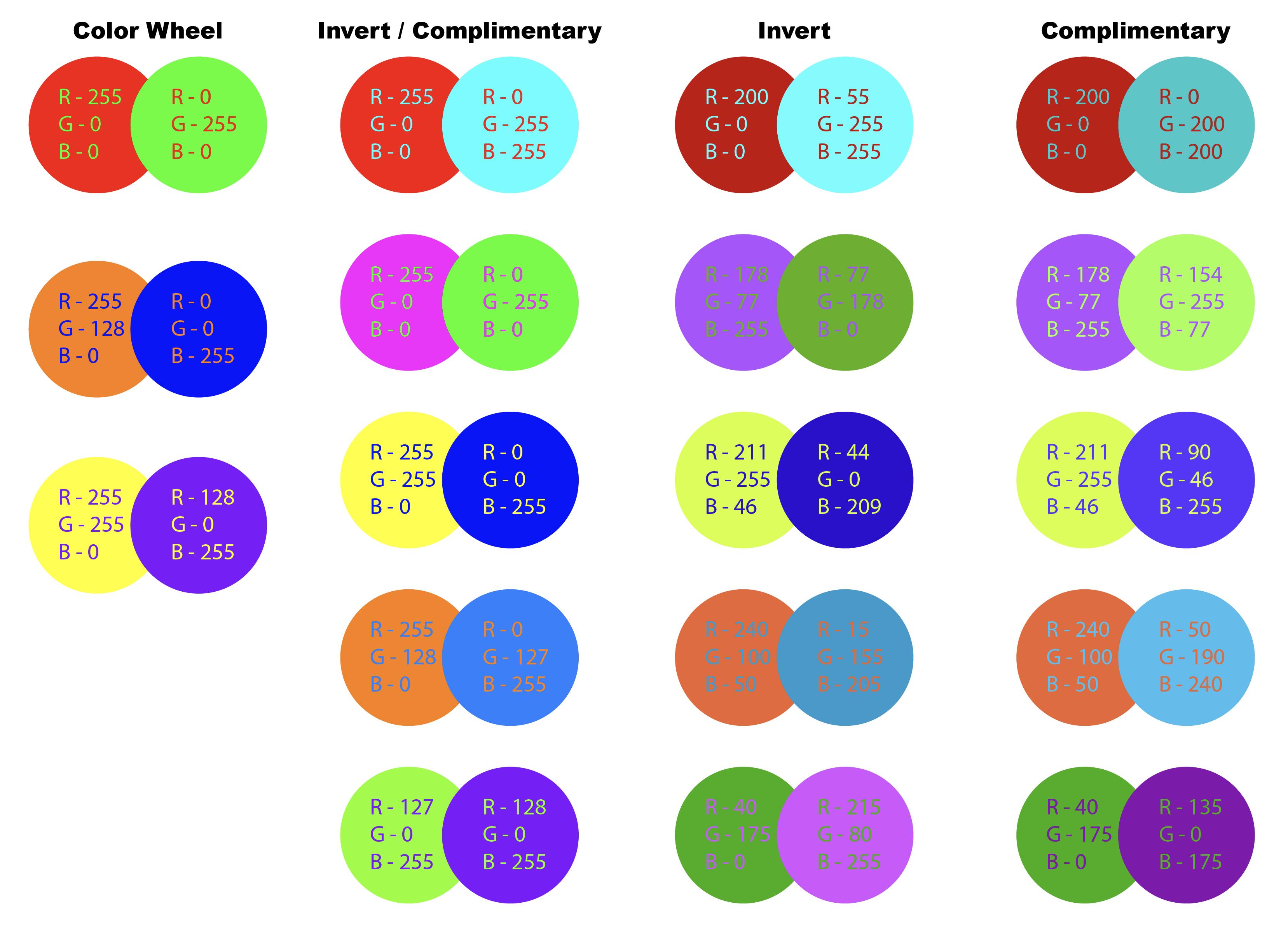
Taking that theory into account, you can make a chart of the simplest comparison like the column on the left.
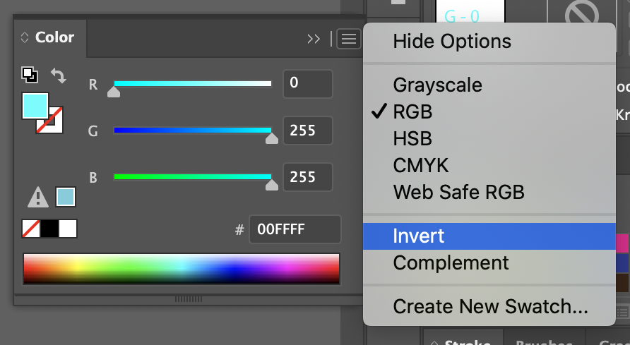
Adobe Illustrator has a built-in Invert and Compliment tools in the color palette.
In testing, at absolutes in the RGB channels, either max, 0 or 50%, the two tools do the same thing, but if you mix it up a bit more, they have different effects. See second column.
Invert literally takes 255 - current value = inverted value to all 3 channels. See third column.
Complementary isn't so straight forward. It takes the lowest and highest values of the 3 channels and flips them. But the third channel is a little less clear. I haven't been able to figure out how it comes up with the number, maybe someone can add more to this who has a better grasp of the math. See fourth column.
IMHO, the Complementary gives the easiest to look at combination. (with the exception of the Light Blue / Orange shift. That one just hurts.) But again, it all comes down to personal preference, and none of these take into account the color-blind aspects.
Part I. Not answering your question.
1. Please. Do not use
any given text color
and then throwing a "formula color" to the background.
I am going to twist this story because I am only writing it from memory.
There was a known painter and some assistant asked the master if his nephew could start as an apprentice in the studio.
-- He can start painting backgrounds.
And the master responded.
-- Really? I can hardly know how to paint backgrounds.
A background is built around your subject. In painting, you give some hints of the background at the same time you are working on the subject. It affects how you perceive things, how the final colors will look. They need to be constructed together.
This was known to the master, so the background is just as important as the subject.
You design things harmonically, even if you decide to brake harmony.
2. Color is used to give a message, to provoke a feeling or sentiment. It can be subtle or can be decisive.
Let's assume you need to do that, so the first color you have is the background. In terms of readability, probably you need to start with the background because it is the most dominant thing on the pice.
3. Readability implies a series of factors, probably the main rule is not to stress the viewer's eyes.
In the old days, this was done using the white of the paper. So probably this is a good start. This forum uses white as a background, so you can read. Some other sites constructed for that are also white. Wikipedia and Quora come to my mind.
4. Of course we have "reading modes" more and more popular. They use a dark gray as a background and white text. In some contexts, it is a good choice.
5. In almost all cases a neutral color is preferred.
But you could add a warm tint, a straw tint to the background instead of using white.
6. Color on the background should be used as a messaging resource, almost as important as the text itself.
Imagine a green for an ecological message or wine for a wine website. But you need to avoid really saturated colors, because they start to hurt viewers eyes.
7. But look at some examples of colored background and text. Normally you have a low saturation text. White gray or black.
Part II. Trying to answer your question.
8. There is no formula, it is human perception, not a physics experiment.
But probably a low saturation background is preferred, so the only variable you have then is shade.
Light background if your text is dark, and dark background if the text is light. You can add some color tint to a dark background.
If your text is middle gray probably a good choice is dark but depends again on the context.
9. This is a type of contrast, a lightness contrast.
10. Do not use hue contrast to make decisions. This is one of the most stressful things to do to reading when the saturation is high.


