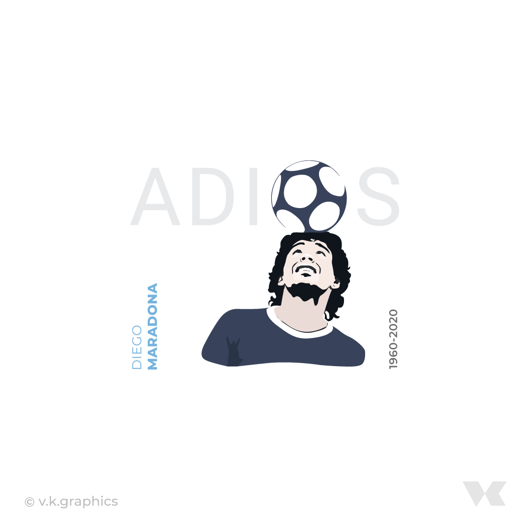
5

Every other design for social media, I face this problem. I discussed this in room also. I came to know that different countries have different views. They also gave examples about book spine. Which I couldn't understand very well. enter image description here enter image description here Now I know it can be opinion based. But I also know this is a genuine problem. If this weren't a graphic design problem, I would never be so much confused about every other design. I often face this problem.

Does it depends totally on Designers choice (what he likes)? Does it depend on size of text or number of words? Does it depend on side (left / right / top / bottom) of the design?

So for a particular design, how can one decide that keeping top to bottom or bottom to top will be better? For example, how do I decide which approach I should finalize for this design?

Also, book spine text direction is relevant to this topic?

Few examples:

England cricket page uses top to bottom approach for logo and some text:

enter image description here enter image description here

TONI&GUY page uses it bottom to top: enter image description here

5 Answers 5

4

There exist relatively common graphical representations that frequently have rotated vertical text. These are called technical drawings. The standard here states that vertical text is always rotated like your first example.

Another example happens in book spines that are typically rotated in the opposite direction.

I couldnt find any scientific evidence that either is harder. Although, i found a study that claims there is no measureable difference. The sample size is a bit small for super conclusive evidence. I am personally just more accustomed to the former.

4

Preference

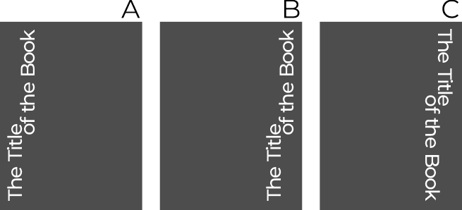
A. If I have the vertical text on the left of the space my choice is clear, Bottom to Top.

B. Even if the text is on the right, I still feel that the "unease" it produces is more like "expectation" than "awkwardness" C.
enter image description here

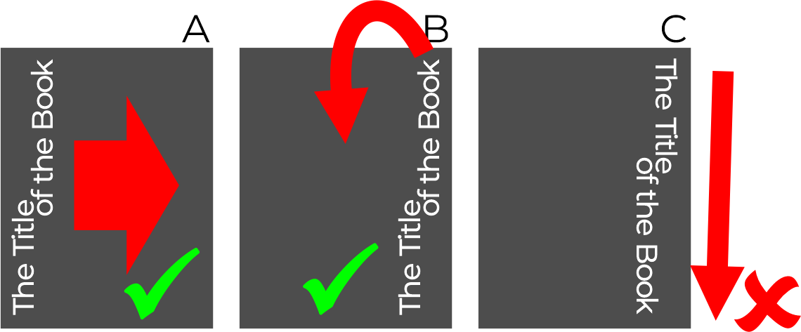
After watching the 3 examples you also notice how the sight in cases A & B ends in either the top part of the design B or is a clear introduction to it A, whereas in case C it ended on the bottom of the page, so the reading ended, and you do not want that in advertising. You want your design to be watched again.
enter image description here


Hand and eye

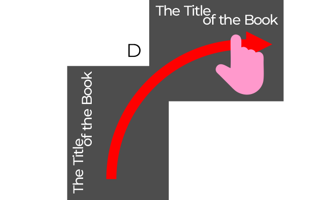
Although we know that in Western writing we go from left to right and top to bottom, and this second option (top to bottom) could be more "natural", it is not. I think the muscular effort when reading, for example when using our hand to follow the lines has a smoother flow when the text is bottom to top.
enter image description here


One practical example

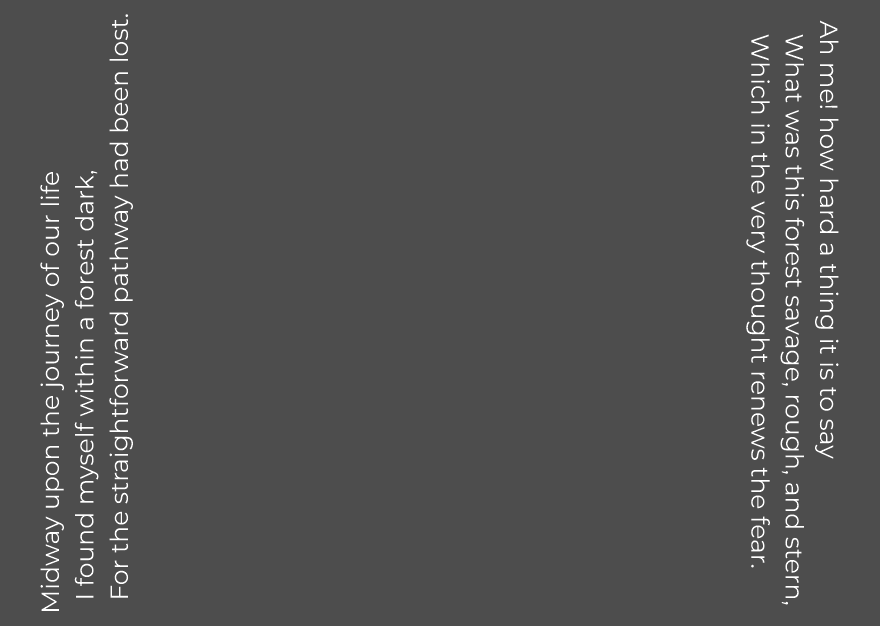
Now, try to read these two paragraphs and compare if you struggle with one or the other, especially when you skip to the next line.
enter image description here

Not only every individual line is harder to read. You are suddenly forced to start reading right to left...


Second practical example

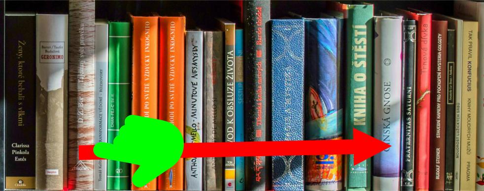
How this is a lot more useful and natural is for example when reading the spine of books on a shelf.

Each book becomes a line, and we normally look for books from left to right, so the natural reading will be according to these lines. In order to be consistent for this is to put the text from bottom to top.

See how the books that have the other orientation are disruptive.
enter image description here

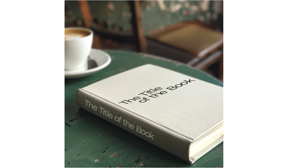
But, probably the title top to bottom works if the book is going to be on a coffee shop.
enter image description here


Some conventions

In the other answers, technical drawings are mentioned.

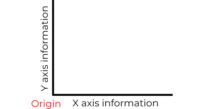
In a graph, you could have the Y-axis title rotated. On both cases you expect the origin to be at the bottom left.
enter image description here

Having a convention there on things like blueprints allows you to only rotate it in one way, and not do it like you are lost with a paper map.

enter image description here


Images?

This orientation also is used on photos, for example, those mini posters inside a magazine or calendars. You can even think about the orientation of a Laptop, and how you hold it as if it were a magazine and then opening it.
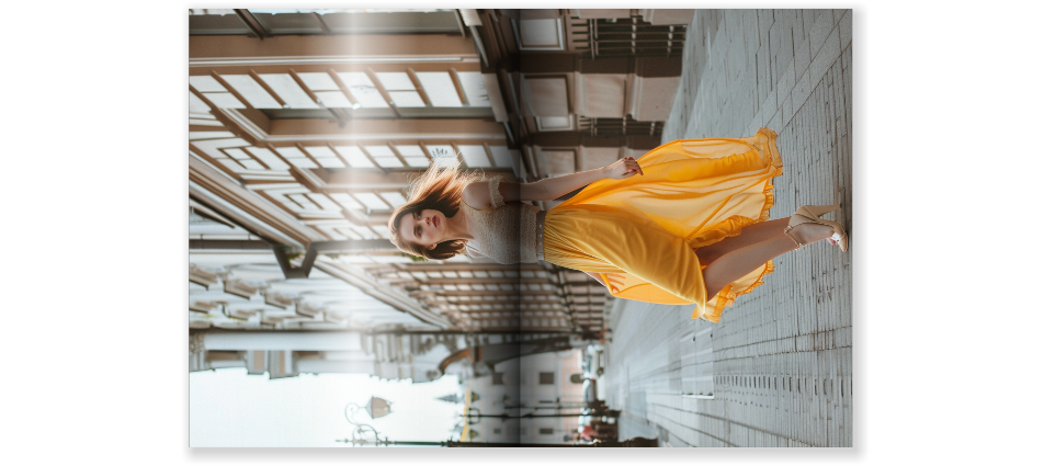
enter image description here


So, I would go from Bottom to Top 95% of the time.


But fortunately, Design is open to creativity. Of course, you can do whatever you want if your design is disruptive. Just be sure the intention is clear.
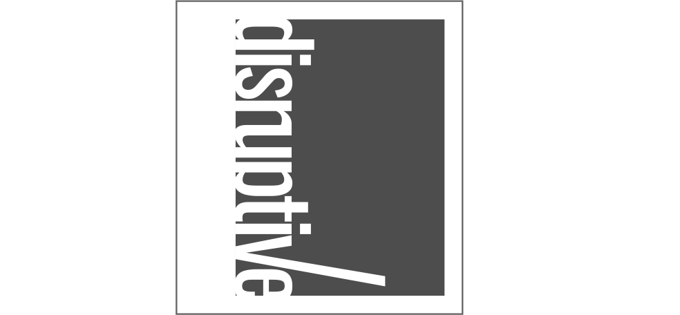
enter image description here

Save that 5% for these cases!

3

I create architectural drawings in the US for a living, and text is very densely packed in these drawings, and frequently must be angled or vertical. If it's angled, it remains left to right, no matter how slight the angle. If it's vertical, it is tilted counterclockwise, reading bottom to top.

I'm so used to this that the other looks awkward to me, though it is true that all my book spines are turned the other way! It might depend on what you're used to, and probably could go either way, but if you have a lot of vertical text, like in a technical drawing that requires it, it must all go in the same direction.

That's my two cents!

2

It's exceptionally rare that I'll set any text in a rotated fashion such as these. But it does happen from time to time.

I, personally, pay attention to the flow of the eye.

I would never use any rotated text which causes the eye to move downward when reading it.

An upward movement is always percieved as more favorable.

I suppose if you want to promote a more morose or unpleasant feeling, then downward may be appropriate.

7
  • I agree that upward is more"comfortable" for me. I did not like the cricket picture using the downward orientation. I am guessing it was decided upon because of the crown logo attached to the left justified text- but still, I would prefer it upward reading (or horizontal).
    – Kyle
    Commented Nov 27, 2020 at 20:45
  • 4
    I disagree and I think it must be a cultural thing. To me it's natural to tilt my head clockwise to be able to read vertical text. It's in the muscular memory of my neck. Here in Europe I believe it's most common to have text on a book spine going top to bottom. It makes the spine readable when the book lies flat. Also I can't see how reading downward should be unfavorable. That's how you normally read text. One line at a time, starting from the top and moving downward. That said, both directions could be used depending on which route you want the eye to follow through a design.
    – Wolff
    Commented Nov 27, 2020 at 23:02
  • (I am aware that book spine text direction varies in different countries.)
    – Wolff
    Commented Nov 27, 2020 at 23:15
  • Spines are a (possible) special case. Spines are initially designed to be read horizontally when the books are stacked on top of one another.. so left to right. Naturally when a book is then turned vertical, to be placed on a shelf, the text reads downward. And I wouldn't argue that this might be a cultural thing. And my inclination is to always tilt my head to the left, so....
    – Scott
    Commented Nov 27, 2020 at 23:49
  • 2
    I have to disagree as well that there’s anything ‘morose’ about reading from top to bottom. The thing about the cricket design that makes it uncomfortable to me is that ‘Jonny’ and ‘Bairstow’ go in opposite directions. It ultimately depends on the design, but in general, I think it’s more important that the direction and alignment of the text pull the eye towards important areas in the design, rather than away from them. If (both parts of) Bairstow’s name had been BTT in the same location where it is now, it would pull the eye out of the image instead of towards the player. Commented Nov 28, 2020 at 14:24
1

I would suggest those that read from top to bottom are probably more common, as book spines follow this rule here in the UK (in Enlgish). I don't know if that's the same in all languages.

However, the example with the "We are England Cricket" text is absolutely horrible, and I can't see any reason for having the text run vertically at all. I have no objection to the Toni & Guy one running bottom to top, looks fine. As for the Diego Maradona examples, I don't think the text rotation is necessary. There's plenty of room for horizontal text.

It's really quite rare in English to have text running vertically, and I would say it should be avoided in most cases unless it can't really be helped, such as on a book spine, or where there isn't enough space to have the text run horizontally.

Your Answer

By clicking “Post Your Answer”, you agree to our terms of service and acknowledge you have read our privacy policy.

Not the answer you're looking for? Browse other questions tagged or ask your own question.