1

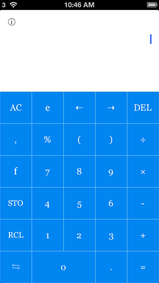
I am developing a calculator app which looks like this:

  enter image description here

I'd like to bundle a few themes for the user. So I pick a few colors for the keypad I like. However, I have a hard time to determine which color to use for the borders. Besides, I found pure white or pure black text may not always look the best...

For example, I have no idea of how to determine the border color for the following blue theme:

  enter image description here

Is there any guideline or tool I can use? Now I am taking a trial-and-error approach (moving mouse pointer on the Photoshop color palette aimlessly)...

4 Answers 4

3

Try this tool:
https://kuler.adobe.com/#themes/random?time=30

  • With colors already arranged

And more (You could set your colors by) :
https://kuler.adobe.com/#create/fromacolor

  • analogous
  • monochromatic
  • Triad
  • Complementary
  • Compound
  • Shades
  • Custom
2

For compactness, adaptability, and plugability, I would first sample the base color to see if it consists of mainly bright or dim colors (say, if every RGB value is greater than 127, then it is bright). Then, I'd draw the borders as the sampled color +25% brightness for dim colors and -25% brightness for bright colors. Then, you can set the text color to be black on bright and white on dim.

1

Look at what you have

You're not so much seeking a color theme as you are a contrast scale. I would find a combination of button/divider that works and use that as your formula.

Your dividers are distinguished simply by brightness/value rather than hue. Saturation/chroma can come into play here too as you move along the brightness scale but that will be apparent and divergent from one swatch to the next.

Look to your successful experiments and calculate the percentage difference on the brightness value in the HSB model. You can then use that ratio to determine a starting point for your next theme. For instance, you would take your button color, apply it to the divider then multiply it's brightness by the appropriate factor.

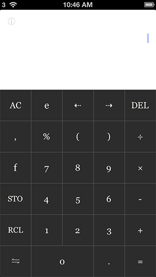
Using your dark grey theme as a starting point I see that your buttons are #2c2c2c (17% brightness) and your dividers are #444 (27% brightness). 27÷17 gives me 1.5882 which is to say your ratio of dark to light is approximately 1:1.6.

Bottom line

Determine a light color based on a dark color:
Multiply the dark color's brightness value by 1.6.

Determine a dark color based on a light color:
Divide the light color's brightness by 1.6.
2
  • I tried this for a few colors. However, I cannot conclue whether a brighter or dimmer border is usually better. Any suggestions?
    – ohho
    Commented Jan 24, 2013 at 10:57
  • 1
    By "brighter or dimmer" I assume you mean lighter or darker. It's all a matter of taste. Your current palette (in the examples above) is very simple because the dividing lines are roughly the same color as the numbers. If you went dark with the dividers it would expand your palette and you may like the extra punch it gives the numbers. Of course, if you had light colored buttons, you could switch all that around: lighter rules and dark numbers Commented Jan 24, 2013 at 17:40
1

Color Scheme Designer 3 sounds like what you may be looking for. It is useful for inspiration, but take it with a grain of salt. Use it as a guide, not a scientific tool; you'll probably get better results if you tweak the results manually to blend nicely.

Your Answer

By clicking “Post Your Answer”, you agree to our terms of service and acknowledge you have read our privacy policy.

Not the answer you're looking for? Browse other questions tagged or ask your own question.