I can't think of any especially good software architecture diagrams that haven't had the data they show heavily simplified and cut down, but we can find some relevant stuff by first breaking down what a software architecture diagram is.
Then, we'll look at some examples of designs that deal with similar challenges.
It's a type of flow chart / process diagram with a focus on categories of element / node. That in turn is a type of node-link network diagram, with added directionality: essentially, nodes, which can have categories, and connections, which can have direction.
Anything based on node links can turn into a messy 'hairball' when the complexity of what it's trying to represent increases. If nothing suggested below based on node links works - if the thing in question is just too complex - here's an article by a respected data visualisation academic on some alternatives to the "node-link" concept as a base for network maps that data visualisation researchers have come up with. If you can figure out how to adapt some of these into something user-friendly and directional, you could be on to a winner. But that's the really hard way to go, only try that if you have to.
So, complex flow diagrams and network diagrams with an emphasis on direction/flow and categories of node/element. First basic principles:
- Keep every node/element simple
- Make the differences between types of element clear and simple with a clear hierarchy between them
- Make the flow and connectivity as much of a background element as possible
Think of the signal-to-noise ratio (sometimes called the data-ink ratio in the context of information graphics): the connections are visual guides, not data, so make them as subtle as possible without making them less easy to follow. Also think of figure-ground: the data should be the thing that is attended to in the foreground, the visual cues showing flow and category should be the background that people are aware of but not distracted by.
First example, a typography decision flowchart poster (I'm sure some people will disagree with the content...). Using only black and white, it makes a complex diagram usable with a clear hierarchy between elements:


It's very clear what each element is, using clear-but-subtle hightlighting and variation that adds minimal noise. The whole is complex but each part is clear.
Possible improvements - there's no overall direction, with it going from the middle out - the lines could have directional information without adding noise by being very small subtle dotted chevrons (like >>>>>) instead of dots, so you could start anywhere and see where to go next without those direction cues distracting.
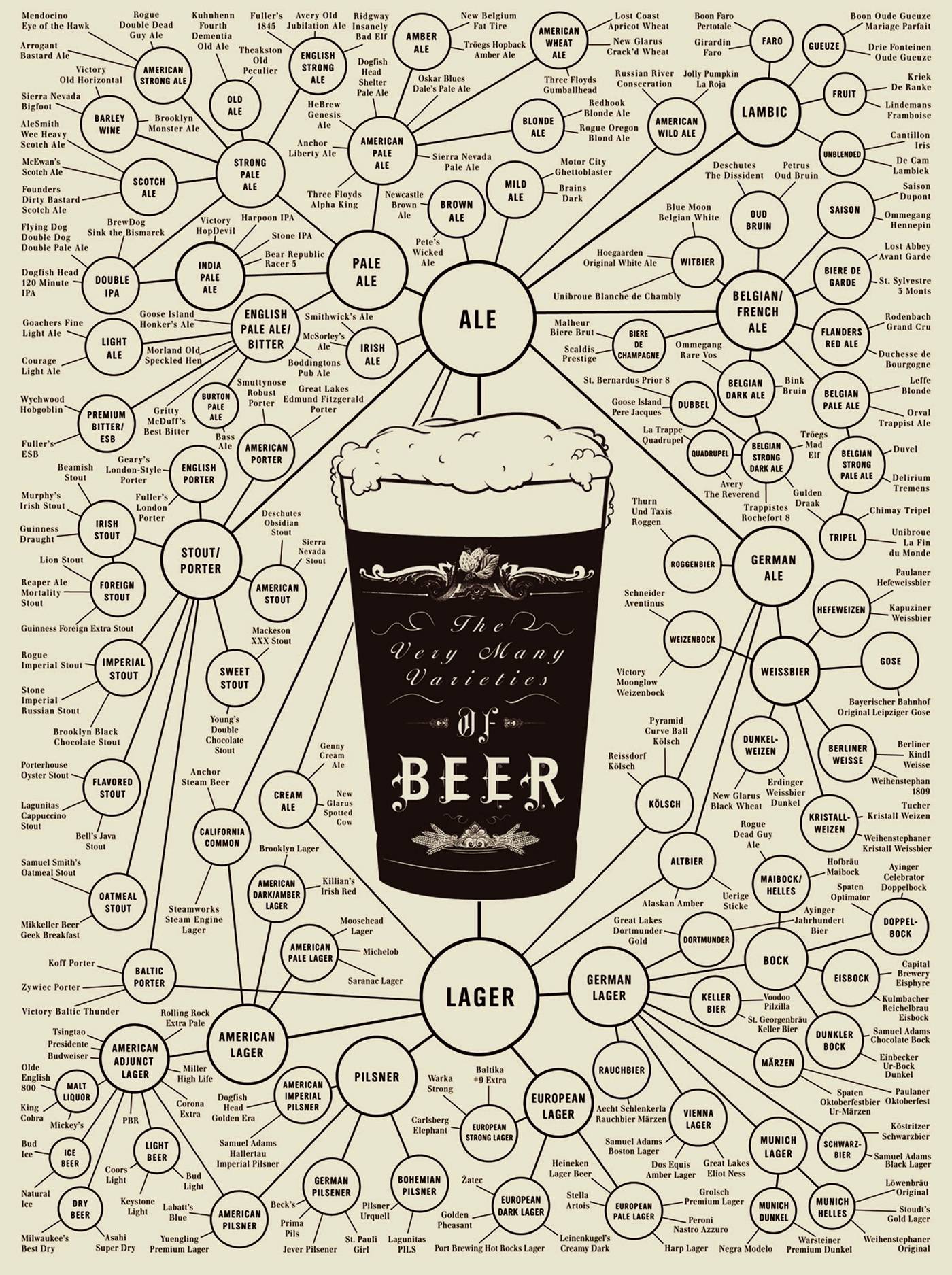
Here's another similar example where the flow is moving through a hierarchy (most general > most specific). It turns a lot of categories into two types of node: products, and types, and the size of the node tells you the specificity of the type. (the circle outlines and connecting lines could be much much more subtle, but they seem to have been weighted to complement the type and give everything except the central pint glass a more even texture). The circle size also doubles as an indication of position and flow - you go from larger to smaller circles, so they don't need any other complexity-adding visual cues like arrowheads.
The very many types of beer

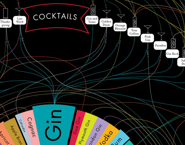
A lot of the work done by PopChartLab is relevant. They specialise in big posters showing lots of interconnected things, and they sometimes write up their process. Here's their writeup of a project where they really struggled with the amount of things they wanted to show. I personally don't much like the end result (they worked hard to tame the hairball, but the end result is still a hairball), but reading what they tried and what worked and what didn't could help.

Here's an example that makes neat use of placement on the page to show categories and order in flow. It doesn't need the blaring garish colour scheme (which is a reference to the subject matter, Apple's old rainbow coloured logo). Using the page x and y axis like this means it can save the connecting lines for other types of information.

Finally, as I mentioned at the start, software architecture diagrams are an example of network maps, which are a type of map. So, you can get ideas from regular (cartographic) maps, which also have a similar problem of lots of categories of dense, complex information which often has connections and direction - constantly trying to stop your many signals turning into noise.
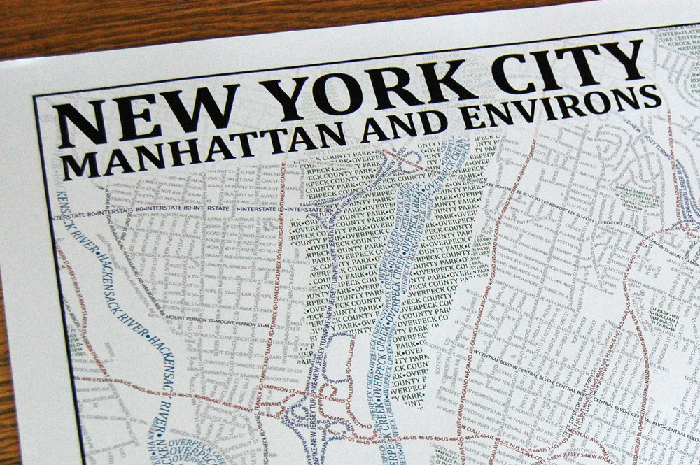
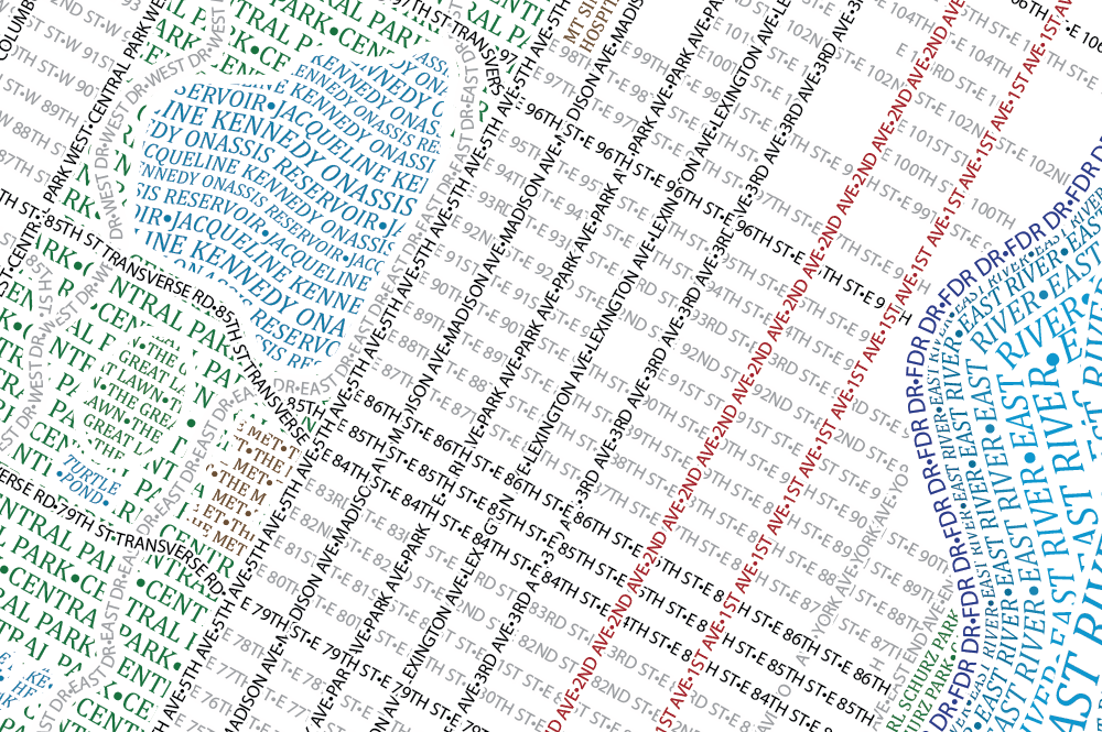
Axis Maps produce amazing typographic maps that have some of the best signal-noise ratios of any information graphics I've seen, by simply using their labels as the things the labels label - then colour and a few subtle twists of typograohy and spacing to indicate category.
If you don't mind some extreme typography, this could probably be used to tame a flow chart that was getting out of control. Looks like painstaking work, but the results are awesome.
