4

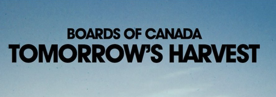
I'm listening to the new song by Boards of Canada, and looking at the fine artwork. –Avant Garde, that's a nice one, I think to myself.

But when I try it out on the poster I'm working on I notice a slight difference from the cover artwork

enter image description here

The M and W has got an even thickness as opposed to the traditional Avant Garde. Anyone know if this is an alteration done by the graphic designer or if there is a font like this?

Thanks!

1
  • 1
    Do you mind checking your links. You posted the same link twice. If you edit the link I can attach the images.
    – user9447
    Commented Jun 4, 2013 at 15:18

2 Answers 2

4

We've got an existing question listing fonts similar to Avant Garde: What's a good replacement font for ITC Avant Garde Std?. It might be one of the very similar fonts listed there (e.g. Tex Gyre Adventor or Raleway).


But to answer the other implied part of the question - is it likely that they modified the type for this album cover? - yes, it's very common for type to be manually modified and in some cases redrawn for anything that is like a logotype.

If the goal is that a piece of type is itself to be a recognisable design, or, is to form a significant part of a design that is to be recognisable and distinctive, it's very common for a designer to tweak the typeface, going over every corner, every line and every flourish and serif, where appropriate redrawing them to be just right for this usage.

For something like cover artwork for a major artist, it would be surprising if the designer didn't tweak and perfect for their eye this specific set of letters, even when working from a classic typeface like Avant Garde.


For one thing, that ' is definitely not from ITC Avant Garde Bold:

enter image description here

Looking at it, it looks like many of the letters might be a lighter Avant Garde (demi-bold?) with a stroke applied, which would explain the R and the seemingly smaller counter (hole) in the O as well as the more even thickness; alongside tight tracking, manual kerning and swapping the ' in from another font.

A modified, stroke-fattened Avant Garde demi-bold using a single close quote () and the low-slung A from the 'Bold' font looks likely:

enter image description here

3
  • 1
    Beware of the difference between ' and ’.
    – TehMacDawg
    Commented Jun 4, 2013 at 16:08
  • @TehMacDawg Good point! Updated Commented Jun 4, 2013 at 16:15
  • That is a great answer. I think you might be right both in that some tweaking has been done and that the font they've been working with is the demi-bold. The single quote could also simply be a comma. The version of Avant Garde I have is issued by Adobe, it has not got the closed R. Kind of odd by the way that only the demi-bold and its italic has got a different R. Thanks!
    – Johan
    Commented Jun 4, 2013 at 16:28
1

It could also be Neuzeit Grotesk Black with a modified M, A, E and T:

enter image description here

0

Your Answer

By clicking “Post Your Answer”, you agree to our terms of service and acknowledge you have read our privacy policy.

Not the answer you're looking for? Browse other questions tagged or ask your own question.