0

I have a client who wants a design for a web app. He told me that he would like "a large sidebar menu on the left" and gave MailChimp's new design as an example. We both agreed that what the client wanted was a responsive design and a similar look and feel of MailChimp. The client's current site is using bootstrap and is under the 960px grid. I've made designs to fit for 960px grid before, but this is my first time adding a vertical menu.

How would I go about this? I'm not sure if I should be incorporating the menu width to the 960px width. For example, if the menu is 200px wide, should I use the 760px as the main content div? Or should I be designing the main content div as 960px and create the menu outside of the 960px width?

And if you are in a teaching mood, I would love a quick analysis of how MailChimp did their layout. Like, structurally, how it is set up.
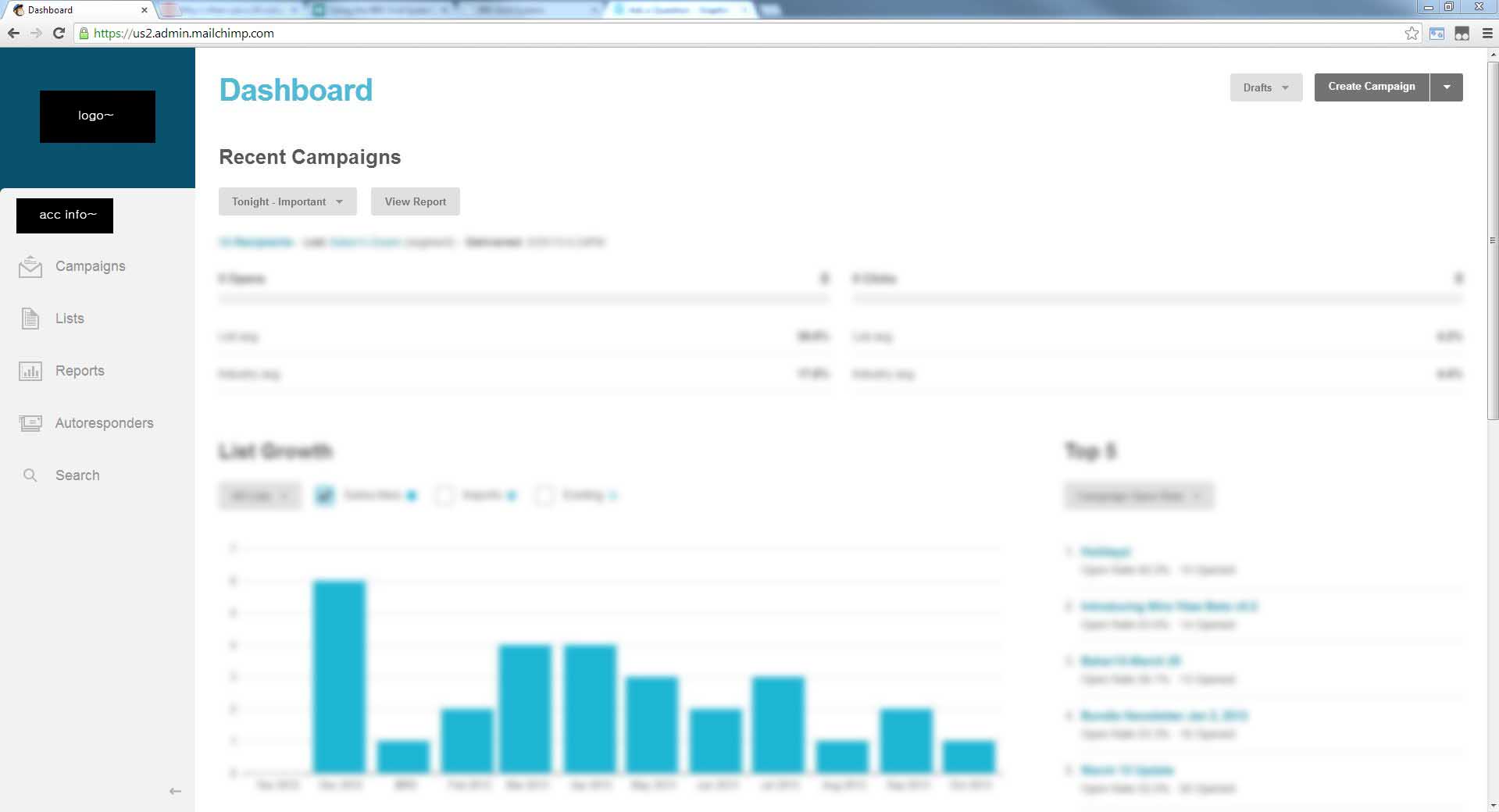
dashboard screenshot

5
  • I think you are targeting the wrong audience. graphicdesign.stackexchange.com is primarily for graphic design, not Bootstrap developing.
    – Slava
    Commented Oct 19, 2013 at 0:18
  • Is my question leaning more on boostrap rather than layout? Hrm.. I thought it was still in the boundaries of design. Should I ask this on stackoverflow instead? Thanks for your input.
    – Jason Kim
    Commented Oct 19, 2013 at 1:32
  • Well the question could be on topic of it didnt appear like a brainstorming question. Quality web design takes into account of all space needed, what is your primary goal, what is supposed to be included in the side panel, what colors are to be used, how is the visitor of the site supposed to use the sidebar, does this sidebar include all the navigation, etc. etc. etc. I could go on, but as I said before this appears to be more of a brainstorming question which we do not allow. If you have a question on how to do X design feel free to ask.
    – user9447
    Commented Oct 19, 2013 at 3:11
  • 1
    As I understood your question is about the alternative ways of coding your design with HTML&CSS in Bootstrap framework. Photoshop guru's probably won't have a clue how to help you. Based on your screenshot, I would go for two div's on the same level (menu and content). You will get less and cleaner CSS rules. But this is without taking Bootstrap into account! I think stackoverflow will be a better place to ask this. Don't forget to tag it [bootstrap].
    – Slava
    Commented Oct 19, 2013 at 14:05
  • Traditionally 960px means all content falls within the 960. Not 960px + sidebar widths.
    – Scott
    Commented Aug 8, 2014 at 17:47

2 Answers 2

1

I do not entirely understand what you mean. Your client wants a responsive design, but you talk about fixed widths in pixels.

Are you comfortable with coding css? I am going to assume you have a fair grasp of css.

Bootstrap have solutions for responsive web, I am unsure what you mean when you say they use the 960 under bootstrap. Do they set widths fixed in pixels? If so, why? Then a good deal of the reasons for using bootstrap is moot.

You can simply download sourcefiles for mailchimp, and poke around in the code yourself, or you could do it via various web developer tools. But I would say this is not really worth the effort because:

The whole thing seems pretty simple to me though. I would suggest you - for now - ignore the 960, go to bootstrap and read the intro on responsive design and how to use their column selectors.

If you have set widths in the code, this is easily removed, and bootstrap would pretty much take care of the responsive action.

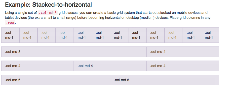
You will then, with bootstrap make a simple column-choice, and add whatever menu items, buttons etc you want. It is pretty well described here http://getbootstrap.com/css/#grid

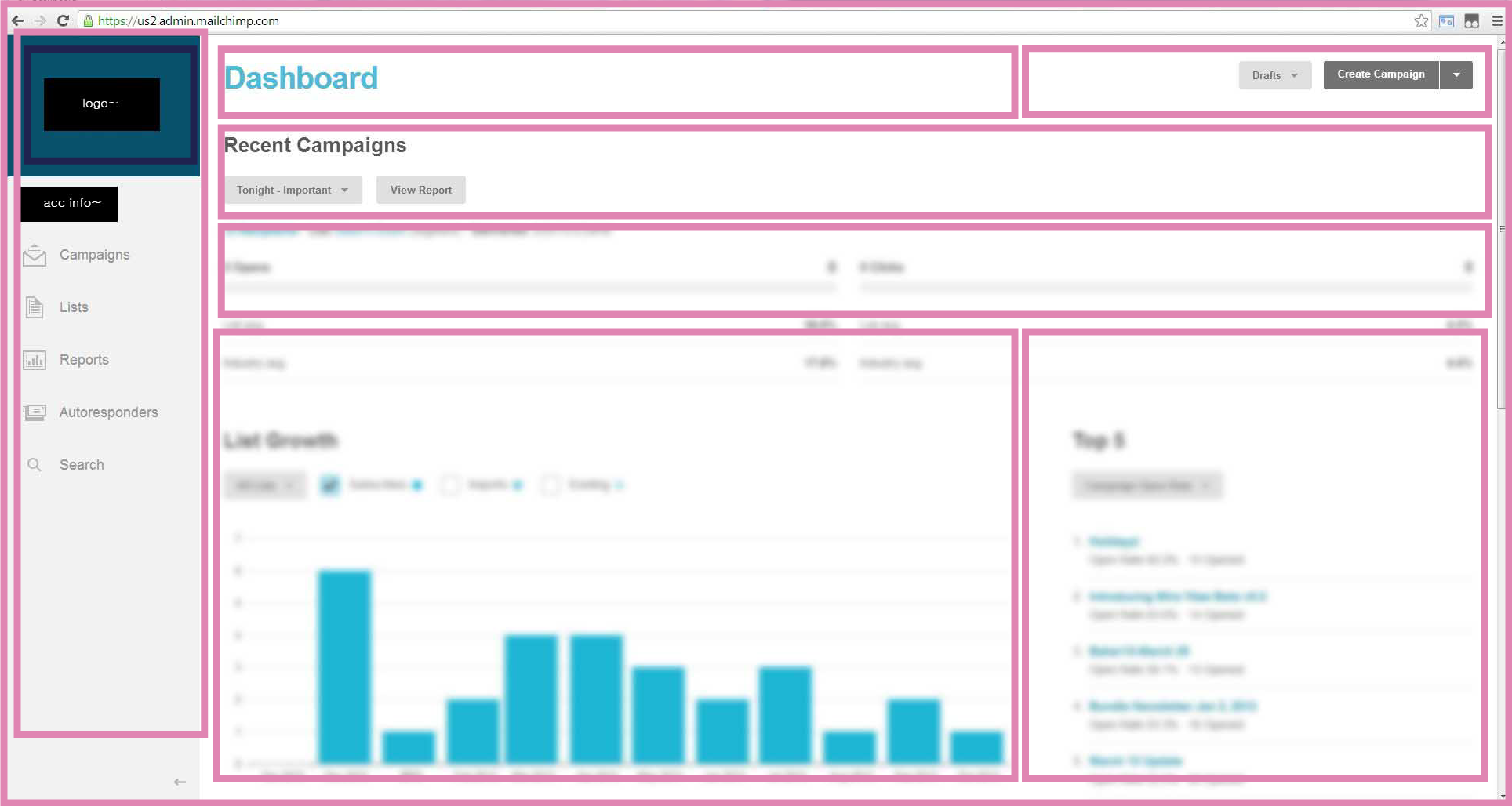
Here is the basic, underlying structure for mailchimp: enter image description here

This is how it is done in Bootstrap: The columns have to add up to 12. Therefore, based on the mailchimp example, you would have your sidbar at for example col-md-3, the one containing the words "dashboard" maybe a col-md-6, the one containing "drafts, create campaign" at col-md-3.

The one below that; containing the text "recent campains..." would then be a col-md-9 (12 minus 3) Here is how they outline it: enter image description here

Whatever you do. Get rid of any fixed widths.

1

In the specific case of MailChimp they have made their framework available for public use here- http://ux.mailchimp.com/patterns/ You will also find nuggets of their design process in their blog articles and if you subscribe to their newsletter. They also warn that it isn't like Twitter Bootstrap and a lot of it has been tailored to have suited their needs.

The important question that everybody else here is also raising is this- what's your content strategy? Because your design should be an answer to that. And the world moved out of 960 grid long ago. With Adaptive layouts you try to make the best out of the space available to you and at the same time ensure that the user gets the maximum usability in each screen size. It's a multi-level exercise. A grid system might not necessarily answer all the questions. Your understanding of the content and the user's needs will largely determine the outcome.

Your Answer

By clicking “Post Your Answer”, you agree to our terms of service and acknowledge you have read our privacy policy.

Not the answer you're looking for? Browse other questions tagged or ask your own question.